When I travel, I pack art supplies in case I have down time at the hotel. This trip, I’m in Athens, Georgia, and I forgot my art stuff. Perfect excuse to visit the local art store!
The k.a. Artist Shop is a really cute art store. It makes me feel like a kid in a candy store – everything looks pretty, and colorful, and I want it all.
I like visiting independent art stores. The Artist & Craftsman Supply in Charleston is another one of my favorites. It has everything and it’s employee owned which is cool.
When I lived in Manhattan, I loved visiting Kate’s Paperie in Soho. Sadly the store is no longer around (as far as I know). Such a colorful, creative store to visit.
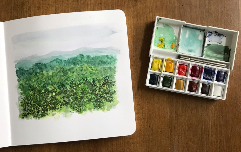
At k.a. I bought a new sketchbook. I figured it was a good excuse to sample a different one and update my watercolor journal recommendations post. I also bought a Winsor & Newton Cotman watercolor travel set. The watercolor pans come out, making it convenient to replace and or swap out colors. Unwrapping each color felt like I was unwrapping Starbursts, without the sugar.
After the art store, since I was out in the rain already, I figured I’d try Zombie Donuts. Wow! The freshest, lightest, fluffiest donut I’d ever had. I should have bought more.
Back in the hotel, my donut eaten, I set up my purchases near my big window and started unwrapping each color and testing them out. It’s always good to know the colors in your palette – read this post: Painting Tips for Beginners.
I have to admit, I’m not loving the new sketchbook. It’s mixed media paper, but I don’t think it’s suitable for watercolor. The paper is coming apart as I paint. See my sketchbook/ journal recommendations here. Paper is so important with watercolor!
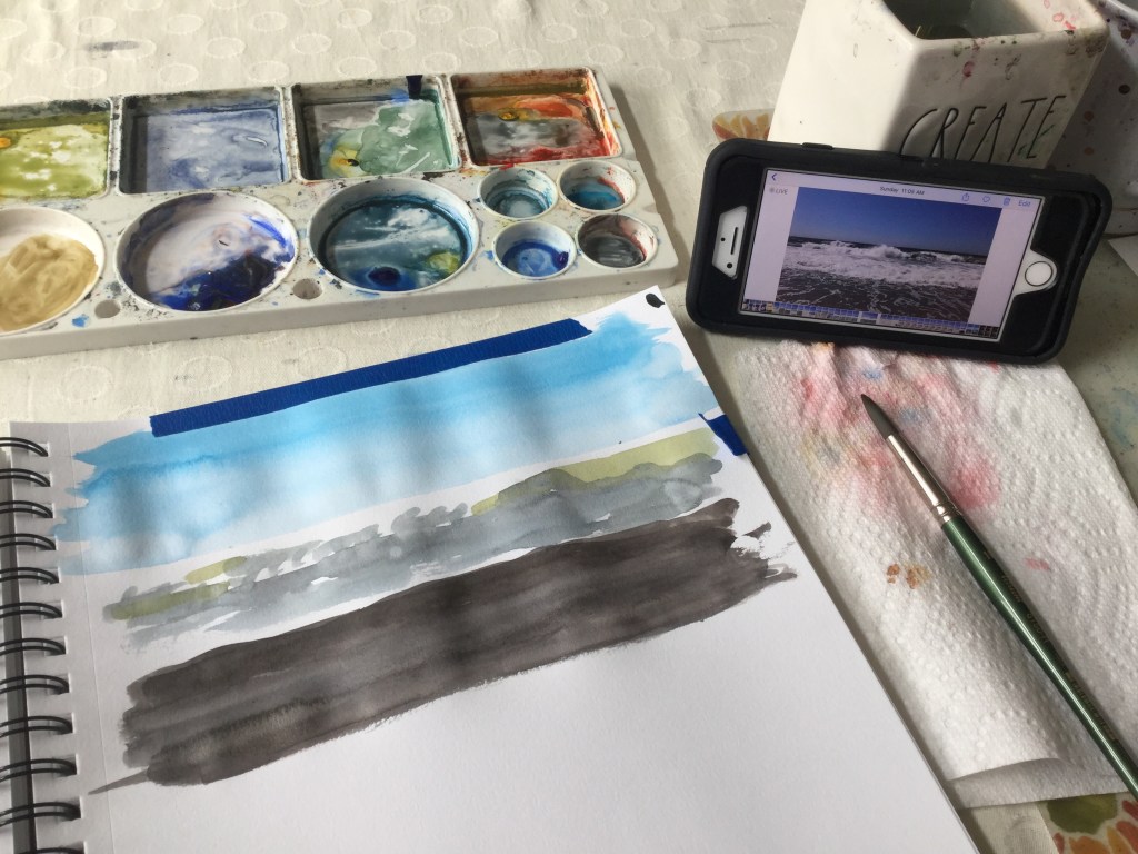
A few days after I wrote about my time in Georgia, I traveled to upstate New York. We were staying by a lake. Unfortunately one day was pouring. Good thing I had my paints with me!
Whoops! There was an error and we couldn't process your subscription. Please reload the page and try again.
This post contains affiliate links to products/brands I use and recommend. I earn a small commission whenever you buy using these links, at no additional cost to you. Thank you for supporting my blog!
1. Look before you paint. I’m so impatient I want to dive in and start painting. I need to remind myself to stop and observe before my brush hits the paper.
2. Paint the same subject over and over. Painting is seeing. The better you see your subject, the better your paintings will be.
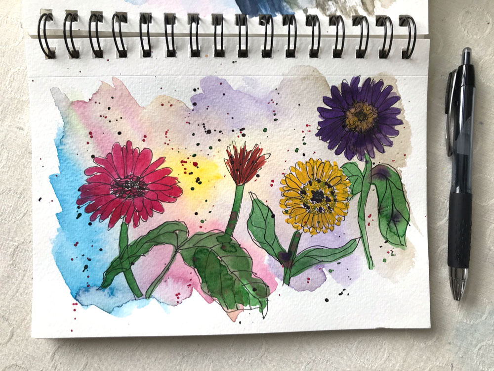
3. Play in a sketchbook regularly. You’ll feel more free to experiment. A sketchbook takes away some of the pressure and the fear of “ruining” a painting. My favorite is the Canon Mixed Media XL.
4. Add more layers of detail for more realistic looking paintings. Don’t forget to allow for drying time between layers.
5. Invest in thin brushes for finer details. I use a 3/0 brush and 5/0 brush. These brushes have made a huge difference for me.
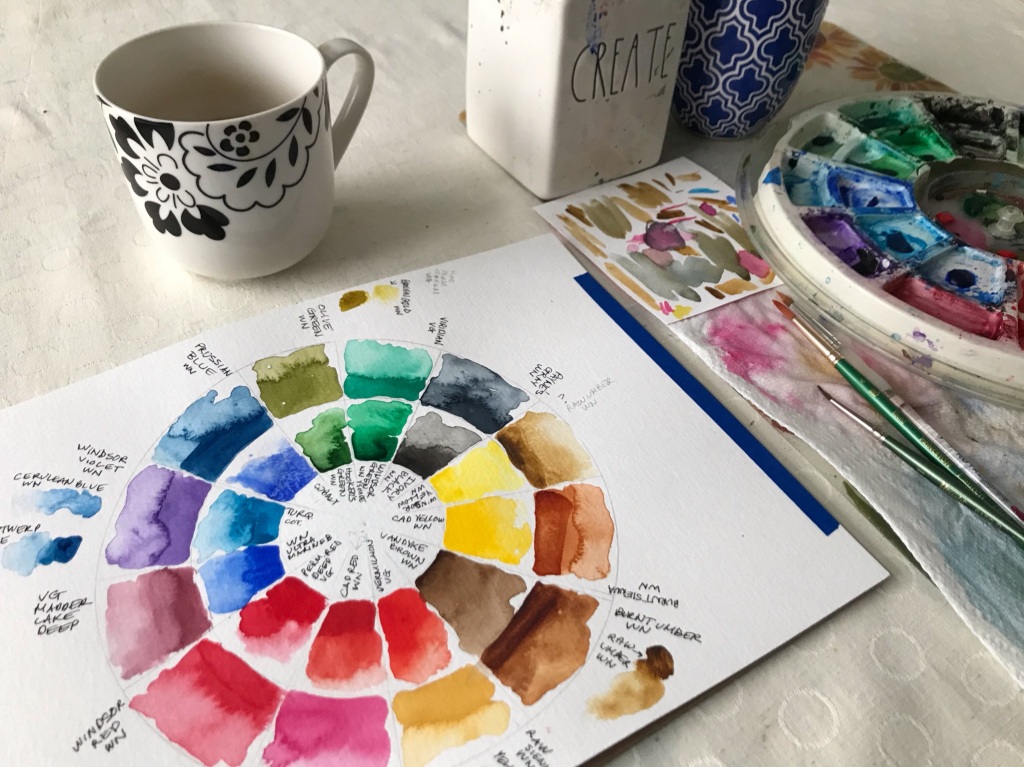
6. Create a color key of all your paints. Paint each color at the darkest (less water) and the lightest (more water). This color guide will help when selecting your colors. It will show you what your paints are capable of.
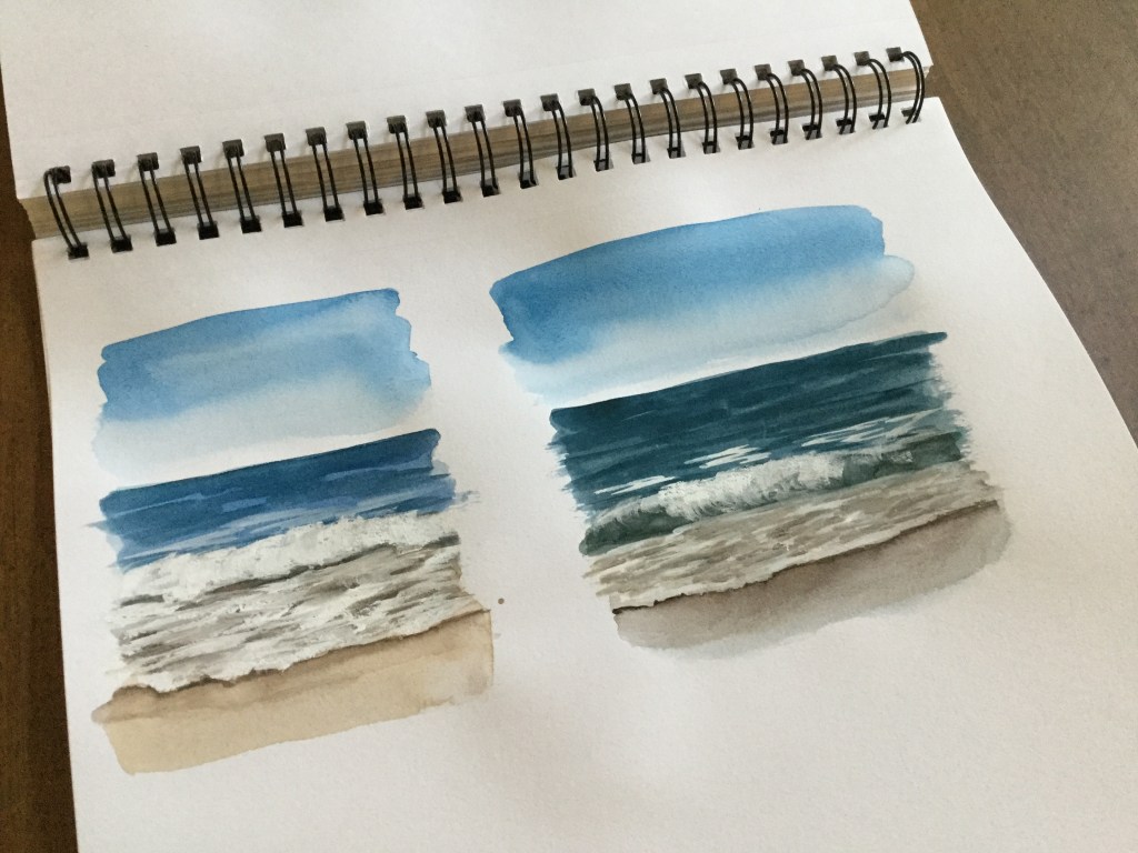
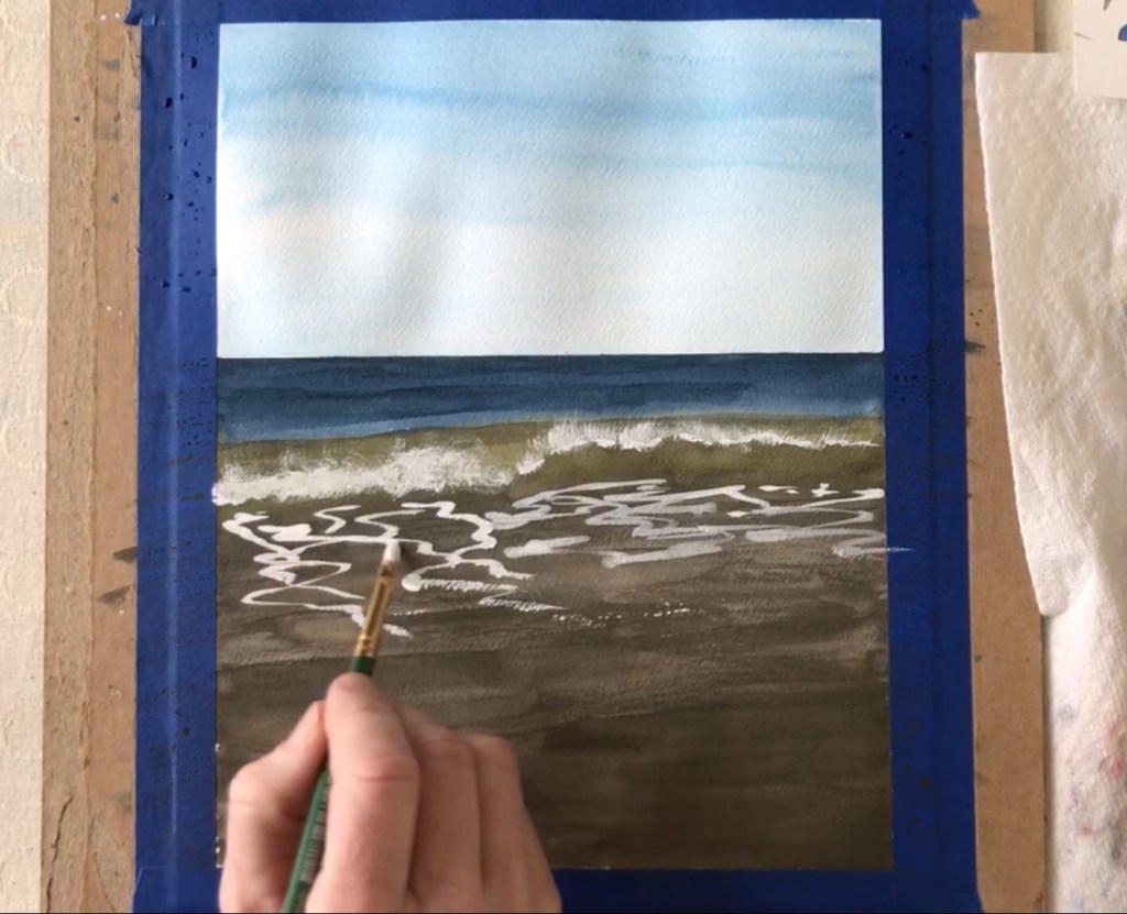
7. Mix your colors from the primary colors. Even though I have tubes of paint in many colors I often use Winsor & Newton cadmium red, cadmium yellow and ultramarine blue to mix almost all of the colors in a painting. I especially do this when painting seascapes, as it allows for more natural looking ocean colors and allows me to mix more variations on the blues, greens and browns.
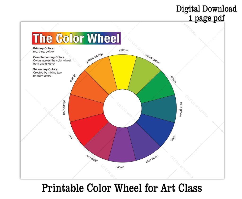
8. Create shadow colors by mixing a color with its complement. Sometimes using black for shadows can be harsh and unnatural looking. Instead mix a color with its complement. Colors across the color wheel are complements – red and green, blue and orange, etc. If you need a color wheel – I have a printable one in my Etsy shop – click here.
9. Use painter’s tape to mask areas and to “draw.” I use painter’s tape to tape my watercolor paper to a piece of cardboard to keep the paper from buckling when it gets wet. I also use tape to help me paint a straight horizon line. Sometimes I use it to “draw” a shape and mask an area.
For example a couple of pieces of tape can create the shape of a lighthouse. Then you can freely paint the sky without having to paint around the lighthouse. You paint right over the tape and then peel it up (carefully), when the sky color dries.
10. Add white back in by using white gouache.Instead of leaving white areas blank (the color of the paper), I often add back the white at the end of a painting using white gouache. Gouache is thicker and more opaque than watercolor. I use this when I’m painting seascapes.
11. Try new things and experiment. It’s easy to get comfortable in the way you paint. But it can be beneficial to mix things up. I was “stuck” using 6” x 6” paper until I accidentally ordered bigger. I never went back!
12. Learn from others. Read a blog post, watch a YouTube video, do a painting tutorial. Getting other people’s perspectives and painting tips can be invaluable to your painting process!
I have variety of printable tutorials and video lessons that teach watercolor fundamentals and techniques while you create a beautiful final painting. Browse painting tutorials here.
This post contains affiliate links to products/brands I use and recommend. I earn a small commission whenever you buy using these links, at no additional cost to you. Thank you for supporting my blog!
I’ve been missing painting regularly, so I’m dedicating August to Creative Exploration! Won’t you join me? There are no rules, just some suggestions to inject new life into your creative practice.
August Creative Exploration Ideas:
New creative schedule. Create daily (or regularly). Even 15 minutes a day is great!
New place. Paint in a new place or paint a new place. I’ll be in some new places so I’m excited about this one!
New medium. Try a new medium. I’ve been wanting to incorporate collage into my watercolor journal pages. (Note to self – pack a glue stick!)
New ideas. All of the above helps open you up to new ideas! Keep track of them (and prioritize them) with my ideas worksheet – available on Etsy.
This past week I was teaching watercolor to the kids at the art studio. I’ve noticed that the kids are often impatient. They paint a background color and then they rush to paint the details. Since the background is still wet, the details bleed creating a blob.
I told the kids that painting in watercolor is like getting dressed in the winter. Just like you add layers of clothes to keep warm, paint layer after layer, letting each layer dry before adding another. With each layer add more and more detail.
When you start a painting, start with a wet, bigger brush, painting the lighter colors. As you progress to the final layers, paint with a drier, thinner brush to allow for the finer details.
Watercolor “Rules”
PAINT LAYERS – LET THE PAINT DRY BETWEEN LAYERS.
PAINT LIGHT TO DARK, BIGGER BRUSH TO SMALLER BRUSH, WET TO DRIER BRUSH.
Following these “rules” helps you to turn beginning blobs into a detailed illustration or painting.
Processing…
Success! You're on the list.
Whoops! There was an error and we couldn't process your subscription. Please reload the page and try again.
Learn the fundamentals
from beginner brushstrokes to a final seascape painting and four other painting projects in between!
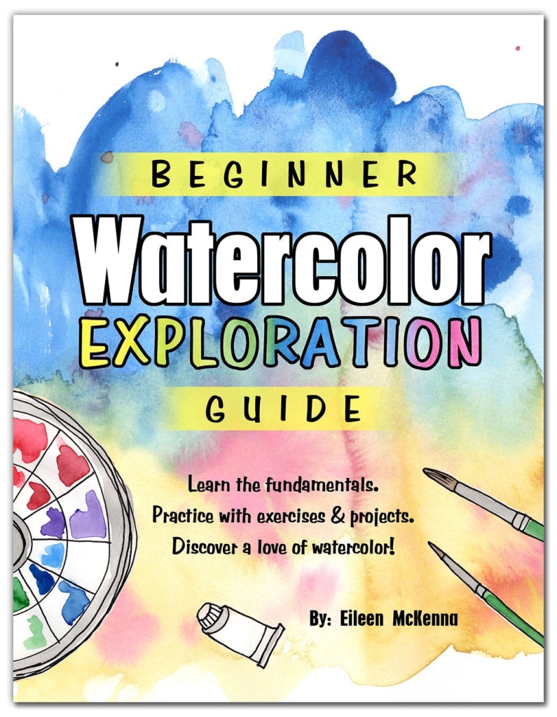
Check out my “Watercolor Exploration Guide” – which walks you through the fundamentals of watercolor with exercises and five painting projects. Discover a love of watercolor!
This post contains affiliate links to products/brands I use and recommend. I earn a small commission whenever you buy using these links, at no additional cost to you. Thank you for supporting my blog!
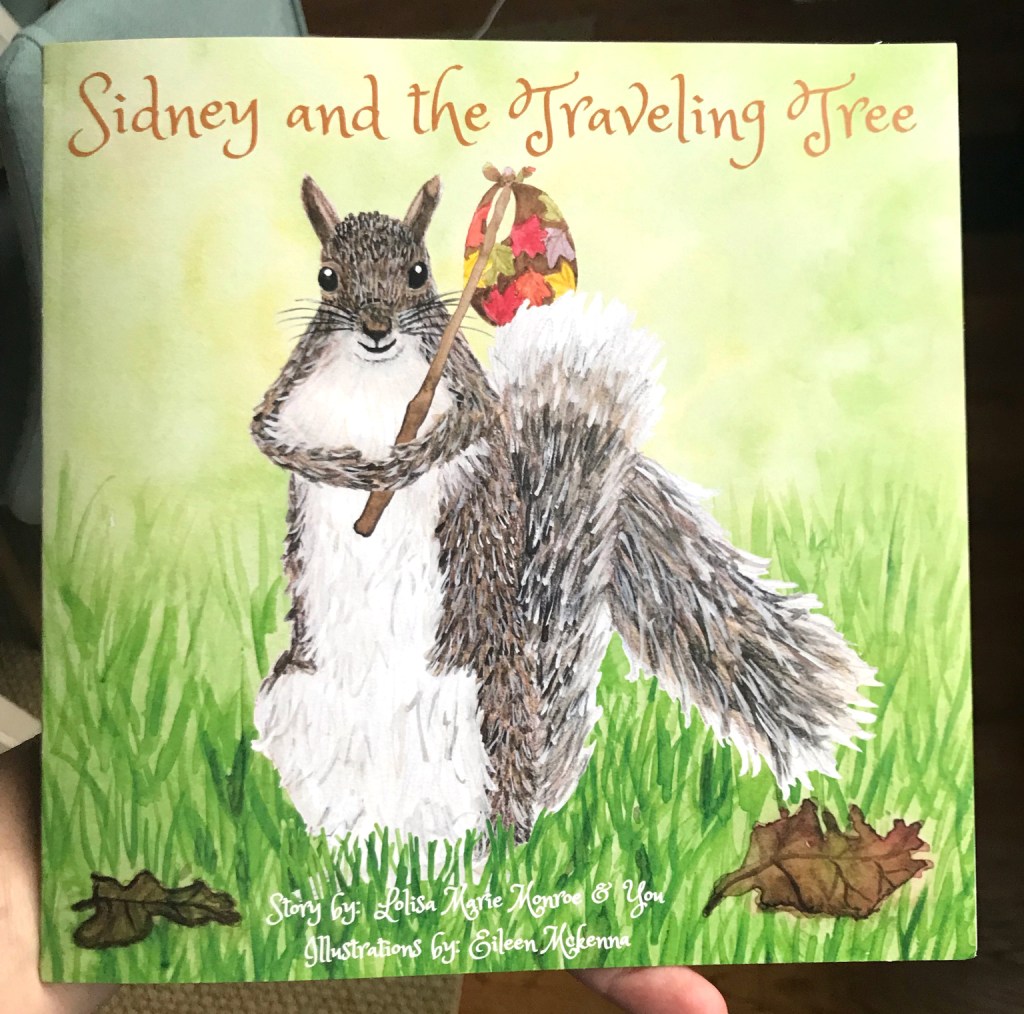
I’ve illustrated a book! For years I aspired to illustrate a children’s book. When the kids were small, taking them to the library and looking at picture books was my favorite thing to do. I even wrote and illustrated my own children’s book – although that one hasn’t seen the light of day.
This book – “Sidney and the Traveling Tree” is by Lolisa Monroe is “a story about a grey squirrel from Western Maine and his adventures in the woods. He discovers a mysterious tree that takes him on the journey of a lifetime. Your child will be engaged as they help ‘fill in the blanks’ in Chapter 1 and actually write and illustrate Chapter 2 by themselves! Develop the writer and illustrator in your child.
This is the first of the series of Miss Lisa’s Little Writers featuring the illustrations of Eileen McKenna. More volumes coming soon!”
Finding a children’s book illustration style
The early days of my blog were about trying to find a children’s book illustration style. I struggled with that for a long time. How do you decide on a style? What I learned is that you develop a style, by drawing or painting alot. Just keep painting – your style will emerge. It’s okay to emulate the style of others in the beginning or try out their techniques. In the end your style will shine through. And it will evolve as time goes by.
How to get hired as an illustrator
I’m working on two books at the moment – one is the second book in the Sidney series, the other is about a dog (by a different author). So how did I suddenly find myself with all of these book illustration projects? The dog project is through a friend. The other is through Etsy. The author of the Sidney books, Lolisa Monroe, found a watercolor clipart squirrel that I sell as a digital download in my Etsy shop. Lolisa liked my style so she reached out and asked if I would do custom work.
How can you get hired as illustrator? Post your work. Even your friends need to know what you do, in order to consider you for a project or to recommend you to a friend. Post the work you are doing on social media. I hate to say this, because it’s what everybody says and because for me it took years for it to happen. I was posting in 2015/16 about children’s book illustration.
I will say that even though the children’s book work took awhile, other great opportunities have come my way because I post my artwork. I have been teaching art to kids for over three years. I got the opportunity because I posted a watercolor seascape on facebook. The owner of the art studio, who was my web design, marketing client, saw my painting and ask me if I would teach a three day summer camp week. That one week of summer camp has evolved into me teaching three days a week. And I absolutely love it. I love working with the kids.
Side note of advice – take opportunities that scare you. I was terrified to teach that week of camp. Now I can’t imagine teaching not being part of my life!
how to Illustrate a book
Because I am new to illustrating books I am learning so much about the process of working with an author and about illustrating. Here’s the top things I’ve learned in hopes of helping you with your process.
Request detailed descriptions from the author with photos
Since we can’t visualize what is someone else’s head, ask the author to provide a description of what they want the illustrations to be. Also ask for supporting photos. These things will help you visualize what the author is thinking. Don’t rely only on the text of the book unless the author is giving you creative freedom.
I realize as I’m writing this that the two books I’ve been working on have been very different processes. In the dog book, I was given the text of the book and creative freedom. With the Sidney book, the author has had specific ideas of what each illustration should be. Before you pick up your brush get as much direction as the author has to give.
Processing…
Success! You're on the list.
Whoops! There was an error and we couldn't process your subscription. Please reload the page and try again.
show rough sketches and/or descriptions of illustrations
Before painting, show the author what you are intending. It is much easier to adjust at that point than after you have fully painted an illustration. In the case of the dog book, where I was given creative freedom, I wrote out what I intended each illustration to be, and got approval beforehand.
In the Sidney book, I learned the hard way. I completed illustrations based on the author’s descriptions and photos and then got feedback. For the second Sidney book, for a more complex cover illustration I did a pencil sketch and made adjustments based on the author’s comments before painting.
Sketch for future illustration
image retouching is part of the process
Incorporate into your estimate the time it takes to scan and retouch your illustrations. It is rare that you would be mailing your originals to the author. They probably will want digital files that are ready for a graphic designer to insert into the book.
high tech and low tech tools for adjusting illustrations
photoshop
Photoshop was extremely helpful for me when I completed an illustration and then had to make edits based on the author’s comments. In some cases, I painted elements separately and put them together on the computer in Photoshop, so I could have more control and it would be easier to change things.
This was especially useful when I painted the squirrel separately from the grass background. I had to adjust the illustration proportions to fit on the cover. I was able to reduce the squirrel but not the grass. If the squirrel and grass were one illustration, it would have been more challenging to fix.
Tracing paper
A couple of times, when I had to edit an illustration I used tracing paper to trace the area that needed to be changed. Then I put graphite on the back of the tracing paper. Then I traced the area onto mixed media paper. This way I had a light pencil line indicating the exact size of the area I needed to repaint.
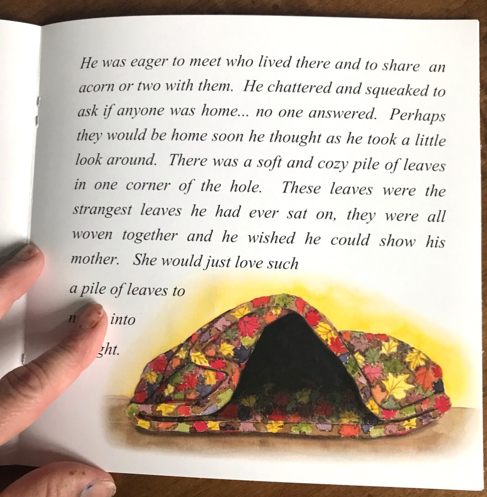
This transfer technique is one we use with the kids at the art studio to transfer their drawings onto canvas. It came in handy! I didn’t have to repaint the entire illustration. I used it for the folded quilt below. The original quilt illustration had solid red border. The author requested that the border be removed and instead I continue the leaf pattern. For the quilt, I added the shadows in Photoshop. I figured I’d have more control than if I added them with paint.
get sizes up front, work larger and include bleed
Again, I learned this the hard way. You can always reduce an illustration but for resolution reasons, you can’t increase it. As a graphic designer I should have realized that any illustrations that go to the edge of the page need extra image size so that there is “bleed.” The image needs to have about .125″ more to give room for some of it to be cut off after printing. This prevents a white edge if things shift slightly in printing or trimming.
refine your process
With each illustration and book – keep track of what went smoothly and what didn’t. Try to incorporate ways to improve the book illustration process.
check out “sidney and the traveling tree” On Amazon!
want to learn watercolor?
Check out my “Watercolor Exploration Guide” – which walks you through the fundamentals of watercolor with exercises and five painting projects. Discover a love of watercolor!
This post contains affiliate links to products/brands I use and recommend. I earn a small commission whenever you buy using these links, at no additional cost to you. Thank you for supporting my blog!
It’s that time of year when the gardens are blooming! They are at their peak, before the August heat starts to take its toll. I love taking lots of pictures to use as reference for future paintings. I’m like a squirrel stocking up for winter. I’m storing creative inspiration on my phone for the winter months.
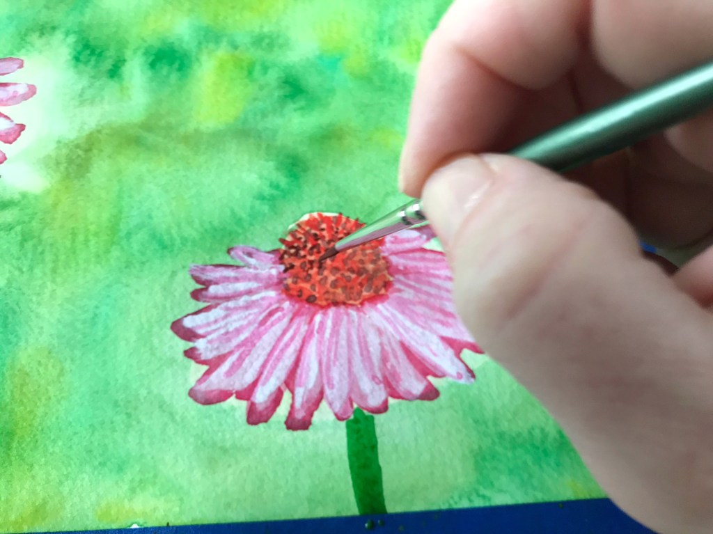
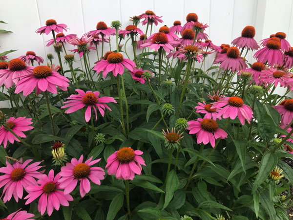
I’m in awe of every hibiscus bloom we get. I’ve made several attempts to paint them. And the coneflowers – Echinacea – are one of my favorites. Last spring I created a new printable tutorial if you’d like to give coneflower painting a try!
This week I went to the Van Gogh Immersive in NYC. The Immersive is a series of rooms where the walls are screens. Van Gogh’s work has been made into a moving animation. On the screens his paintings and elements from his paintings move and pulse and transform from one to another to music. The movements sometimes makes it feel as if you are riding in an elevator. You are surrounded by the images on all four sides and in one room the images are also projected on the floor!
The projection plays on a half hour loop. We walked in to a bizarre screen of illustrated flies buzzing around. I immediately thought, “Well this is trippy.” We watched the projection two times, from different rooms. My favorite scenes were the sunflowers, the irises and a brick wall, that was made up of a rainbow of colors.
This post contains affiliate links to products/brands I use and recommend. I earn a small commission whenever you buy using these links, at no additional cost to you. Thank you for supporting my blog!
Summer is upon us! Let’s celebrate with a beachy craft. First enjoy collecting shells, driftwood, sand and inspiration on your next trip to the beach. Then let’s put it all together in this cute mini diorama!
Supplies you’ll need:
Round lid with edges. I’m using the cardboard packaging from Brie cheese.
Pencil, scissors and a hole puncher.
Watercolor paper and brush
Watercolor paint – a blue green, turquoise, and brown. You can mix blue and yellow to create the blue green.
Ribbon, fabric, or paper to line the inner and outer rims.
Twine or ribbon (or in my case the handle from a shopping bag)
Glue gun, craft glue, and double sided tape.
steps:
1. Trace a circle on your watercolor paper using the lid as your guide.
2. Paint a simple seascape overlapping your circle shape.
Seascape painting tips:
Determine the position of the horizon and mark lightly with pencil.
Starting at the pencil line, paint with the blue green color. (Leave some areas white for breaking waves.) Lighten the blue green by mixing it with water as you move lower, leaving the bottom 1/3 of the circle blank.
If desired – add darker strokes to the ocean for waves.
Paint the bottom of the circle a very light brown (brown mixed with water), leaving a thin gap between the ocean water and the sand.
Using a light blue or turquoise, paint a fade from the top of the circle to the horizon line by adding more water to your blue as you paint.
3. After the painting dries, cut inside the circle. Adjust until the paper fits inside the lid.
4. Tape the painting inside of the lid using double sided tape.
5. Hold up your diorama and with the horizon straight determine what the top is. Poke a hole through the top of the lid or use the hole puncher. (If you are using a plastic lid skip this step. Instead use the glue gun to glue string to the back of your lid.)
6. Glue ribbon around the inner and outer rims, putting seams at the bottom. (You can also paint your lid – I recommend acrylic paint for this.)
7. Thread twine through the hole and knot.
8. Use a glue gun to add all of your beach treasures. Use tacky glue to add sand. Once dry shake off excess sand.
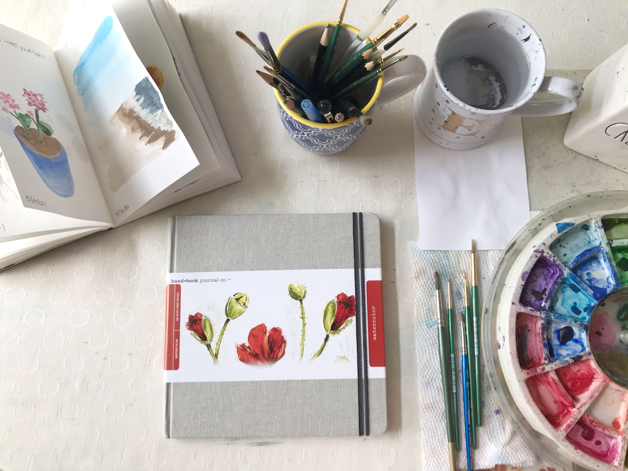
I am having so much fun filling my watercolor journal by painting every day – or almost everyday – no one is perfect right? My pages are of the moments of joy I experience each day. I call my watercolor journal project “Finding Joy” and it’s been a great source of positivity in my life these last two months. And it’s great to paint almost every day.
Thinking of doing your own watercolor journaling? Here are my reviews on several watercolor journals.
The size: 5.5″ x 8″. I liked the small size of this book
The paper: 90 lb. mixed media paper. The paper can withstand some “working” at it – meaning you can apply the paint, lift the paint, add more paint without the paper starting to crumble.
The binding: The book doesn’t lay flat but I used binder clips to keep the pages secure while I was painting.
Cover: The cover is a bit flimsy and rubbery.
Pages: 64 pages. The pages are white which is good as I’m not a fan of off white paper.
Overall I really liked working in this book. If I wasn’t gifted a different journal I probably would have ordered another one of these.
The size: 8.25″ x 8.25″ square. I always liked working with square paper!
The paper: 95 lb. watercolor paper.
The binding: The book lays completely flat.
Cover: Linen hardcover.
Pages: 60 pages. The pages are white which is good as I’m not a fan of off white paper.
Extras: A ribbon bookmark and clear pocket on back inside cover.
So far so good! I just started working in this journal. The cover is beautiful, the pages are spacious. The book feels special. Laying flat is a nice bonus.
Join my email list for weekly watercolor tips and tricks and creative inspiration!
Sign up and receive the “Watercolor Basics” free pdf:
Processing…
Success! You're on the list.
Whoops! There was an error and we couldn't process your subscription. Please reload the page and try again.
looking for a comprehensive introduction to watercolor? This guide is for you!
This Beginner Watercolor Exploration Guide is the perfect introduction to watercolor. Each fundamental is explained and then you practice it with exercises and painting projects.
The 5 tutorials build upon one another as you progress through the guide. You go from beginner brushstrokes to a watercolor seascape!
This posts contains affiliate links to products/brands I use and recommend. I earn a small commission whenever you buy using these links, at no additional cost to you. Thank you for supporting my blog!