I don’t LOVE mistakes

lovemistake
Ironically the first thing I wrote in my last linocut post was “Mirror image. The design prints the reverse of what it is on the block. I keep forgetting this!” and I still forgot! And this time it was text – so you can’t ignore the mistake. Sometimes when I make a mistake this bad I learn my lesson. Let’s hope!

On a happier note…I’ve decided to challenge myself to post, on Instagram, my Valentine’s Day artwork and photos, every day from February 1st through the 14th. So please join me on Instagram (mycreativeresolution) to see what I’m working on! Let me know you found me originally on WordPress. I promise not to include anything you need to hold up to the mirror! 🙂

Learning Lino – A Different Way of Thinking

finalacorns
As I worked on my second linocut, I realized that with block printing it’s a totally different way of thinking, than painting or drawing. It’s also exciting (and hard) that you don’t really know what you are going to get, until you do that first print.

Here’s what I was thinking about as I carved my second linocut:

  • Mirror image. The design prints the reverse of what it is on the block. I keep forgetting this!
  • Positive and negative. Parts of the design are either printed or not. There is no in between. I sometimes forget which is which, and what I’m supposed to carve! I had to write myself a note (“Carve the blue”). The tricky part is when objects in your design meet. You have to work out what prints and what doesn’t, so the design makes sense.
  • Plan. It’s better to plan exactly what gets carved away and what prints before carving.
  • Blade sizes. Wispy little lines don’t exactly translate to carving blades. You almost have to plan the design in terms of what is “carvable.”
  • How deep to carve? I’m still figuring this out. In my first linocut, I didn’t go deep enough, but there was a nice surprising texture throughout.
  • Paint colors. I tried using a blend, but when I rolled the brayer a couple of times it mixed it into a muddy army brown. Printing more than one color is more interesting, but I think you have to print each color separately.
  • Colored paper. An easy way to introduce another color. It’s fun seeing a print on different papers.
  • Press paper on lino or lino on paper? That is the question. I saw a couple of videos that put the paper on top of the lino block and burnished. Then I got a recommendation to press the lino onto the paper.* Like stamping. This time I tried both, and I found that peeling the paper off the lino is easier than picking up the lino block without smudging. Maybe it depends on the size of the lino block?
  • Workspace. As I learn the block printing process, I’m learning how to organize my workspace – what is working and what isn’t. Spreading the paint on a piece of taped down palette paper is working great – and it’s easy to clean up!

acorn1 acorn2 acorn3

*I appreciate any advice on block printing. Your expertise and experience is welcome! Thank you to bluechickenninja for recommending pressing the lino down onto the paper, in my last post: My First Linocut!

My First Linocut!

finallinocut
Finally I sat down and carved my first linocut. It’s amazing – when you make a date with yourself and commit, you follow through. I had been putting it off, sketching ideas for the design, until I realized the design didn’t really matter – it was about trying out the tools and learning the process.

Linocut Tools:

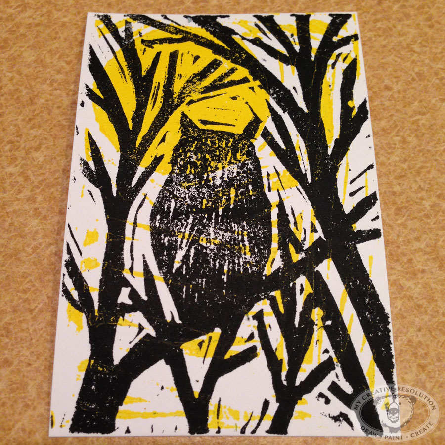
I sketched an idea I had in pencil, directly onto the “Speedyball Speedy-Cut Easy” block. It took me a few minutes to figure out how to attach the carving blade to the handle, but I got it. I was surprised at how easy it was to carve. I carved around the trees first. For the owl I used a thinner blade to add texture (to show the feathers). I messed up with the beak when I momentarily spaced on what I was supposed to carve off – the negative space. But again, this is a learning process.

I used the back of the block, because I wanted two colors. I transferred the eye shapes over to the back with tracing paper – although they mostly fell within the moon. These fine details didn’t really print in the end. And I did it wrong – it should have been the mirror image of the eyes and moon. Imagine my surprise when the moon ended up on the left instead of the right. There were other mistakes: I should have wiped the carving before printing. I didn’t carve deep enough, but this led to a happy accident because I liked the texture it added and the yellow through the print. I can’t wait to do another one!

Here are my steps:

This slideshow requires JavaScript.

You’ll need: