Drawing “cute” illustrations

happyvalentinesday
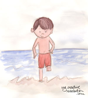
A while back, I worked hard to learn about illustrating in a “children’s book style.” I really studied up on it. (See below for the links to the posts I wrote on my progress.) This week I wanted to do a cutesy illustration of a boy with a box of chocolates and a little girl. I first bought a box of chocolates – we all need a little chocolate, right? Then I had my ten year old, pose with the chocolates under his arm and then as the opposite figure. I didn’t want the illustration to be realistic, but I figured having some reference photos would be helpful.

I went straight to my watercolor paper (taped down on a board), and drew with pencil. I didn’t like it at all. My son looked more like a man than a boy, and there was nothing cutesy about the illustration.

sketch1cd

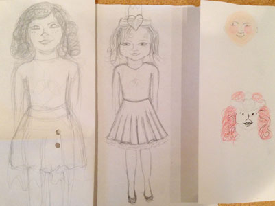
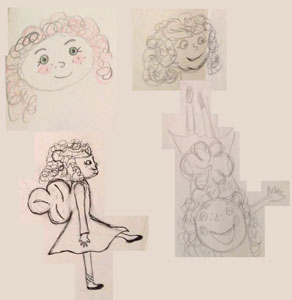
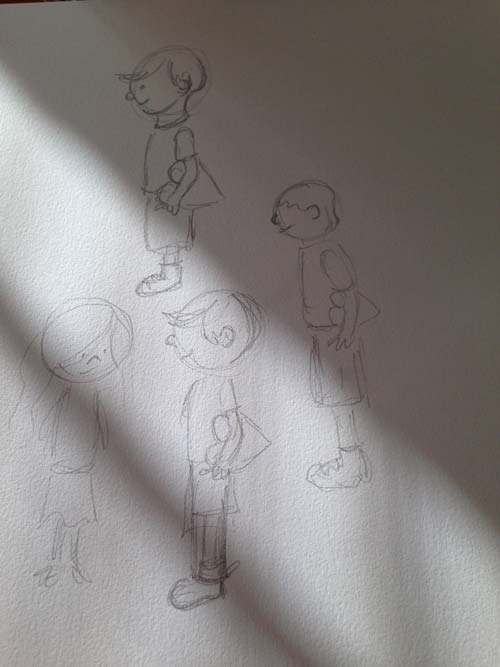
I remembered how drawing something over and over, can really help me arrive at the results I want. So, the next day I pulled out my sketch book and did several versions of the little couple. I remembered the things I learned from observing children’s book illustrators:

  • exaggerate features – like big eyes or wacky teeth
  • color palette – stick to 3 colors
  • kids – small bodies, big heads
  • outline

Following this advice, I made the heads bigger and rounder, and the bodies smaller. The illustrations definitely looked cuter.
cutedoodles

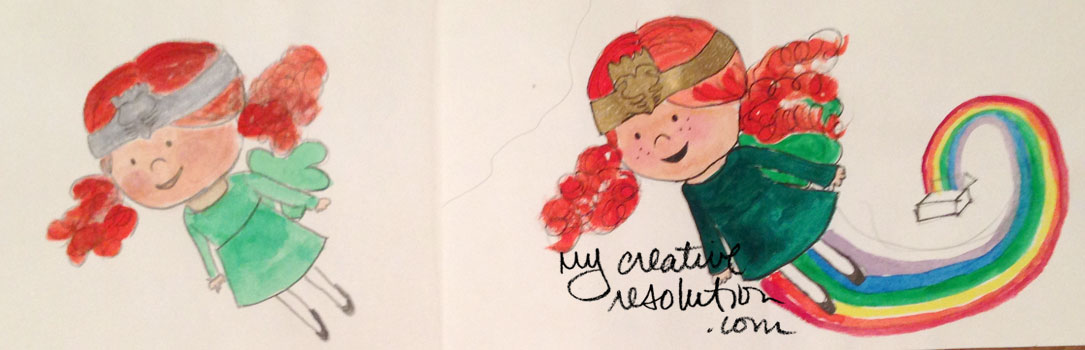
I went back to my watercolor paper, erased the original illustration, and started over, following the style from my sketchbook.
sketch2cd

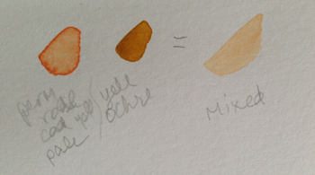
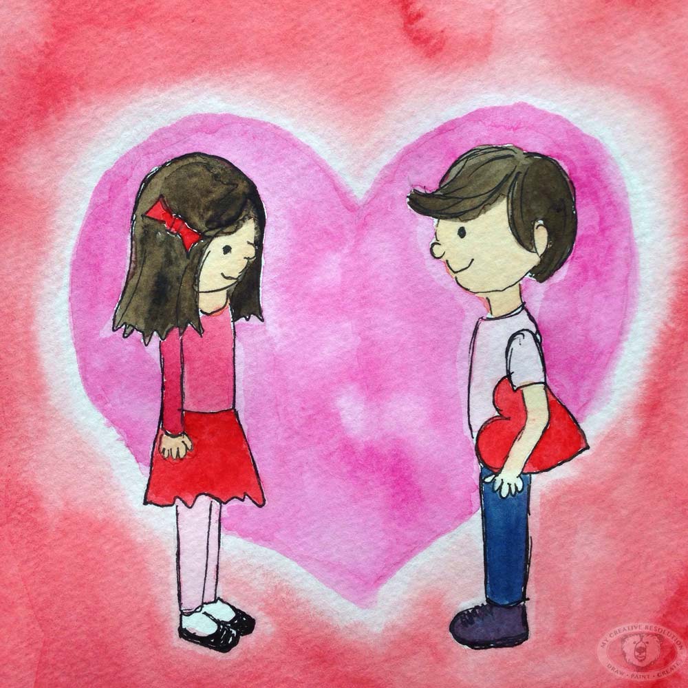
I thought a heart behind them would really emphasize the theme, so I painted a pink heart and a red background. Then I used my pen to create the ink outlines, using the pencil lines as a guide. I waited a bit, so I was sure the ink was dry, and erased all the pencil. I thought about the color palette I wanted. Instead of using blue from the tube, I added pink to it, to mute it, and make it work better with the pinks and reds.

I’m happy with the results, especially compared to my original illustration.

Have a wonderful Valentine’s Day. Lots of love from New York! And if you are also in the Northeast – stay warm!
Eileen

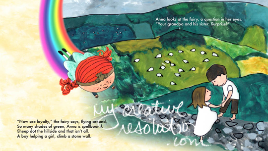
Other posts I’ve written about children’s book illustration style:

For my Dad – a painting of memories

dadscard
A few weeks ago I was walking through Barnes & Noble when the book “Wherever You Go?” by Pat Zietlow Miller and Eliza Wheeler caught my eye. I love Eliza Wheeler’s illustrations. I loved that she created worlds and scenes. I was really inspired by her work.

I wanted to try to create my own scene and I decided that a homemade card for Father’s Day was the perfect project. As a parent, I can’t help but think back on my own childhood and some treasured outings with my dad. The yearly trip to his office in Manhattan was a highlight for me – the subway, a street hotdog, his office at the telephone company, etc. I also fondly remember our Saturday morning trips to the beach. My mom was working one summer so it was just the two of us. My dad was the one who taught me to body surf.

The interesting (and unintentional) thing about my card is it really represents my dad – the city boy who ended up settling by the beach. The little boy who went to sleep with the subway rattling outside his bedroom window, who now goes to sleep to the sound of waves crashing.

I am hoping to paint more scenes in the future.

My steps:
1. Pencil sketch. 2. Ink 3. Watercolor
pencildadink

Back to the drawing board with Beach Girl’s Face

backtodrawingboard
Last week I struggled with the face of my “beach girl” in a fun watercolor painting where she was floating in a pool. I “erased” her face several times and destroyed the paper. It was extremely frustrating.

Looking back I realized that just diving in to paint her face was a bit of a mistake. I haven’t quite figured out how to paint her face. A while back I arrived at a cute pencil drawing of her face, but how does that apply to watercolor? I’ve decided I don’t want her to have just a couple of lines and dots – for eyes. I want to add a little more detail. But I’m not sure how.

It was naive of me to think I could just wing it. If I had started with her face, in the floating painting, I would have thrown away several versions. Instead I painted everything around her face and thought I’d figure it out. (That is the Aries in me!) I now realize figuring it out is going to take time, work, patience and lots of practice.

I’ve been working on this all week. First I did pencil sketches using photos of my daughter (the inspiration behind beach girl). It is amazing how hard it is to capture the essence of a person. Is it the shape of her eyes? her chin? Then I spent time mixing colors, to figure out the right skin tone. I mixed Permanent Rose and Cadmium Yellow pale. Then I added Yellow Ochre. I’m still playing around with how much of each. And I’m still struggling with what color to mix for the shadows on her face. Add payne’s grey? or the compliment?
mix2mix

I painted the shape of her head in the skin tone. Then I experimented with adding the detail – the hard part! I hated all of them. But, I learned from them – the pencil is too sharp and fine, too much detail in this one, etc.
skintone

Today, I decided to try again. Before I started I looked at sample watercolor illustrations. Then, I tried again. I haven’t gotten there yet, but I am further along then last week!

Beach girl – drawing her face 100x

bgface2b

I decided to draw 100 faces, to find the right face for my beach girl character. I couldn’t believe how quickly I fell in love with a face! It was the 9th one I drew. I did a few more after that, but I think she is the one!

bgface3

I started out with 24 circles on the page – assuming I do several pages to reach 100. I only made it to 17!

bgface1

I tried her face from different angles, using what I learned from Shoo Rayner – Drawing School (video “Draw characters from different angles“). I need to work on the different angles more.

angles2

I also put her face on her body. I’m excited. I feel like I’m getting somewhere.

bgbody

11 Art Supplies I can't paint without 6 Tips on Developing your own Illustration Style


Beach girl – working on an illustration style


girl at the beach

A couple of years I go I did this sketch of a girl (my daughter) at the beach. I love how loose it is. I love the movement. I aspire to be a children’s book illustrator, or at least develop a children’s book style, and I think this sketch is a step towards my style. I want to fully develop this beach girl character.

Here are sketches of my sons (also from a couple of years ago).

boybeach littleboybeach

A year or so prior to this, I worked on developing an illustration style for I book I had written, “The Claddagh Fairy.” Although it was a great exercise and experience, I don’t think the illustration style is fully “me.” It isn’t loose enough, too much computer. But maybe it was me at the time, just not now.

I did this sketch this week. Definitely needs work, but I’m excited to play and work on developing my characters. I’ve watched some great videos and now have concrete ways to go about it.

beach kids

Links:
Lynne Chapman (How to draw a child’s face)
Shoo Rayner – Drawing School (How to design Children’s Book Characters)

My Claddagh Fairy illustration made into a doll!

Happy St. Patrick’s Day! I am so happy today (in honor of St. Patrick’s Day) to bring you the doll version of my Claddagh Fairy. All thanks to my niece, Ryan, my illustration has come to life – in doll form! Thank you Ryan!

claddagh fairy doll 2 back irish fairy doll flying irish fairy doll

See more illustrations from the Claddagh Fairy and my journey to develop a children’s book illustration style.

claddaghfairy

The Claddagh Fairy is copyrighted. Unauthorized use of this blog’s content, text and artwork is prohibited. Re-blogging and/or sharing links is allowed provided that http://www.mycreativeresolution.com is credited and a direct link to the original content is included. Thank you.

Developing a Children’s Book Illustration Style (Part III)

I finally developed an illustration style for my Claddagh fairy! Now what? Time to illustrate the whole book. Wow, intimidating. As a graphic designer I had the knowledge (and the software) to design the layout of the book, so that helped. I started with thumbnail sketches (a storyboard) of where the copy would fall and what the illustrations should be.

thumbnails

Even though I had my fairy design, how exactly was I illustrating the book? Watercolor? Acrylic? And I was very worried about getting the fairy right from all angles and keeping her consistent. I read online, about Illustrator, Will Hillenbrand, who draws on vellum (paper) and paints the paper (from the back side). Thank you Will for sharing your technique! I thought that sounded interesting especially because I thought if I drew on the computer, I’d have more luck keeping my fairy consistent.

If you decide to try this technique – printing the illustrations and then painting the back of the vellum – make sure you buy vellum that is compatible with your printer type: vellum for inkjet or vellum for laser.

11 Art Supplies I can't paint without

My Illustration Process:

  • Loose, quick sketch with pencil and paper
  • Scan sketch (to use as guide) and “draw” outlines in Adobe Illustrator using the pen tool
  • Print the drawings on vellum (vellum for inkjet or vellum for laser)
  • Paint the back side of the vellum using Liquitex acrylic paints
  • Scan the drawings and retouch if necessary
  • Using layout program (Adobe Indesign), import artwork and add text
  • Print final book spreads

Vellum with illustration from the computer and back side of vellum painted:

vellum

Using more finalized illustrations, I super sized my thumbnails and arranged them on a giant bulletin board to map out the book. At that point, the type and illustrations were different pieces of paper, so I could move things around. Several times I created an illustration only to move copy around and change what the illustration should be.

It was a very fun project illustrating “The Claddagh Fairy.” But it was a lot of work. So far, no one wants to publish it though! lol! In my mind getting it published was out of my control, but sticking with it and illustrating the whole book, was in my control. It felt like a huge accomplishment! It was a great learning process and I don’t regret spending time on it, even if it never gets published. One of these days I’d like to illustrate another children’s book. Although this time, I’d like to do more of the illustrations with pen and brush instead of the computer.

Here are a couple of my favorite Claddagh Fairy spreads:

castlespread

irishmeadow

claddaghfairy

Related Posts you may enjoy reading:

Copyright Eileen McKenna 2017. Unauthorized use of this blog’s content, text and artwork is prohibited. Re-blogging and/or sharing links is allowed provided that http://www.mycreativeresolution.com is credited and a direct link to the original content is included. Thank you.

Developing a Children’s Book Illustration Style (Part II)

In my quest to develop a children’s book illustration style, I continued to look at the work of other illustrators and practice drawing. Each exercise made a difference in the evolution of my character and the birth of a drawing style. My character, is an Irish Fairy, called the Claddagh Fairy. I invented her when I wrote my children’s book, “The Claddagh Fairy.” She spreads the message of the Irish Claddagh – friendship, loyalty and love!

Phase 1

phaseone

Phase 2

phasetwo

Phase 3

phasethree

Phase Four – I have a look for my fairy! Now the question was – how was I going to illustrate an entire book?! How was I going to make the Claddagh Fairy from different angles, but still look the same?! Read Part III to find out.

Claddagh Fairy

Related Posts you may enjoy reading:

11 Art Supplies I can't paint without

The Claddagh Fairy is copyrighted. Unauthorized use of this blog’s content, text and artwork is prohibited. Re-blogging and/or sharing links is allowed provided that http://www.mycreativeresolution.com is credited and a direct link to the original content is included. Thank you.