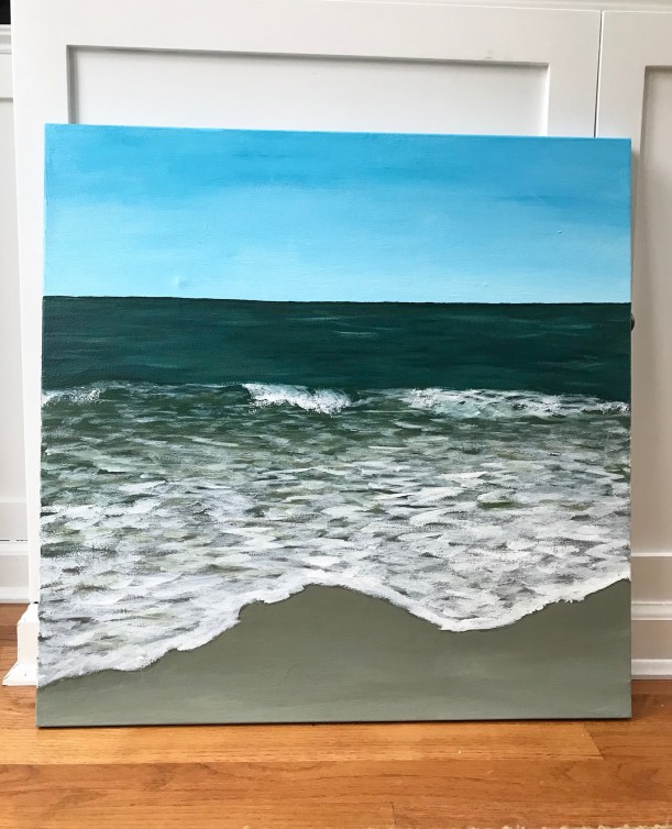
Painting Seascapes
Before beginning to work in acrylics, I practiced painting seascapes in watercolor. Although acrylics are different, I found practicing in watercolor to be very useful. I developed a process that, when I switched to acrylics, I could follow. And painting with watercolor on paper is less expensive than using up canvases.

Process for Painting Seascapes
Here is a summary of my painting process. Keep reading for links to more in depth resources.
- Mix seascape colors – I mix blues, greens, and browns from ultramarine blue, cadmium yellow, and cadmium red.
- Mark the horizon line. I use painter’s tape to achieve a straight horizon line.
- Paint the ocean water closest to the horizon darker and bluer.
- Paint the water in the cresting wave lighter and greener.
- Paint the shallow water near shore brown.
- Paint the sand. The sand is darkest closer to the ocean where it is wetter.
- Paint the crashing waves with white.
- Paint the foam with white and a flat brush. Horizontal lines help this area appear flat.
- Add shadows to the breaking wave.
- Paint the sky as a blue fade that is lighter closest to horizon.

Tips for Painting Acrylic Seascapes
- Study a reference photo to identify the details that will make your seascape more realistic looking.
- Clouds in the sky – I used an acrylic gel medium to thin out the paint and overlay colors for a more transparent look.
- Paint lighter areas on the ocean for the sunlight
- A dry brush can help create the spray off a crashing wave
- Use an art sponge to make the shadows in the crashing wave look more natural.
- Add a dark line beneath the edge of the foam to make the foam appear thicker.

Practice painting seascapes in watercolor with these tutorials:
I share my step by step process for painting watercolor seascapes in the following tutorials. Choose the format that works best for you:
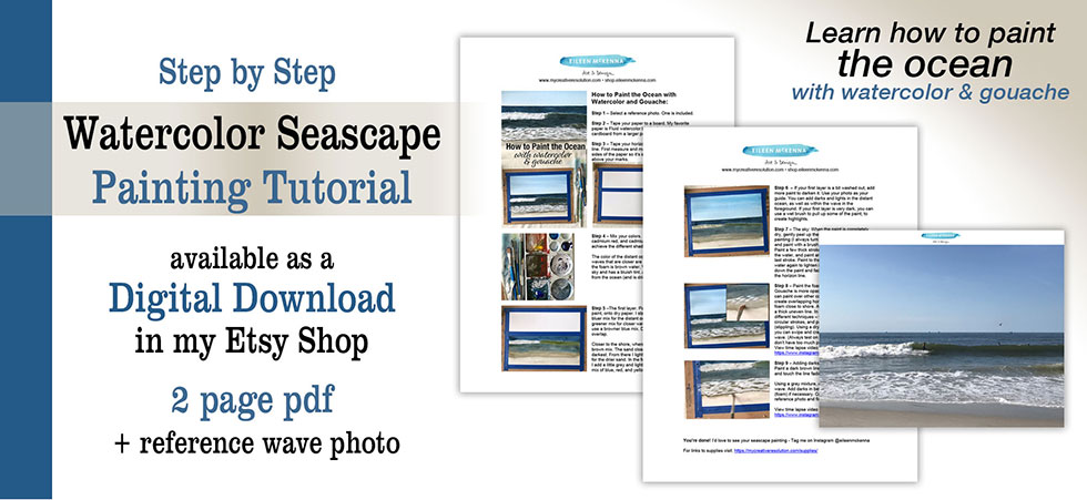
- Printable tutorial – step by step with photos of each stage of the process
- Video lesson – 34 minute video lesson
- Live Zoom lessons – coming soon! Check here for updates.


For a weekly dose of creative inspiration ~ Sign up for my weekly newsletter here.
This post contains affiliate links to products/brands I use and recommend. I earn a small commission whenever you buy using these links, at no additional cost to you. Thank you for supporting my blog!


