

Prints available at shop.eileenmckenna.com.
When I first started painting my seascapes, the skies were simple blue gradations, with the lightest blue closest to the horizon. With each seascape painting I started playing a bit more with the sky – trying to achieve the perfect sky blue, adding other colors as a glow on the horizon, adding a bit of texture for clouds.
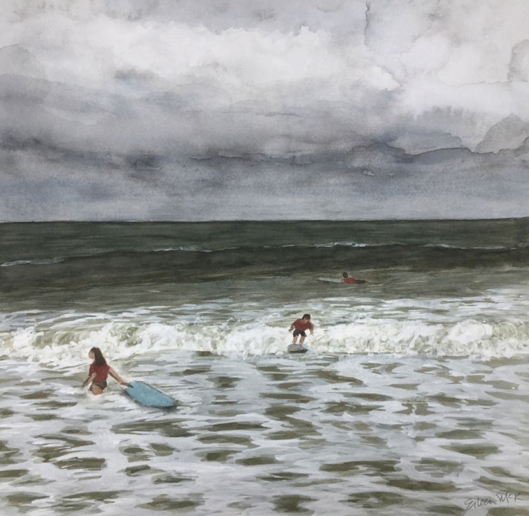
Then I did two painting with gray cloudy skies, which were a lot of fun.

Now more often than not, I’m adding colors and texture to my skies, like in these recent paintings.


I’m still striving to find the perfect mix of blue for “sky blue,” especially to capture those bright blue sky, summer days.
I even searched online for “best watercolor blue for the sky” and found a great post on Scratchmade Journal by Tonya, who experimented and discovered,
“almost any combination of blues can be used to create a realistic sky in watercolor, but no single blue worked well alone.”
See all my seascape paintings and compare the skies at shop.eileenmckenna.com. Prints of my seascapes are available on watercolor paper or canvas, in many sizes including the new “mini” canvas 11″ x 14.”
Want a dose of creative inspiration? Sign up for my newsletter “My Creative Collection” by clicking here. Learn more here.


The water and sky look so real! Love the top one!
Thanks so much! 😀
Love these! The simple blue sky in the first is gentle and serene, but as you add detail & try different color combos, the skies come alive. And the gray stormy skies have a lot of personality.
Thank you so much! It is fun adding more detail to the sky. I love how you describe it as coming alive and having personality!
You’re welcome! 🙂
WOW! amazingly beautiful paintings! ~amy @ 2me4art.com
Thank you so much Amy!
You’re so talented. Beautiful.😀
Thank you so much Kimmy 😊