“LOOK! UP IN THE SKY!”

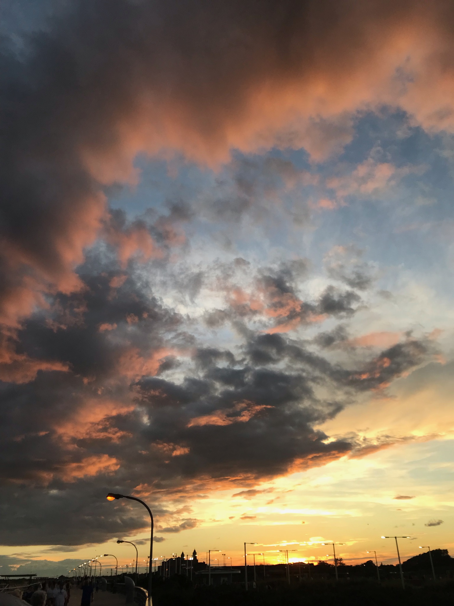
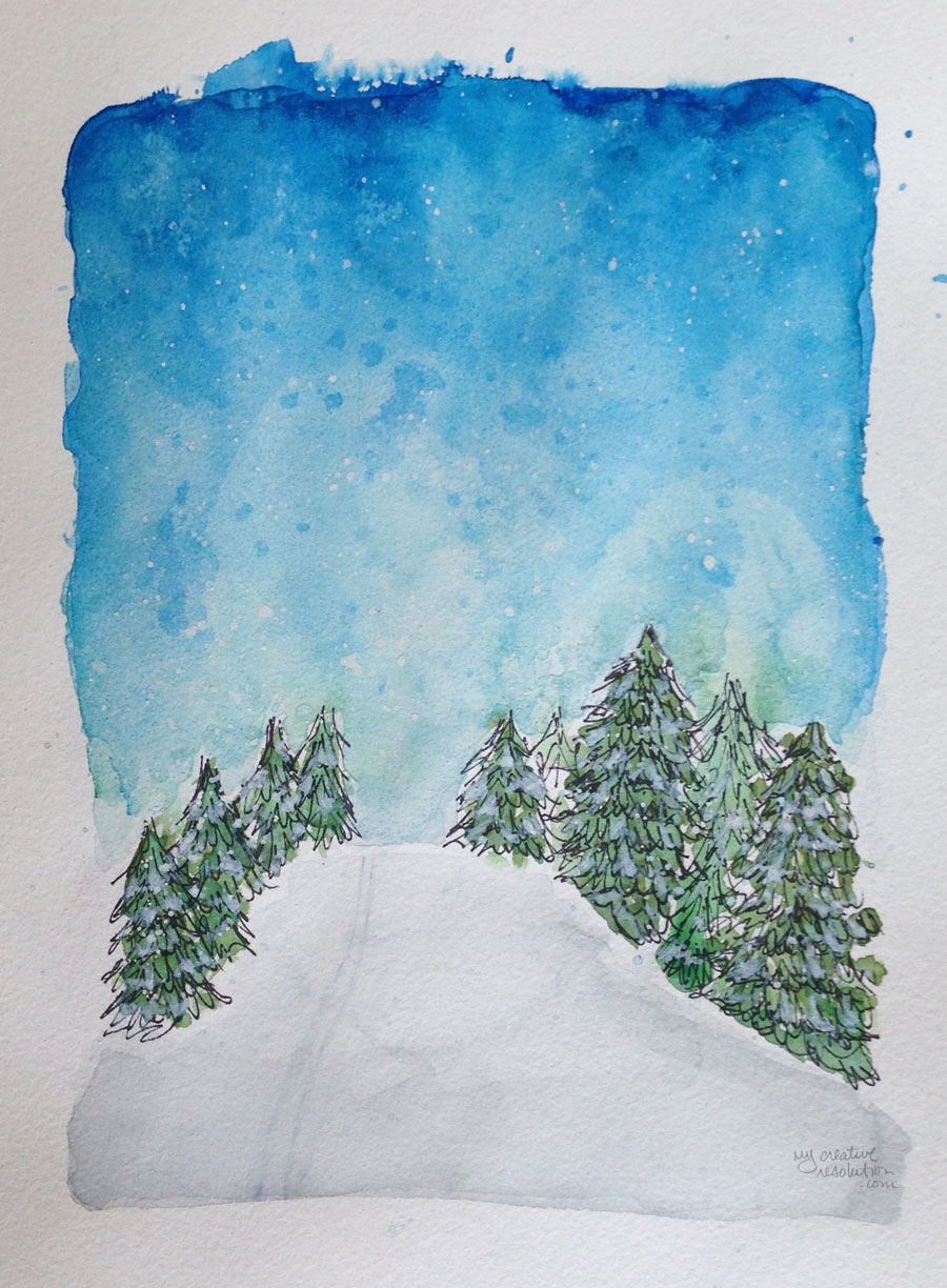
I love the ocean, but I’m also fascinated with the sky. The colors at sunrise and sunset are unbelievable. Every morning when I enter the high school parking lot I’m greeted by a wide open view of the sun rising over the trees. It’s a great way to start the day.

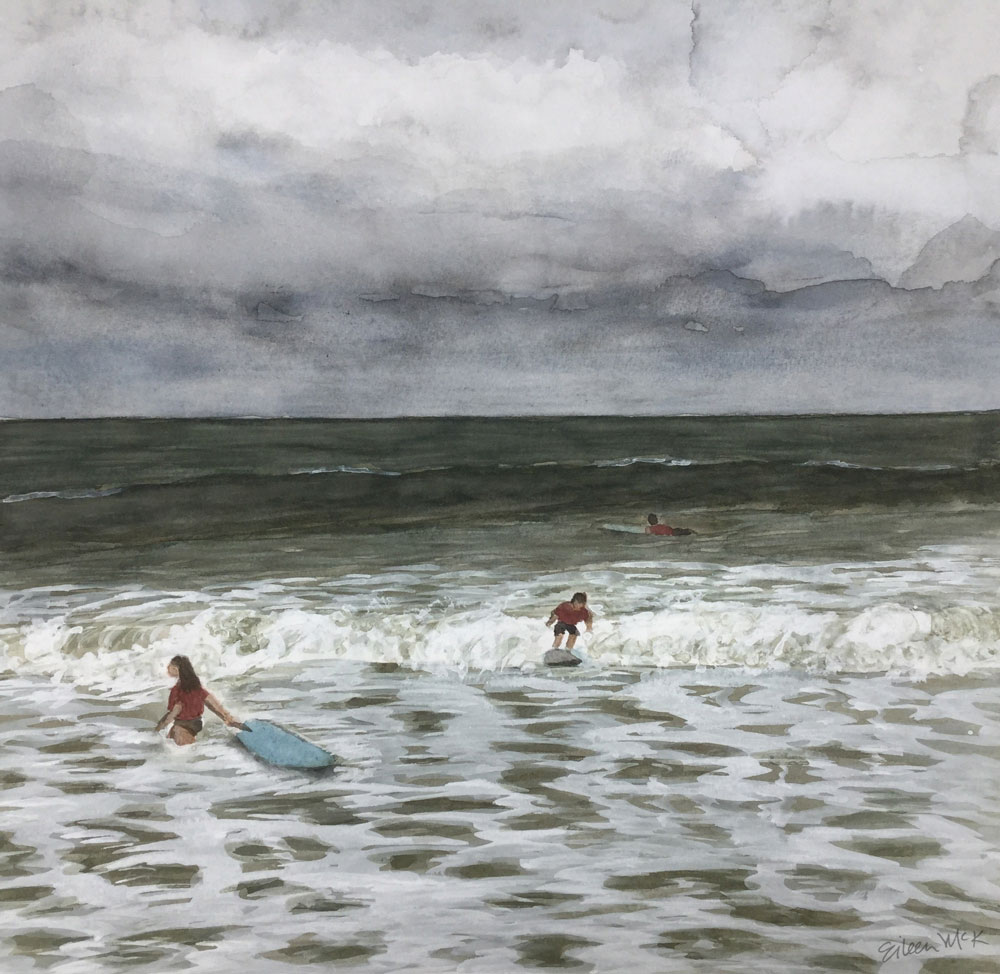
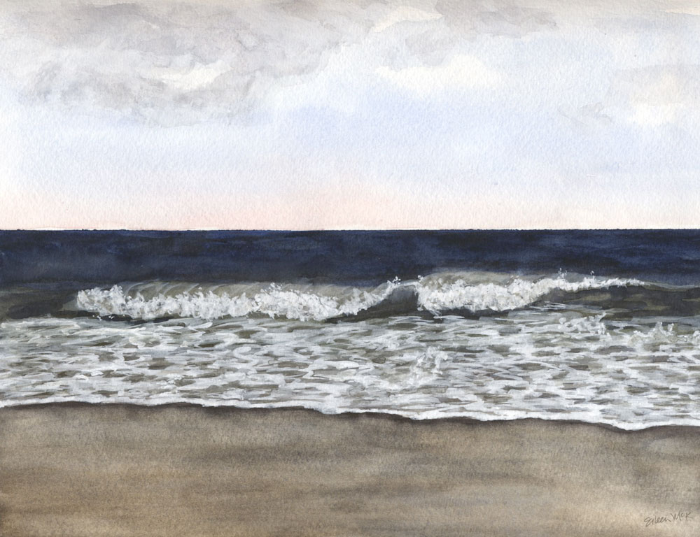
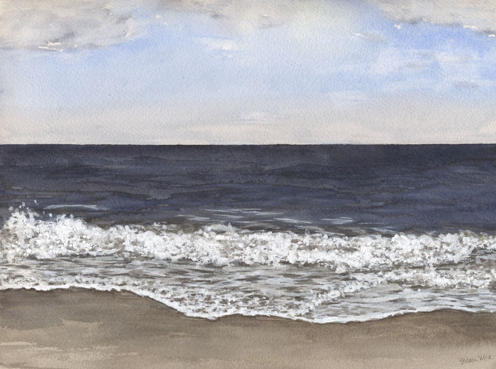
When I look up at the sky, or down from an airplane window, I’m amazed at how the clouds remind me of the ocean. Sometimes there is so much movement and power, other times it’s calm. 

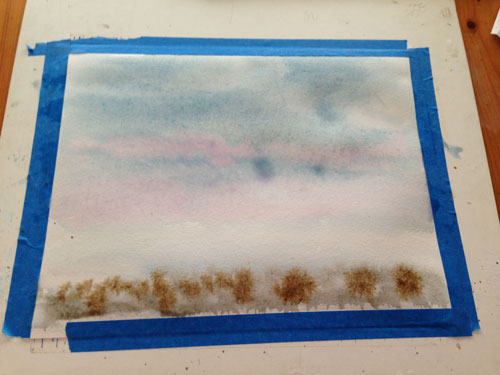
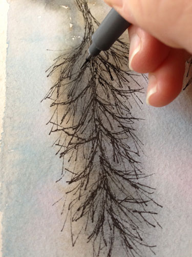
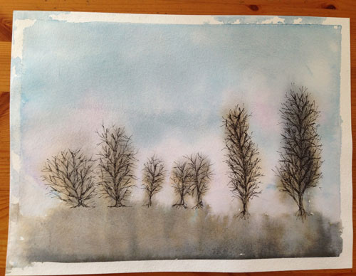
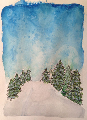
If you are struggle with the question of what to paint – just look up!

for more creativity ~

Processing…
Success! You're on the list.
https://mycreativeresolution.com/2020/09/18/14-creative-fall-project-ideas/

Capturing the Bluest Blue Sky

Painting the sky in watercolor

I’m happy with the results of the sky above, which is ironic because I thought this painting was a lost cause. This is what it looked like:
Blue skies in watercolor

In an effort to capture the saturated blue of the sky (with a hint of purple), I had previously used several colors (including cadmium red and ultramarine) and the above was the result. It was too purple, and too dark. It looked like a cloudy day.

I didn’t give up. I removed a lot of the paint  by wetting it and soaking it up with the brush, and also blotting with a paper towel. Then I added cerulean blue on top. It was this layering of the colors that helped achieve the blue I was looking for. I don’t think the cerulean alone would have worked as well.

I also painted clouds and highlights with white gouache. I’ve been using white gouache for the foam of the ocean for a while but only recently have I been using it in my skies. I’m loving the results. Just shows that you gotta push through the ugly stage! 

Watercolor Seascape Tutorial Download

Want a dose of creative inspiration? Sign up for my newsletter “My Creative Collection” by clicking here. Learn more here.

View my collection of watercolor seascapes at shop.eileenmckenna.com. Prints are available on watercolor paper or canvas, in many sizes.

This post contains affiliate links to products/brands I use and recommend. I earn a small commission whenever you buy using these links, at no additional cost to you. Thank you for supporting my blog!


Watercolor Skies

Blue Wave #11 by Eileen McKenna https://shop.eileenmckenna.com/
Blue Wave #11

Prints available at shop.eileenmckenna.com.

When I first started painting my seascapes, the skies were simple blue gradations, with the lightest blue closest to the horizon. With each seascape painting I started playing a bit more with the sky – trying to achieve the perfect sky blue, adding other colors as a glow on the horizon, adding a bit of texture for clouds.

Then I did two painting with gray cloudy skies, which were a lot of fun.

Surf Camp 1 by Eileen McKenna https://shop.eileenmckenna.com/
Surf Camp 1

Surf Camp 2 by Eileen McKenna https://shop.eileenmckenna.com/
Surf Camp 2

Now more often than not, I’m adding colors and texture to my skies, like in these recent paintings.

Watercolor Seascape "November 1" by Eileen McKenna
November 1 by Eileen McKenna

Watercolor Seascape "November 2" by Eileen McKenna
November 2 by Eileen McKenna

I’m still striving to find the perfect mix of blue for “sky blue,” especially to capture those bright blue sky, summer days.

I even searched online for “best watercolor blue for the sky” and found a great post on Scratchmade Journal by Tonya, who experimented and discovered,
“almost any combination of blues can be used to create a realistic sky in watercolor, but no single blue worked well alone.”

See all my seascape paintings and compare the skies at shop.eileenmckenna.com. Prints of my seascapes are available on watercolor paper or canvas, in many sizes including the new “mini” canvas 11″ x 14.”


Want a dose of creative inspiration? Sign up for my newsletter “My Creative Collection” by clicking here. Learn more here.

The Winter Sky and Bare Trees

baretrees
I’m somewhat obsessed with the Winter sky – the different colors at sunrise, sunset, the clouds throughout the day. All of this shown through the bare branches of the trees. I love how the bare brown trees have a bluish tint to them.

A sunset from my window:
sunsetsky
Another pretty sky.
wintersky2

The start of the painting – watercolor.
thestart
Letting it drip.
starttwomorepink

Adding the ink to the trees. I was hesitant to even do it, but the painting didn’t look complete without it and I wanted to follow through on my vision.
inkingtrees baretrees2

Winter

skitrail
I’m really happy with how the sky turned out – although the salt wasn’t working as well as last time. I had to try it several times – I think the painting wasn’t wet enough. Some of the salt is stuck on there for good. It adds a bit of sparkle! Maybe I let it dry too long?

My Steps:
The underpainting.
skitrail1
Adding ink.
skitrail3

One of the attempts with the salt.
skitrail4