So excited! (Calligraphy Workshop)

calligraphyworkshop
Today I started an online Calligraphy workshop. I really like it. One of the supplies for the workshop is a Tombow brush pen. I have smaller Tombows, but this pen is awesome! This is exactly what I was looking for – hand lettering with a brush (not a nib and ink). The pen makes it almost easy.

The workshop is about an 90 minutes. I made it halfway through. I still have to do the lowercase letters. I’m so impatient, I want to jump right to the fun stuff! I know taking the time to learn each letter and practice will pay off. Can’t wait to show you!

Happy March! Time to pull out your green!

shamrock1
I’m planning another Instagram art series and I’d like you to join in the fun! The theme is St. Patrick’s Day. Include #mcrstpatricksday in your Instagram post. Join me for a day or all 17 days (March 1 – 17th).  It will be fun!

I had a great time last month posting Valentine’s Day art for 14 days. Working within the same theme was really interesting. You really explore the theme as the days go by, and you come up with different ideas. I used several different mediums: watercolor, watercolor and ink, scanned doodles from my sketchbook and painted them in Photoshop, created a pattern, and a linocut.

Hope to see you on Instagram! Look for me: mycreativeresolution 🙂

Painting Digitally

citybike

I’m still playing around with painting digitally! The original idea for this illustration was a quick sketch in a lined notebook. I intended on redrawing it more carefully, but I liked the messy one better!

Original sketch:
citybikescrap

I scanned it and opened it in Photoshop. I’ve been using Photoshop for years as a Graphic Designer, but I’m learning and practicing great stuff with brushes that I never used before. This previous post links to an awesome video tutorial. It opened my eyes to another side of Photoshop. Before watching it, I didn’t know it could be so quick and easy to add texture.

In Photoshop, I first went to Image > Adjustments> Levels and made adjustments so the paper didn’t show and some of the blue lines disappeared. Then, following what I learned in the tutorial, I made my sketch one layer and put the “multiply” effect on it. (When you select multiply all the white stuff disappears, only the black remains and the layer underneath shows through.) Then I did all the coloring in a layer underneath it.

My color layer:
citybikejustcolors

The sketch is visible on top of the color layer because “multiply” is selected:
citybikecolor

To give it character, I applied a mask to the color layer, and filled it with black. (The entire layer disappears.) I selected the Soft Oil Pastel paintbrush and painted white onto the black mask. (The white parts of a mask is what shows through.) This gives the effect you see at the top of the post.

It’s fun! Give it a try and let me know your results. 🙂

Color!

burpeecatalog
It may be shades of white and brown in my garden but inside there is color! The Burpee (seed, plant, and flower) catalog arrived. I couldn’t be happier using every color in my palette to play in my sketchbook. There is something very freeing, for me, when I work in my sketchbook. The pressure is off! And my new sketchbook is a heavier weight paper, so it’s better for painting with watercolor.

I’m especially proud of my Zinnia. 🙂

IMG_5648

Creating fades (Gradations) with Watercolor

sunsetfinal
I’m looking forward to the warm days of Spring and Summer. The weather this weekend was a combination of extreme cold (4 degrees), followed by snow and rain. I’ve had enough! I tried to stay busy, which included painting. 🙂 First I painted some blobs, with the intention of adding ink and turning them into feathers.

3feathers1 3feathers2 3feathers3 3feathersf

Then I painted the sunset above. I was inspired by a watercolor heart I created a few weeks ago, where I blurred the edges of the heart so there was a soft edge. To blur the edges I let the paint mostly dry. With a wet brush, I pulled up some of the color at the edge of the shape. Then I soften the edge into the white area to create a fade.
featheredheart

I wanted the sun to have the same soft effect as the heart and I wanted to keep the sunset simple. I painted the sky part first and let it dry before painting the bottom. I didn’t want the bottom bleeding into the sky! In addition to softening the edge of the sun, I added water (to the water) to soften the blooms.* (This word was on the tip of my tongue, but I couldn’t remember what they are called. Thank you to this link for the definition below.)

*Blooms or blossoms – are cauliflower looking marks created when extra moisture creeps back into a damp or partially dry area of a painted. As the excess water levels out it will “push” the tiny pigments of paint to the outside edge of the watermark. A back run can totally ruin a smooth flat area of a painting, unless you add the excess water intentionally. (also known as back runs, back wash, and water blossoms)

sunset1 sunset2

I’m not sure what my next project will be, but that’s part of the fun, right?

Watercolor (Throwback Thursday)

beachpaint
After taking drawing classes, and falling in love with colored pencil, I decided to try watercolor. My teacher was the same woman, Eva, who I loved and who was very encouraging and supportive. You need that when you are starting out (or maybe always) – someone to recognize that you have something, a little bit of talent, that merits nurturing.

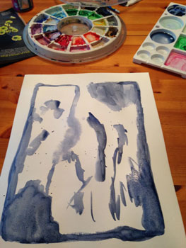
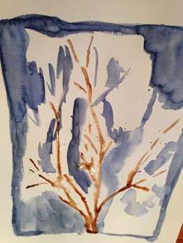
Imagine my surprise when I created my first watercolor piece and she didn’t like it. “No, no, no, you are drawing! You need to paint with watercolor.” Here it is:
girlatlake

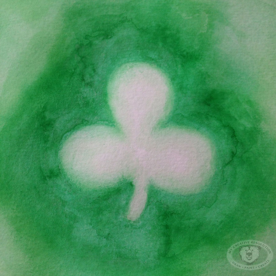
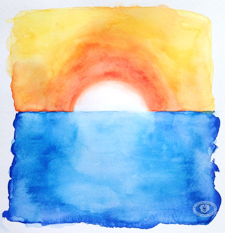
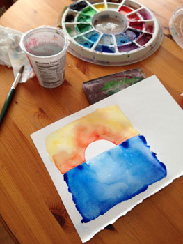
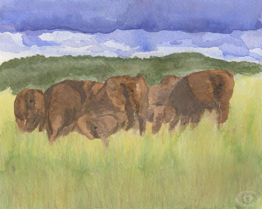
I didn’t really understand what she was saying – that there is an unexpectedness and beauty when you let watercolors “do their thing,” when you add paint to a wet surface and let something magical happen! Shortly after, I created this painting below, of the elephants. I was especially proud of how the clouds came out. I let it “happen” by picking up the paper and letting the paint roll around.
elephants

It took me awhile to let go and loosen up. During the drawing class, I was trying to be perfect, to draw perfectly. Now, years later, I’m loosening up more and more and I’m finding that “not perfect” has a style to it. A style I’ve been aiming for, for years. Now, I enjoy letting the watercolor do something unplanned and then creating a piece around that.

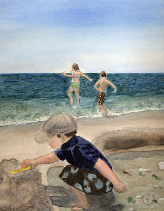
As the years went by I started using watercolor pencils in some areas, to add detail. The first painting in this post, of my kids at the beach, is my favorite watercolor to date.

Click here to see my favorite watercolors.

What to paint?

cherryblossom
I wanted to paint, wanted to get “into” a project, but I had no ideas or inspiration. I couldn’t go outside and take pictures of the garden. It’s covered in snow. Not a pretty snow, a solid, icy, block of snow. As I was trying to come up with an idea, I grab two magazines and remembered the post I wrote about coming up with ideas. Looking through magazines was on my list.

Both magazines had pictures of cherry blossoms in it. This was ironic, because just that morning I booked a Spring trip to Washington, DC, which is famous for it’s cherry blossoms. I was really inspired by a picture in Martha Stewart Living with the cherry blossoms on a dark slate background. I love the look of a dark background. One of my goals for 2015 is to paint on dark paper.

My steps:
cherryblossom1  cherryblossom3 cherryblossom2

cherryblossom4

It felt good to get into my project. My goal was to stay loose and not paint each flower – which is why I started the flowers and buds by splashing the pink on my paper. I wanted the background to be dark. To achieve this, I had to apply a couple of layers to the background. I think buying gouache paint is in my future!

For me this painting is not so much about the final product, but about getting started, and getting ideas flowing again.

I can’t wait for Spring and for the Cherry Blossoms!

Valentine’s Day Mantle

valentinesdaymantle
I’ve been having fun the last couple of weeks creating art with Valentine’s Day in mind. I challenged myself to post my creations on Instagram for 14 days in a row. If you’ve been following, let me know which one you liked the best.

It’s been great, working within the same theme – coming up with different ideas and using different mediums. I’ve used watercolor, watercolor and ink, scanned doodles from my sketchbook and painted them in Photoshop, created a pattern, and a linocut. One more to go! Hmmmm.

My daughter’s art teacher gives them one word and they can execute it anyway they’d like. I love seeing her creations. It must be fun to be in the class and see how other people interpret the word. Their words have included – bounce, sticky, and bump. For “bump” my daughter drew a pregnant woman (focus on the bump) with a crib in the background. I thought it was very creative. Maybe I can sneak into the class!

I’m planning on another themed Instagram challenge – March 1 – 17th. The theme is St. Patrick’s Day (of course). Join me in the fun by including #mcrstpatricksday in your Instagram post. Join me for a day or all 17. It will be fun!

Have a happy Valentine’s Day!