Striking while the iron is hot.

cupid-1
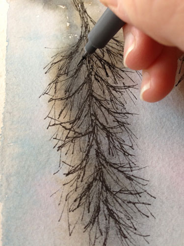
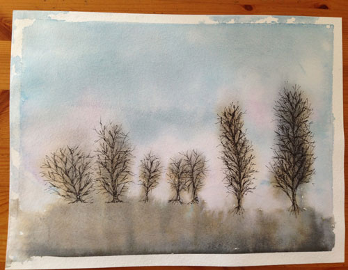
It is an amazing feeling when you are “into” a project and the creative ideas are flowing and you’re excited and inspired and motivated. I’m always better off “striking while the iron is hot” and working on a project when the inspiration first hits me. If I wait, sometimes the spark is gone. The enthusiasm dies down and it’s hard to motivate myself to work on the project.

When I’m in the “creative mode” I can move from one project to another and get things done, while new ideas are popping up, and it’s great! I’m on fire! Other times, I spend days thinking, “I should sit down and paint something.” For some reason, it is hard to sit down and do it, and gets harder as the days go by. Once I do sit down, and start, it all seems to come flowing back.

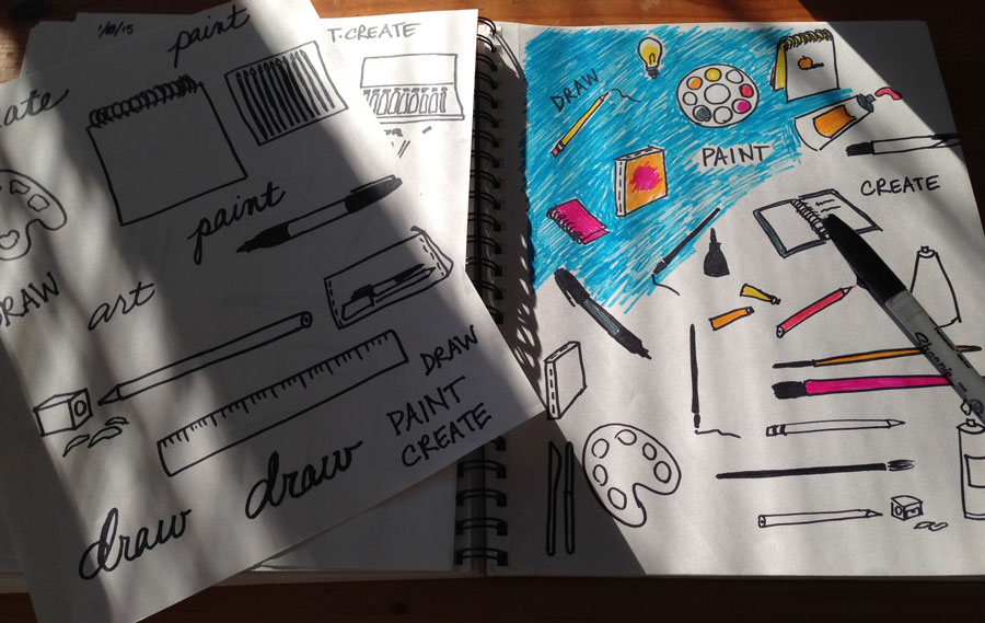
I also feel this way about blogging. I’ll be on a roll with ideas and posting, and then a couple of days go by and I start to question myself – “What should I post? I can’t post that!” I get kind of shy and start thinking, “Maybe I shouldn’t share that mistake.” Sometimes I have to remind myself that I’ve made a commitment (to myself) to be honest about my successes and failures. The best medicine, again, is to sit down and share and get the ball rolling again.

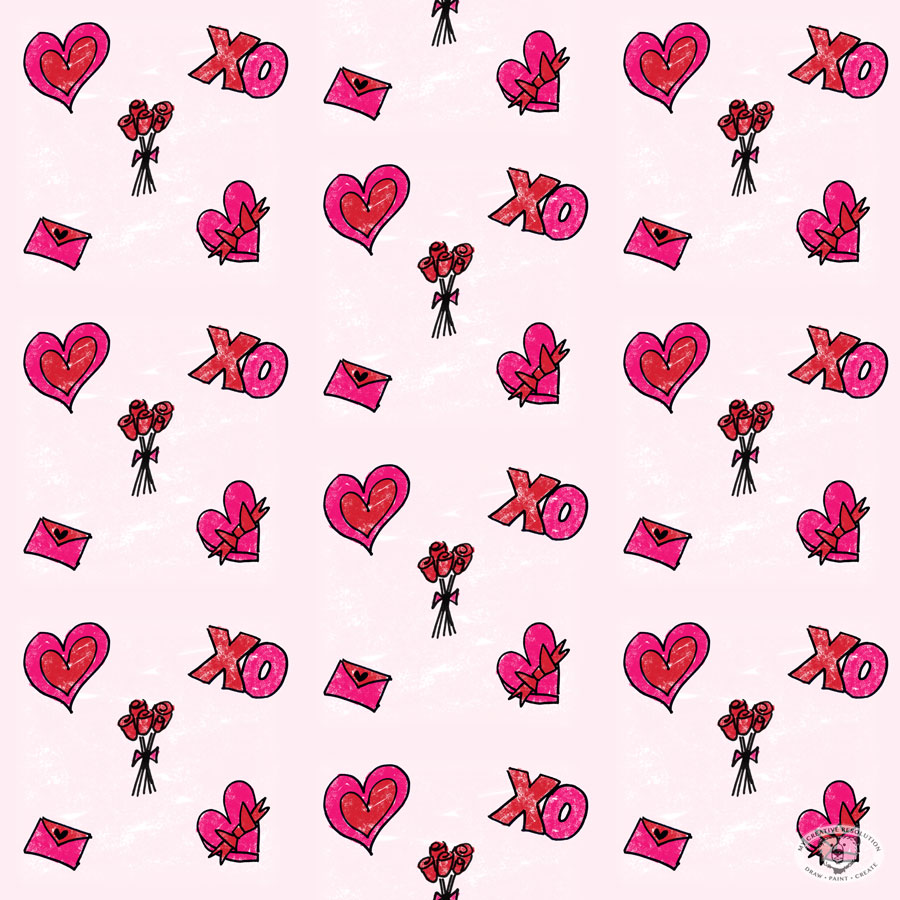
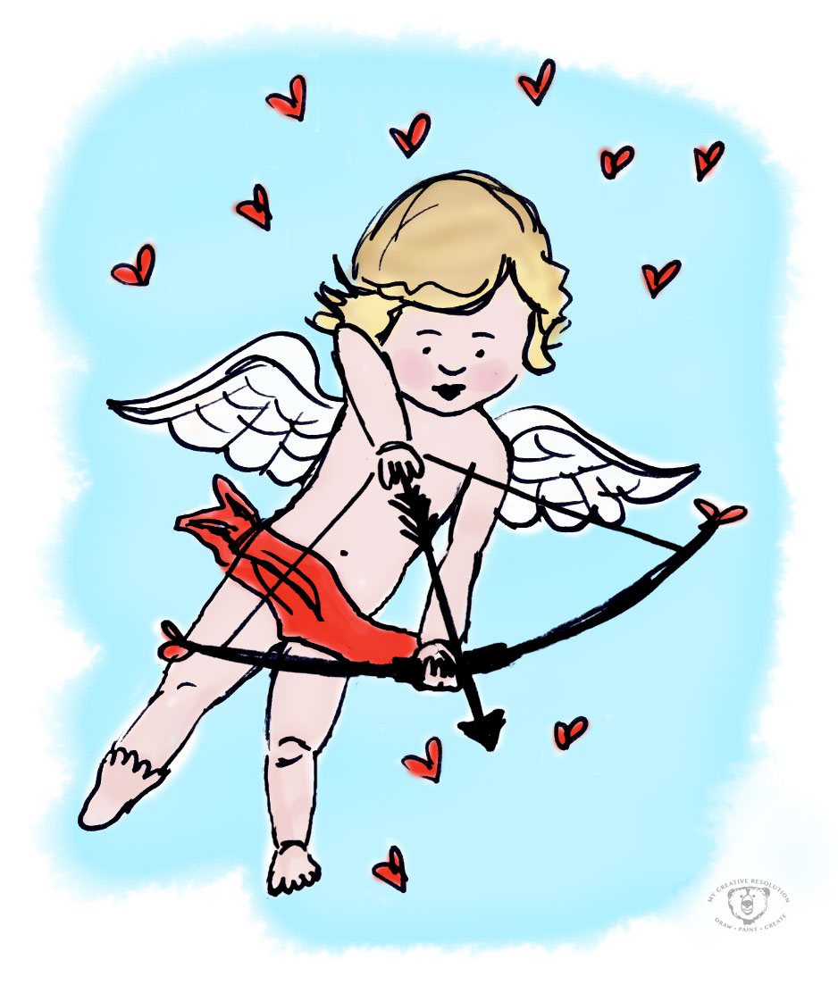
Cupid was a Sharpie doodle in my sketchbook that I scanned and painted in Photoshop. Follow me on Instagram to see my other Valentine’s Day inspired posts!

“Valentine’s Day Love” Pattern

valentine'sdaypattern
I’m in the heart/love frame of mind this week, as I am posting a new Valentine’s Day inspired photo to Instagram, every day from February 1st – the 14th! (@mycreativeresolution) So, it’s no surprise that my digital pattern of the month is also Valentine’s Day inspired.

I’m getting into creating art in Photoshop, especially with doodles that originate in my sketchbook. The process is a lot quicker than I thought it would be. And the amount of different textured brushes is awesome. Where have I been?!

I’m excited to continue trying new brushes – last month I used a watercolor brush for my January pattern. This month I used the Soft Oil Pastel brush. I wanted the background to have texture – but that can be an issue when you repeat the pattern because irregularities won’t line up. I used a fade so that it wouldn’t be an issue, but I’d like to learn more about the technicalities of creating repeating patterns.

It’s ironic that two of the things I’ve been working on so far this year, are so different! Linocut seems like an old craft, and digital illustration is on the other end of the spectrum! Time will tell how things shake out and in what form I continue to work.

It’s been so fun, I may have to do another pattern before February is over!

Here is the pattern without the repeat:
valpatternnorepeat

Colored Pencils (Throwback Thursday)

shaun15
About 8 years ago, when my third child was still a baby, I finally signed up for a drawing class. For years, I had looked longingly at the course catalog, but the class times were never convenient. Finally, I realized I needed to make it happen, and I’m so glad I did!

In that class, I quickly moved from pencil to colored pencils. You’ve probably seen my bear – my first proud moment! For a long time I continued to work in color pencils and I created pieces that, til this day, I am proud of.

Eventually, the limitations of working only in colored pencil started to frustrate me. Pencil was perfect for the hair of an animal, but it was really hard to create smooth surfaces, like skin. Blending colors wasn’t easy. I wanted to draw the beach – sand, sky, surf – but landscapes in colored pencil were a challenge. Without know it, I was longing for watercolor. (to be continued…)

Linocut – The Mirror Test

heartpattern

I made the critical error of not reversing the type on my last linocut. At the same time as I penciled “Love” incorrectly, I also penciled “I love you” on another block. As I sat down to correct this second block, I realized that holding the block up to a mirror would be a good way to check that the print will read correctly.

Holding the corrected block up to the mirror:
mirrortest

After passing the mirror test, I carved this little block. Here is the print:
iloveu

I need to take more care when I draw the letters. I thought I could easily carve them, and make them look more square, but they came out raggedy. So, I decided to cut the top piece off and create a pattern using just the heart. (First image in the post.) Even though the heart was also raggedy, I like how the pattern came out. The roughness gives it character.

I was off to a great start with linocut. I was so happy with the results of my owl and the acorn. But the last two have been much less successful. I think I need to plan and sketch more carefully and (like anything worth doing) I need to practice with the tools. Also, as a beginner, working on small blocks isn’t helping me. I need to work larger.

I don’t LOVE mistakes

lovemistake
Ironically the first thing I wrote in my last linocut post was “Mirror image. The design prints the reverse of what it is on the block. I keep forgetting this!” and I still forgot! And this time it was text – so you can’t ignore the mistake. Sometimes when I make a mistake this bad I learn my lesson. Let’s hope!

On a happier note…I’ve decided to challenge myself to post, on Instagram, my Valentine’s Day artwork and photos, every day from February 1st through the 14th. So please join me on Instagram (mycreativeresolution) to see what I’m working on! Let me know you found me originally on WordPress. I promise not to include anything you need to hold up to the mirror! 🙂

“Draw, Paint, Create” Pattern

artpatternrepeat
Wouldn’t this be great on pajamas?! This pattern (my January pattern) is in honor of my creative resolution. I scanned some of my doodles, created the pattern in Photoshop, and painted it with one of the digital watercolor brushes. Creating this pattern hits upon several of my goals for 2015, which include doodling, creating patterns, and digital brushes. Three birds with one stone! My revised goal is to create a pattern a month.

I still have mixed feelings about using the computer to create my patterns. As a Graphic Designer, it feels less like fun creative time and a little more like work. But there are certain things, styles, etc. that I want to try, and the computer is the way to achieve these things. I do love that the pattern is hand drawn illustrations and I’m having fun learning things in Photoshop I’ve never used, like the watercolor brushes.

Click here to see the prior post on this subject and my sketchbook. Stay tuned for Febraury’s pattern – I’m very excited about it!

Here is the pattern without the repeat.
artpatternfinal

The Winter Sky and Bare Trees

baretrees
I’m somewhat obsessed with the Winter sky – the different colors at sunrise, sunset, the clouds throughout the day. All of this shown through the bare branches of the trees. I love how the bare brown trees have a bluish tint to them.

A sunset from my window:
sunsetsky
Another pretty sky.
wintersky2

The start of the painting – watercolor.
thestart
Letting it drip.
starttwomorepink

Adding the ink to the trees. I was hesitant to even do it, but the painting didn’t look complete without it and I wanted to follow through on my vision.
inkingtrees baretrees2

Learning Lino – A Different Way of Thinking

finalacorns
As I worked on my second linocut, I realized that with block printing it’s a totally different way of thinking, than painting or drawing. It’s also exciting (and hard) that you don’t really know what you are going to get, until you do that first print.

Here’s what I was thinking about as I carved my second linocut:

  • Mirror image. The design prints the reverse of what it is on the block. I keep forgetting this!
  • Positive and negative. Parts of the design are either printed or not. There is no in between. I sometimes forget which is which, and what I’m supposed to carve! I had to write myself a note (“Carve the blue”). The tricky part is when objects in your design meet. You have to work out what prints and what doesn’t, so the design makes sense.
  • Plan. It’s better to plan exactly what gets carved away and what prints before carving.
  • Blade sizes. Wispy little lines don’t exactly translate to carving blades. You almost have to plan the design in terms of what is “carvable.”
  • How deep to carve? I’m still figuring this out. In my first linocut, I didn’t go deep enough, but there was a nice surprising texture throughout.
  • Paint colors. I tried using a blend, but when I rolled the brayer a couple of times it mixed it into a muddy army brown. Printing more than one color is more interesting, but I think you have to print each color separately.
  • Colored paper. An easy way to introduce another color. It’s fun seeing a print on different papers.
  • Press paper on lino or lino on paper? That is the question. I saw a couple of videos that put the paper on top of the lino block and burnished. Then I got a recommendation to press the lino onto the paper.* Like stamping. This time I tried both, and I found that peeling the paper off the lino is easier than picking up the lino block without smudging. Maybe it depends on the size of the lino block?
  • Workspace. As I learn the block printing process, I’m learning how to organize my workspace – what is working and what isn’t. Spreading the paint on a piece of taped down palette paper is working great – and it’s easy to clean up!

acorn1 acorn2 acorn3

*I appreciate any advice on block printing. Your expertise and experience is welcome! Thank you to bluechickenninja for recommending pressing the lino down onto the paper, in my last post: My First Linocut!

Watercolor Brushes in Photoshop

artpattern
I’ve been doodling in different themes lately, in the hopes of making patterns out of these doodles. I decided to add to my resolution, to create one pattern this year, and instead I’ve committed to creating one pattern each month!

I knew it was inevitable that I’d be bringing these ink sketches into Photoshop to color them. I have been using Photoshop for twenty years, but I’ve been using it as a Graphic Designer, not as an Illustrator. I decided I needed to learn more about Photoshop from an Illustrator’s perspective.

I found a great tutorial by lynda.com on youtube, which shows how to create watercolors in Photoshop, using one of the Watercolor Brushes. I didn’t even know there were Watercolor Brushes!

I practiced with the Photoshop Watercolor Brushes, to create a design for an invitation I’m working on. I scanned my Illustration and painted it in Photoshop. Using the technique from the lynda.com video is so much faster than I would have thought! And I love the look – it’s less “digital” than what I previously would have created in Photoshop.
flowerframe

I’m really excited to apply this technique to my pattern for January, which, in honor of My Creative Resolution, is “draw, paint, create!”