I Recall Central Park in Fall

img_0586

Flipping through a magazine looking for something to draw, I came across a couple strolling with their dog. I drew them, added a tree, and had to pull out my watercolors and add some leaves.

That illustration reminded me of walking with my husband through Central Park in New York City. Having just watched “Ferris Bueller’s Day Off” the lyrics “I recall Central Park in Fall” were in my head while I searched for an image of a couple in Central Park. I found a Getty Images photo to use as reference. It’s the lamppost that makes it Central Park.

img_0588

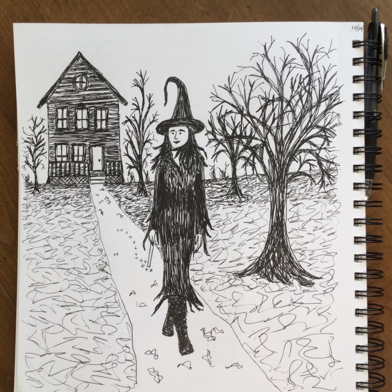
I’m always amazed how one idea or spark of inspiration can lead you down a path. Actually this was the topic of one of my early posts: The paths our art projects take us on:

“It’s funny, how a project can start us on a path. A path similar to the branches of a tree. The path may be fairly straight – projects similar to one another. Or the path may be twisty – each project taking a unique turn. The path can be long – each project sparking the idea for the next one. Or the path may be short – as we experiment with something that doesn’t work out or fails to inspire us any longer.
We follow a path until it ends. Until we have reached the end of that train of thought. At that point, we forge a new path, based on something different that inspires us. But each path we take, is related to the others, just like the branches of a tree.”

Which witch inspires you?

img_0496

When I was little I loved Hazel the witch on Bugs Bunny. Every time she flew off, she’d leave behind her bobby pins floating in the air.

Every October since starting my creative resolution, I’ve been inspired by Halloween – drawing haunted houses among other things. This year I seem to to be drawn to witches.

img_0489

Using a model from a catalog as reference, I drew this witch strolling down her path.

img_0490

Then I created the inside of a witch’s house (the first illustration in this post). That illustration had a mind of its own. On the following day, instead of creating a new illustration for InkTober, I added a new floor to the witch’s house. And I may not be done. Don’t you think it needs some rats scurrying around in the attic? 😂

You never really know how a drawing will turn out

img_0478

As you put your pen to the page to make that first mark, you never really know how things will turn out. At least I don’t know. Sure I have a vision in my head, but that doesn’t mean it will turn out that way.

Personally, I don’t really plan much, I get an idea and just dive in and see what happens. If I’m drawing in ink – which I’m doing a lot this month for InkTober – I rarely do a pencil sketch first. Unless the drawing involves a face or body, then I will do some planning in pencil to get things looking “right.”

I was really pressed for time with this “little guy in the leaves.” The inspiration photo was one of my youngest son probably 8 or 9 years ago. I used pencil first to plan things a little – because you can’t erase ink. I was pleasantly surprised with the results in such a short time.

This drawing experience was the opposite of yesterday’s! I was drawing in the car during my older son’s practice. I first focused in on a nearby car. Within a minute or two of drawing the car, it drove off! Without the car there I had a hard time finishing that part. I drew the car in front of me, but my pen started running out, probably because I was drawing upright on the steering wheel. I ended up focusing on drawing the chain link fence. Like I said, you never know what the result will be when you start drawing!

See all my InkTober blog posts:

Creating a scene

Scarecrow

Now I don’t mean going to a party and ending up with a lampshade on your head! What I mean by “creating a scene” is I’m aspiring to create illustrations that have depth to them. In the past my illustrations and paintings have focused on a single object.

I created the scarecrow on my iPad using Adobe Sketch for the first time. (I’ve been practicing with Adobe Draw). Although I didn’t end up using the more Photoshop-like brushes. I’m still trying to get the apps linked to my desktop. It would be awesome to draw on the iPad and then be able to open the drawing in Illustrator or Photoshop to refine. And I think I had a breakthrough. 😀

Playing around with Adobe Draw

image

Today at the pool I pulled out my iPad and a stylus pen and drew a tree, followed by people in the pool. I’ve used Adobe Draw twice before and it’s something I want to do more of.

image

Previously my digital illustration was done by pointing and clicking the mouse in Adobe Illustrator on the desktop. Although I’ve wanted to do more digital drawing, sitting at the computer feels like work, so I usually end up with pen and sketch pad instead.

Earlier in the summer, I notice a scribbly line in notes and started drawing with my finger. After that I read about an artist that uses Adobe Draw and thought, “I need that!” Then I saw a stylus at my mom’s house and ordered one for myself.

image

Adobe Draw is awesome because you can work in layers like Illustrator. I haven’t even gotten to the point of opening files from Adobe Draw in Illustrator (to refine them), but I’m under the impression that you can do that, and that they’ll be vector files.

Drawing on the iPad is so quick, compared to traditional materials. Although there are things I’d like to do that I’m still figuring out. I plan on playing around more with this. 😀

It’s National Typewriter Day!

typewriter

I remember typing cover letters on my sister’s blue typewriter. The ad for the job I ended up getting, was one of those tiny classified ads in the NY Times. It was less than 1/2″ high. But I was so excited to start working at an advertising agency!

A special shout out to my friend Charlie O’Shields who famously has doodlewashed many national days! And he got July to be officially named World Watercolor Month! More info on Facebook: Doodlewash and World Watercolor Month

Spaghetti & Meatballs

meatballs
On Friday, after posting my limes, Charlie at doodlewash.com reminded me that I was “invited” to dinner. Here is an excerpt of Charlie’s original invitation:

“I’m inviting all of you over for dinner, because seriously, how cool would that be? During the month, if at any time you’d like to come to the party, just “bring over” a lovely doodlewash of something delicious to eat or drink by using the hashtag – #DoodlewashDinner.”

But how could I bring limes to dinner?! I couldn’t, so instead I made a favorite in our house – spaghetti and meatballs. Grab a fork and enjoy. And a big thank you to our host Charlie!


Realizing a Vision

omrgaragesale-copy
Sounds awfully dramatic when put this way – “Realizing a Vision.” But, having the ability to translate what I imagine in my head, onto paper, is still a big deal for me. Often things don’t turn out exactly how I envisioned them – but not always for the worse. Once I start drawing and designing things often take on a mind of their own.

With this project, it came out exactly how I envisioned it. It really made me pause. A few years ago I would not have been able to do this. I wouldn’t have been able to create what was in my head. There were a variety of reasons for this – lack of confidence, not persisting enough, and not having practiced enough to achieve what was in my mind – I guess you can call that lack of skill.

It’s kind of funny that I’m making such a big deal about an illustration for a garage sale flyer. But, I think it’s important to recognize milestones.

A friend asked my to design a garage sale flyer for the school. I’m a graphic designer so it wasn’t surprising that she asked, nor was it a big deal for me to bang out a flyer. But, in my mind I immediately saw it as an illustration project. Since I’m currently sketching “everyday objects” every morning – I began to think of all the things one would sell at a garage sale.

I pulled out paper and began drawing. I focused on the individual elements – not on how they would be arranged. I drew the way I do in my sketchbook in the morning – objects going this way and that, repeating an element a few times to get a better version. Then I scanned every page and arranged the objects in Photoshop. I designed the flyer (not shown) in Illustrator.garagesketches

Kind of makes you want to pull out your junk and have a sale, right?


Drawing “cute” illustrations

happyvalentinesday
A while back, I worked hard to learn about illustrating in a “children’s book style.” I really studied up on it. (See below for the links to the posts I wrote on my progress.) This week I wanted to do a cutesy illustration of a boy with a box of chocolates and a little girl. I first bought a box of chocolates – we all need a little chocolate, right? Then I had my ten year old, pose with the chocolates under his arm and then as the opposite figure. I didn’t want the illustration to be realistic, but I figured having some reference photos would be helpful.

I went straight to my watercolor paper (taped down on a board), and drew with pencil. I didn’t like it at all. My son looked more like a man than a boy, and there was nothing cutesy about the illustration.

sketch1cd

I remembered how drawing something over and over, can really help me arrive at the results I want. So, the next day I pulled out my sketch book and did several versions of the little couple. I remembered the things I learned from observing children’s book illustrators:

  • exaggerate features – like big eyes or wacky teeth
  • color palette – stick to 3 colors
  • kids – small bodies, big heads
  • outline

Following this advice, I made the heads bigger and rounder, and the bodies smaller. The illustrations definitely looked cuter.
cutedoodles

I went back to my watercolor paper, erased the original illustration, and started over, following the style from my sketchbook.
sketch2cd

I thought a heart behind them would really emphasize the theme, so I painted a pink heart and a red background. Then I used my pen to create the ink outlines, using the pencil lines as a guide. I waited a bit, so I was sure the ink was dry, and erased all the pencil. I thought about the color palette I wanted. Instead of using blue from the tube, I added pink to it, to mute it, and make it work better with the pinks and reds.

I’m happy with the results, especially compared to my original illustration.

Have a wonderful Valentine’s Day. Lots of love from New York! And if you are also in the Northeast – stay warm!
Eileen

Other posts I’ve written about children’s book illustration style: