

As I watched a dance show, I paused the TV and sketched the dancers in interesting poses. It was great figure drawing practice!
Art

Practicing Painting Lettering
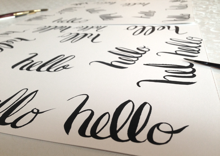
I’ve been practicing! The other day I copied an alphabet from a book (2x). Today I wrote “hello” many times! It’s interesting what you learn by doing, especially when you keep repeating something.
Here’s what I’ve learned:
- Too much coffee makes my hand and my letters shaky
- Light touch – thin line, more pressure – thicker line. I learned this from watching this video.
- Painting downward is easier than upward
- The brush needs to be wet enough. I re-dip before each letter.
- Paint in sure strokes. I wish I could remember where I got this tip from. It is so true. When I hesitate it shows.
I practiced the alphabet below from the book, “Hand Lettering for crafts” by Sandra Salamony. The book was helpful because it showed what part of the letter to paint first and what direction to paint each part in.

Share this:

Practicing Watercolor Portrait

Today I practiced painting a portrait. I think I am making some progress in adding in shadows without making the skin look blotchy. [Blur the edges!]
Beach girl is a character I have been trying to illustrate. She is inspired by my daughter (when she was younger). I’ve struggled with painting beach girl’s face. So, I selected a photo of my daughter to work from. I figure when I’ve mastered painting her face, I can then, work on a less detailed, more illustration style version. I am finally starting to capture some of the elements that resemble my daughter.
Here are some of my steps:

This one looks like an alien!


Share this:

Watercolor Shell

Any advice for me?… I struggled with getting the shell to pop and look 3D, as opposed to smooshed in the sand. I know some of my problems were because: I painted this from a real shell and the background was made up. I used colors in the sand that I should have used in the shell. Since I didn’t want the shell to blend in, I used brown paint and it became a dark muddy mess. I sat down to paint at several different points and the shadows were probably changing.
Why is it that “struggled” is one of the most common words I write?! lol. Oh well, you paint and you learn. 🙂 Not sure I want to attempt a redo on this one. Hoping to hear your comments!
Share this:

6 months of my creative resolution!
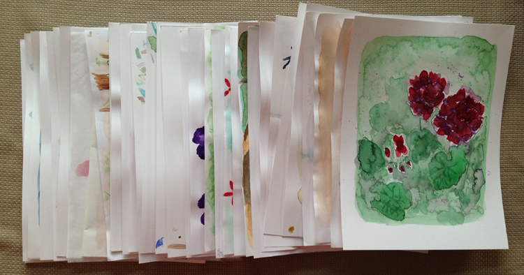
…and still going strong. In the past 6 months I have accomplished 52 watercolor paintings, 8 acrylics on canvas and 64 sketches! It is amazing to me what writing a goal down can do.
When I first typed the words, “I hope to draw, paint and create my way through 2014!” – I didn’t know what I would spend my time doing. Would I be decorating the house? drawing? painting? refinishing furniture? Imagine my surprise when the first months were filled with acrylic painting – one of the things I have the least experience in! I even pulled unfinished canvases – years old – off a shelf and finished them, like this carrot.

And one day I decided to add watercolor to my sketchbook and suddenly I was falling back in love with watercolor! I wanted to do more and more things. Each project led to ideas for 10 more! I felt joy and fulfillment.
I certainly had moments when I wavered. The unexpected connection and support from fellow bloggers pushed me on as well as the encouragement from my family who kept saying, “Don’t stop.” Six months in and I’m not stopping. I’m still not sure of my direction, but I’m “finding” myself as an artist and learning a lot along the way.
Thank you for joining me on my journey! 🙂
Share this:

Patience and Painting

By nature I am not a patient person. The other day as I was painting in my sketchpad, I got annoyed when the painting wasn’t going quickly and easily. This gave me reason to pause and think, “Am I too impatient to ever be a great artist?”
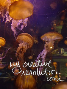
Later that same day, I was back at work on my acrylic jellyfish painting. I had finally gone out and bought some bright colors for the background. (As much as I tried, I was unable to mix a color that popped the way the photo did.) I was working a blend, of these bright colors, into my water background when I thought to myself, “This painting is really hard. It’s taking forever.”
This brought me back to my earlier thought, “Am I too impatient to ever be a great artist?” But, I continued working on the background, getting into a zone. I hit a point where I wished I could “undo” everything I had done that day. I thought I had ruined the painting. My daughter walked by and admired it (and the colors) and I looked at it again and thought, “Maybe I haven’t ruined it.”

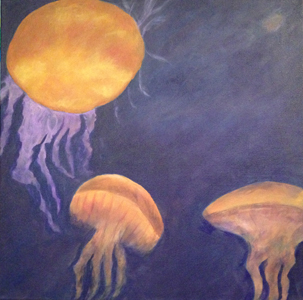
The jellyfish painting is getting there. I can’t say for sure how long it will take me to get there. I do know, it is on the top of my list for my next painting session. Impatient nature or not, I will continue to persevere.
Share this:

Defining paint color with help of the eyedropper tool (in Photoshop)

It has been three weeks since I last worked on my jellyfish painting. Isn’t it ironic that when I last worked on it, I wrote about it under the title, “Procrastination and Painting.” Seems like I’ve been procrastinating getting back to this painting! I know the reason why. I hit a stumbling block.
I was struggling with the color of the jellyfish. What I ended up with was a very orange color. No matter how many times I mixed it, I couldn’t get it to look like the photo. When I left off, I planned to use the eyedropper tool in Adobe Photoshop, to help pinpoint the colors in the photo. It certainly seemed like a good plan. Let’s see if it actually works!

When I opened the photo in Photoshop and starting clicking around on the jellyfish photo, I was surprised to see the colors that came up – maroon, brown, tan, gold. I already felt that it was helping me “see” colors in the jellyfish that I wasn’t seeing. Since I use thalo blue, cadmium yellow and cadmium red to mix my colors, I decided the RGB (red, green, blue) breakdown of the colors was the most useful. I tried to mix and measure following this breakdown.


My first try wasn’t great. I mixed a color which seem to match, but when I painted on top of my existing color, it didn’t look great. I guess the fact that I was painting on top of color, was an issue. The orange beneath my new color, was having an effect on the new color. I didn’t give up!

I kept mixing colors until I got something, that when I put it on top, it looked right. I feel like I’m starting to get there, but have my work cut out for me. I’m so inexperienced I pick hard things and don’t realized they are hard until I’m in the middle of it.
The thing that I love about this photo is that it glows. The colors in my painting are dull and I’m not sure I can fix it – if I’m mixing the colors. Tomorrow I have off and I plan on attacking this painting to see what I can do!
Share this:

Ice Cube Watercolor Palette

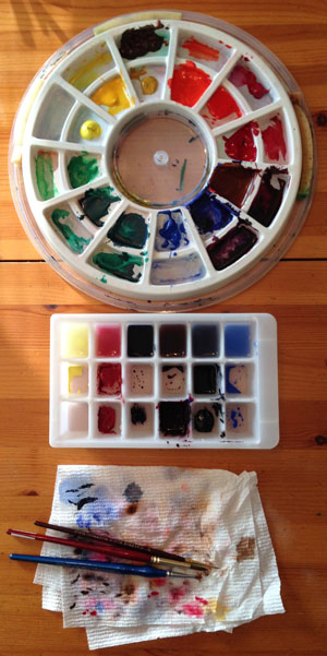 Yesterday, as I set up for my “winter” watercolor I had the best idea. Now, you may not know this but, I recently scrubbed my watercolor palette and set up my paints in the order of the color wheel. Most of the colors were straight from the tube, but I mixed a couple of them. (My palette has sponges that keep the paint from drying out.)
With this setup, I’m ready to paint. I can sit down and paint in my sketchbook without pulling out the tubes and squeezing out paint. The only hiccup is when I need to mix a custom color. I don’t want to dirty my palette! I was able to get away with mixing on a piece of tinfoil, but now I was anticipating mixing several colors. I didn’t want pieces of tinfoil all over the place.
I remembered an ice cube tray, long abandoned, in the back of the corner cabinet, where no one can reach. When I pulled it out, I was excited to see it had 3 rows!
As I rinsed it out, I decided to keep water in the top row. I mixed paint in one of the bottom row cubes. I took some of that paint and put it in the cube above it, and added a little water. Then I cleaned my brush in the top cube – the water cube. I now had, a row of cubes, all the same color, in varying degrees of wetness! Awesome!
I set up rows for the other colors I needed and started painting. It was great. I had 3 options to choose from for each color. It worked like a charm. I’ll use my ice cube palette from now on!
Share this:

The paths our art projects take us on

Yesterday, as I thought about the “abstract” painting I just finished, I thought that it would be cool to paint something similar, but use the colors of sunrise/sunset – pink, orange, purple. I would love to blend them together in the background, the way they blend in the sky. I couldn’t wait to take pictures at sunrise, to use for reference. And, I was excited to paint another tree, to use the techniques I just developed.

It’s funny, how a project can start us on a path. A path similar to the branches of a tree. The path may be fairly straight – projects similar to one another. Or the path may be twisty – each project taking a unique turn. The path can be long – each project sparking the idea for the next one. Or the path may be short – as we experiment with something that doesn’t work out or fails to inspire us any longer.
We follow a path until it ends. Until we have reached the end of that train of thought. At that point, we forge a new path, based on something different that inspires us. But each path we take, is related to the others, just like the branches of a tree.


