Mixing Colors – acrylic painting

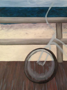
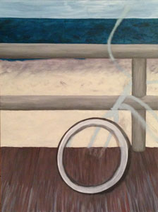
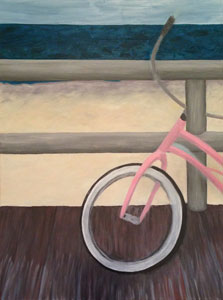
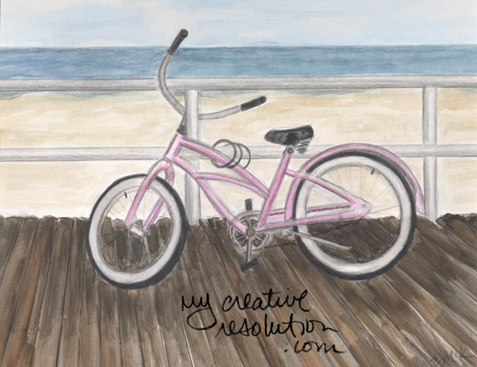
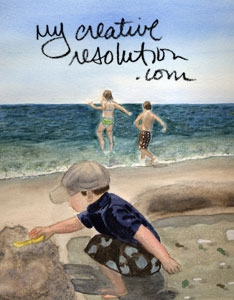
I decided to dedicate a few hours today to painting in acrylics. But, I wasn’t necessarily going to focus on my current painting, bike on the boardwalk. I came up with the idea of setting up a couple of canvases on my table and moving from one to another. This way when I inevitabley got bored of a painting, or felt stuck, I could work on a different one. I thought this idea was quite genius!

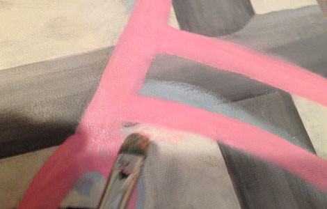
I looked through my old canvases and pulled out a painting of a carrot, that I had started years ago, but never finished. I grabbed a blank canvas, that I had plans for, and I grabbed the bike painting. Although to be honest, I wasn’t that interested on working on the bike painting.

carrot1

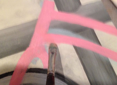
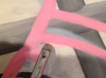
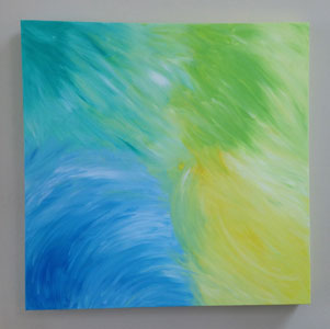
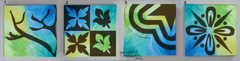
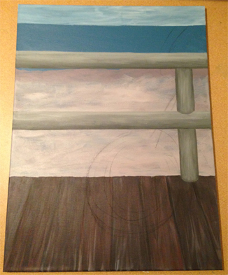
I sat down and started mixing paints. A few years ago I took a class with artist Joe Bucci. He taught me that you should mix your own colors (usually from thalo blue, cadmium yellow and cadmium red). You shouldn’t use mixed colors from a tube because you don’t know what colors are mixed to make that color. His thought was (I’m totally paraphrasing here, this is just what I got from the class and remember) that all the colors in a painting should relate to one other. For example, if I mix a green from thalo blue and cadmium yellow and then, I mix an orange, from cad. red and cad. yellow, add a little of the green so the orange doesn’t look so unnatural and, so, the orange “works” with the green. Who knew? Prior to the class, I was playing around with a set of 10+ colors, never thinking about how they related to one another. He made a lot of sense to me. Here is a painting I did, in his class.

rooster

Back to today, and the carrot painting. I couldn’t remember if I started it pre Joe or post Joe. As I looked at the colors in the painting and the tubes from my set, I had a feeling it was pre Joe. So, I started mixing colors to work on the carrot. I improvised a bit and started with thalo green because I thought that was the tube I had used. I thought it made sense to use it as a base color. When I mixed an orange, I added some of my mixed green, to tone it down, and so, it would work with the green. I also mixed a new brown to add to the dirt. I had decided not to use the brown from the tube, that I had originally used. As I worked on the dirt, I rembered originally working on it, and how I had struggled, because the tubes I had didn’t match the color of the dirt. Joe really opened up a whole new world to me.

I was so “into” working on the carrot – that I hadn’t touched in years – that I never moved on to another canvas! Not only that, but I finished it! And it felt great!

Carrot

Dedicating Time to Painting

I didn’t have much time this past week to work on any of my projects, so I decided I would dedicate Sunday to painting. I don’t often have large chunks of time to be creative, between work, family and home. I don’t think the term “starving artist” came about because there wasn’t time to food shop!

I do think stepping away from a project is a good thing, because when you come back to it you see it with a fresh eye. I was very excited about how I had “sketched” in the bicycle, until I looked at it again. I realized the tire was so small, it looked more like my banana seat bike from the ’70s than a big tire beach cruiser.

bike1

Now, I had to fix the tire, which would involve touching up the boardwalk, ugh. Most people probably start with the foreground and then add in the background. In the case of the boardwalk, I thought it would be easier to paint it first. I’d be interested in hearing how others approach their paintings!

bike2

I was so happy, having so much time to paint, but after less than an hour, I needed a break! I was struggling with the shape and size of the tire. I needed to step away. An hour later, full and refreshed, I came back to the painting. I continued working on the tire, fixing the boardwalk as I went. I then added the bike frame.

bike3

While working on the frame, I realized that freshly applied acrylic paint can be removed as easily as watercolor. With a damp brush I worked on the area I wanted to remove. When the paint transferred to the brush, I blotted the brush on a cloth and rinsed. I repeated this a few times and then used a paper towel to remove excess water.

pink1pink2pink3pink5

pink4pink6

It is always feels great, when you are struggling with something and work through it. I feel so good about where I’ve gotten so far.

bike4

Vote on how I finish this abstract painting!

In home décor stores I often see abstract paintings. They aren’t originals, but prints on canvas. When one catches my eye, I pick it up and after a minute say to myself, “I could do this. How hard could it be? And, I would be able to pick the canvas size and colors that work in my family room.”

I went out and picked a canvas and a couple of tubes of paint. I squeezed the paint directly onto the canvas and blended them around. I thought it looked pretty good. Then, the canvas sat for a while. (This is becoming a common theme, huh?)

background-color

Guess what? Abstract painting is not as easy as it looks! Especially, for someone like me, who is into the “details.” My drawings and paintings are usually on the smaller side and focus on details of the subject. When I draw, I usually use many lines, unlike some people who can use one line that speak volumes. I sometimes think I’m overcompensating! Thinking, “one of these lines is bound to be right!”

4sketches

Now, I want to finish this project. I have a couple of ideas as you can see from my sketches. I’ve even used the computer to simulate these ideas. I’d like to know what you think! Which idea is best suited to the canvas? I’d love to hear from you.

canvas

Irish Blessing pdf download and Citrasolv transfer info.

Irish Blessing Free Download. Info on Citrasolv transfers.
Download the Irish blessing pdf here: maytheroad and the mirror image here: maytheroadmirror.

Visit my Etsy shop for printable coloring pages:
Printable Ireland St. Patrick's Day Coloring Pages make a Coloring Book Kids Class Activity Digital Download is a great way to teach kids about Ireland. Color and fold to create a book! Perfect for St. Patrick's Day.
downloadable clipart:
St. Patrick's Day Watercolor clipart | leprechauns pot of gold rainbow shamrocks

and invitation borders:
St. Patrick's Day shamrocks invitation border printable invitation card

Order St. Patrick’s Day flair in my Zazzle shop!

St. Patrick’s Day #patricks #day #pins #hat

When I read about Citrasolv on a blog, I was very excited. The idea that I could design anything I wanted on the computer and transfer my artwork onto wood, without messy stencils and paint, was very appealing. I came across a cool piece of wood that was originally the top of a plant stand and painted it green with accents of white.

green sign
I layed out the Irish Blessing text on the computer. I flipped the text, so it was the mirror image, and printed it. To do a Citrasolv transfer you need a laser printer, not an inkjet. I positioned the printout on my sign, (text side facing down), taped it so it wouldn’t move, and applied the Citrasolv to the back of the paper with a cotton ball. Using a spoon, I rubbed the back of the paper, trying to rub the entire poem.
citrasolv

My first try didn’t go so well:
blur

Things worked better on my second try. A few spots blurred a little and some areas came out light, because I didn’t adequately rub everything, but it gives it an aged look.

Tips for doing Citrasolv transfers

  • Use a laser printer
  • Don’t do the whole poem at once. It’s easier to work in sections.
  • Rub every area of your design.
  • Don’t use too much Citrasolv.
  • Raw wood works better than the smooth surface of acrylic paint.

finalcitrasolv
For more on citrasolv transfer read the post that inspired me.

Want a dose of creative inspiration? Sign up for my newsletter “My Creative Collection” where I feature artists and makers, and link to inspiring art, design, and craft, inspiring places, interesting books, movies, and more. It’s a collection of all the things inspiring me delivered to your inbox every two weeks. Click here to sign up.

This post contains affiliate links to products/brands I use and recommend. I earn a small commission whenever you buy using these links, at no additional cost to you. Thank you for supporting my blog!

Painting Sand

What color is sand? This is something I’ve been trying to figure out, since I first started painting the beach. I’ve had some successes and some failures. I’ve sat at the beach and wondered, what color is that? I think the challenge is, that sand is different colors, even on the same beach. The dry sand furthest from the ocean is one color. As you get closer to the water, and the sand gets wetter, it changes color. Even the individual grains of sand are different colors. The sun also plays a role in the changing appearance of the sand.

In my last post, I detailed how I mixed the color of the sand (maybe in too much detail!). I wanted to keep track of the process I used, in case it was successful. Sometimes I’m not even sure if I like a color, until the paint has dried. In this painting I think the overall color is good, but I may need to tone down the yellow.

boardwalk3

Here are some other acrylic attempts at sand. The first one is awful. The second one is an okay attempt at wet sand. I did it in a class and have no idea how I mixed it. The third one is okay, but again I don’t even know what color it is. Note to self: keep track of the colors you use!

acrylic sand

I think I’ve been a bit more successful in watercolor, probably because I’ve had more practice. The sand in the first painting is too purple, although I like the texture of it. The second is okay. In the third painting, I am really proud of how I captured the color of the wet sand. It is one of my favorite paintings.

 bikeboardwalk Kids at the Beach

Revisiting Unfinished Projects

I came across several unfinished projects, while cleaning my office. I have a really hard time getting back into a project that I’ve abandoned. I think I’m afraid of ruining it. I forget where I was, and don’t even know where to start.

One such project, is an acrylic version of a bike on the boardwalk. I forced myself to start, even though it wasn’t easy! I had all kinds of measurements (because I was enlarging a section of a watercolor painting) and I didn’t even know what they meant! I had no idea what part I intended on working on next.

Once I got working again, things started to come more easily. I painted the railing and decided to do the sand and ocean next. I love painting the beach. It’s my favorite place. But, mixing the right color for sand and painting the ocean is really hard (for me).

For the sand, I mixed cadmium red and thalo blue to create a purple, which I added white to. This resulted in a grayish purple which I added cadmium yellow light to. In the sand area, I already had a base color, a purplish tan, which I thought might look good in the spots it will show through. I mixed a thalo blue with the cadmium yellow and added this greenish blue to my ocean area.

Here is my progress so far. Time to add the bike wheel…only slightly intimidating!

boardwalk2   boardwalk3

A Bike on the Boardwalk

For a while, I kept meaning to paint a bike leaning on the railing of the boardwalk, with the beach in the background. Then Sandy hit and the boardwalk was destroyed. It is really strange for something that was always there to be gone. Obviously, my painting was of no priority amongst the Sandy damage.

One day I saw a couple of bikes locked to a signpost. I could imagine them leaning on the railing of the boardwalk. I ended up painting the pink beach cruiser, a bike I once owned, changing the background to the boardwalk and the beach. Since I didn’t have any great boardwalk pictures to use as reference, I painted the background mostly from memory.

Even though I always imagined the painting as an acrylic, I ended up working in watercolor. Shortly after, I started an acrylic version, which I never finished. Time to start painting…

bikeboardwalk

Filling the Sketch book

Sketchbook

I plan on filling this sketch book. Although it is a bit daunting! I like saving all my old sketch books and looking through them. I even keep drawings that I am embarrassed by. They show me how far I’ve come. I look at old sketches with a fresh perspective and know what is “off.” Sometimes I look at a sketch and proudly think, “I did that?” As I thumb through, I am reminded of projects I was interested in. I can add some of those  to my list for the coming year.

sketches

Happy New Year!

This year I’m taking my New Year’s resolution to a new level. I’m holding myself accountable, by making a commitment to blog about my progress. In the past I’ve been great in the ideas department, not as good in the follow through! But this time, I hope to draw, paint and create my way through 2014! Join me on the journey so you can witness the successes (and failures) and maybe we’ll both learn a thing or two on the way!

Here’s to a successful resolution and a Happy New Year, Cheers!