Painting my favorite candy – Dots

Painting candy packaging - Dots #candy #illustration #food
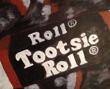
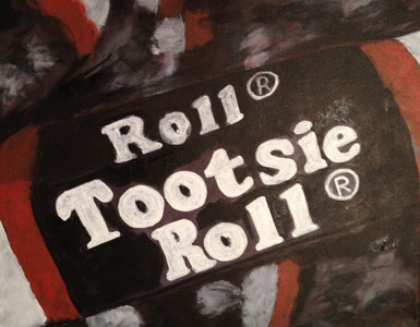
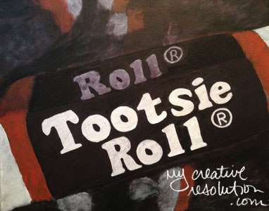
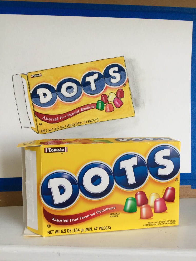
Uppercase Magazine – a favorite creative magazine of mine – recently had a call for submissions of artwork of your favorite packaging. I of course picked one of my favorite childhood candies, DOTS, to paint. (And Yes, I ate all the DOTS.)

One of my goals this year is to get my artwork “out there.” I’m not necessarily searching for places to submit my work, but staying alert for opportunities, in places that I’m a fan of.

So far:

I view each submission as a victory, regardless if I’m accepted or not. It is an accomplishment to follow through and submit, and in many cases create new art for the submission. And just like the old lottery slogan, “You’ve got to be in it, to win it.”


Want a dose of creative inspiration? Sign up for my newsletter “My Creative Collection” by clicking here. Learn more here.

Have you visited my online shop? Prints of my seascapes are available on watercolor paper or canvas, in many sizes including the new “mini” canvas 11″ x 14″ at shop.eileenmckenna.com. Take a peek!

This contains affiliate links to products/brands I use and recommend. I earn a small commission whenever you buy using these links, at no additional cost to you. Thank you for supporting my blog!

Learning the keys to successful surface design

valentine2015repeatsm
At the end of last year, I had just started ordering my pattern designs in wrapping paper and fabric. It’s totally different, to not only see the pattern printed, but then work with the gift wrap and fabric. As I wrapped presents in my designs and other designs, I became aware of things that I never noticed before. Most importantly that a lot of the designs have some elements that are upside down and some right side up. This way, there is no correct side.

Over the summer, when I ordered fabric in my sandcastles design, I experimented with making it into a pillow. I realized how important the size of the repeat is. If it is too big, and you try to make a small pillow (or wrap a small present), then most of the design gets cut off.

These are things you don’t notice when you are creating on the computer. As I continue to pursue surface design this year, my goal is to not only design patterns, but have them printed as gift wrap or fabric, and (most importantly) create something with them – to be the end user. I think it’s the best way for me to learn how to make successful designs.

Earlier this week I tweaked last year’s Valentine’s Day design and ordered a swatch (see above). Specifically, I changed how the pattern repeated. I’m am excitedly waiting it’s arrival! I am also working on a second Valentine’s Day themed pattern, that has more of a watercolor feel.

Original Repeat:
valentine'sdaypattern

To see the 12 patterns I designed in 2016, click here.

Gingerbread houses

It was a lot of fun decorating mini gingerbread houses with the kids tonight. It’s nice to do something together especially since 2 of my 3 are teenagers. Traditions are really nice. We’ve been doing houses together since the oldest was 2 or 3. 

I remember when I was home from college and my sister said we were going to make gingerbread houses with my niece – who was the first grandchild. We baked everything from scratch, and then struggled to put the houses together. Finally we were ready to decorate. My niece ate a few gumdrops, put a few on the house, and yelled, “done!” As she hopped down from her chair. I couldn’t believe it. Kids are too funny! 


Painting Candy

Happy Valentine’s Day! When I think of Valentine’s Day, I think of love…just kidding…I think of candy!! I love candy. I love sweets. I am a sugar addict. Recently, I was looking through my artwork and I had to laugh at all the sweets I’ve drawn and painted.

Colored pencil:

gumball machine cupcake

Acrylic paint:

hard candy

My favorite candy is Tootsie Rolls. Years ago, I started a painting of Tootsie Rolls and of course, never finished. I decided to dust it off and finish. Sometimes it’s hard going back to an old project. I’ve learned a lot since I started this painting. If I was doing it from scratch today, I would paint it differently.

Tootsie Rolls tootsie1

I decided not to over think it, and move forward with what I have. It was an ambitious project, from the beginning, trying to paint the lettering correctly. That is probably why I put the project aside – I got to the hard part. Originally, my plan was to print something to use as a stencil for the lettering. I’ve decided not to do this, but to do my best, and freehand it. I wish I had a bag of Tootsie Rolls to inspire me!

I used a small stiff brush and white paint, that wasn’t too heavy. I decided to sketch in the placement of the letters and then, fill them in. I realized my Tootsie Roll shape was too long, but as I said, I’m trying to do the best with what I have.

tootsie2 tootsie3 tootsie4 tootsie5

I also realized that, there are letters all over the painting, not just on the primary Tootsie Roll. Ugh, I don’t think I’m going to do those too. I’ll have to tone down the Tootsie Rolls in the background. So, they are not so obvious. I’m also going to have to mix more brown paint, whether I want to or not. I stacked my canvases, probably not a wise idea, and they stuck together in spots. When I separated them, the paint came off.

This project reminds me of the artist who paints in Walmart. He literally pushes his supplies around in a shopping cart and stands in the aisles painting. I especially love his close up paintings, of different packaging.

I filled in the letters a few times, then I mixed brown and refined the edges of the letters. I applied the brown all over, then, mixed a lighter shade to put on the front side of my Tootsie Roll. I used a brownish white for the “Roll” letters on the farther side of the Tootsie Roll. I went over the main Tootsie Roll letters on the front side again. I was getting a little crazy with it. I knew it wasn’t perfect. I tried to remember the “Walmart” artist, and how he paints the logos very loose. I put a brownish wash over the letters to tone down the white.

tootsie6 tootsie7 tootsiealmost

I had to touch up one area, of the letters, that was driving me crazy. Okay now, here is the final painting. It’s probably the Graphic Designer in me, but I find packaging interesting. An idea for the next painting – a can of Redpack Tomato Puree. How very Warhol that would be!

Tootsie-Roll-final