Have a good weekend! And if you are on the East Coast – stay dry.
Have a good weekend! And if you are on the East Coast – stay dry.

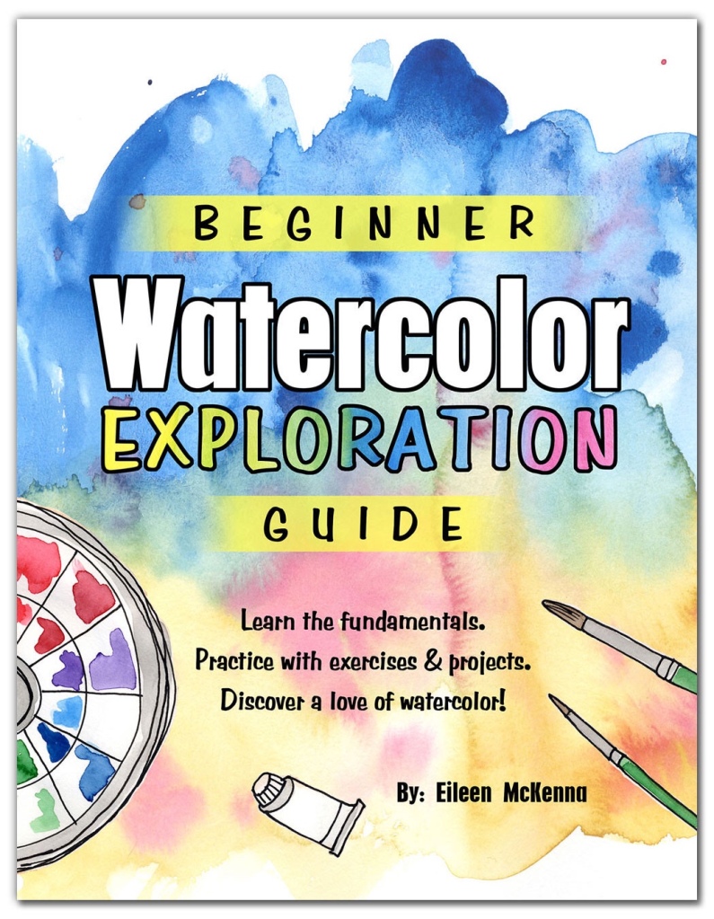
 Supplies:


 This post contains affiliate links to products/brands I use and recommend. I earn a small commission whenever you buy using these links, at no additional cost to you. Thank you for supporting my blog!
Want a dose of creative inspiration? Sign up for my newsletter “My Creative Collection” by clicking here. Learn more about the newsletter here.
This post contains affiliate links to products/brands I use and recommend. I earn a small commission whenever you buy using these links, at no additional cost to you. Thank you for supporting my blog!
Want a dose of creative inspiration? Sign up for my newsletter “My Creative Collection” by clicking here. Learn more about the newsletter here.
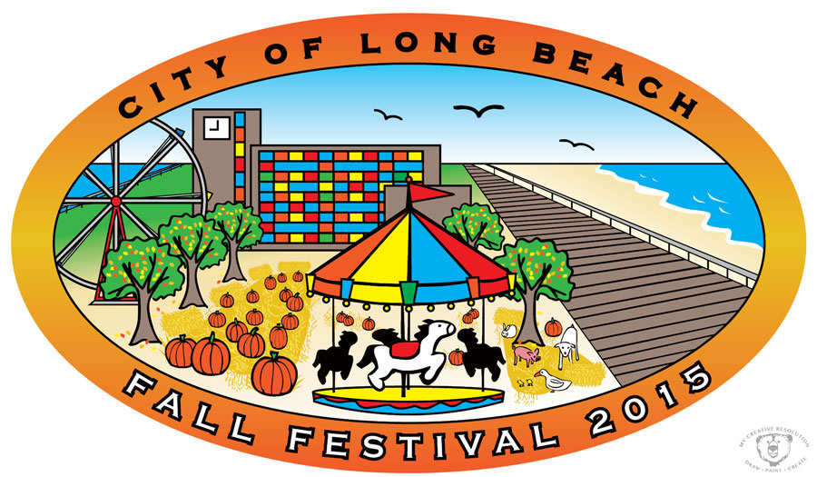
Here is the final logo I wrote about 2 weeks ago in Part 1- Adding illustration to a logo design project. This is the logo project where I really put my years of illustration practice to work!
I was really excited about creating something for the city I was born and raised in. They wanted elements of both the City of Long Beach and the Fall Festival (which the logo was for). Who better than someone born and raised there?
I used the boardwalk, which Long Beach is know for, as well as the iconic City Hall building. And I had to include the bay, because after all, Long Beach is part of a barrier island. Our concept is to modify this logo for other events, by switching out the Fall Festival elements, but maintaining the City elements.
If you are interested in seeing more of my design work please visit my website: www.eileenmckenna.com

I’d love to squeeze in one more beach day, but other than that I’m ready for the hot and humid weather to end. I’m looking forward to those crisp Fall days, with blue skies and beautiful foliage all around. I’m excited about new seasonal things to inspire me – leaves, acorns, pumpkins. I’ve already started doodling and collecting them. Maybe it’s too soon, but it’s nice to have new “material” to work from! Are you ready for Fall?
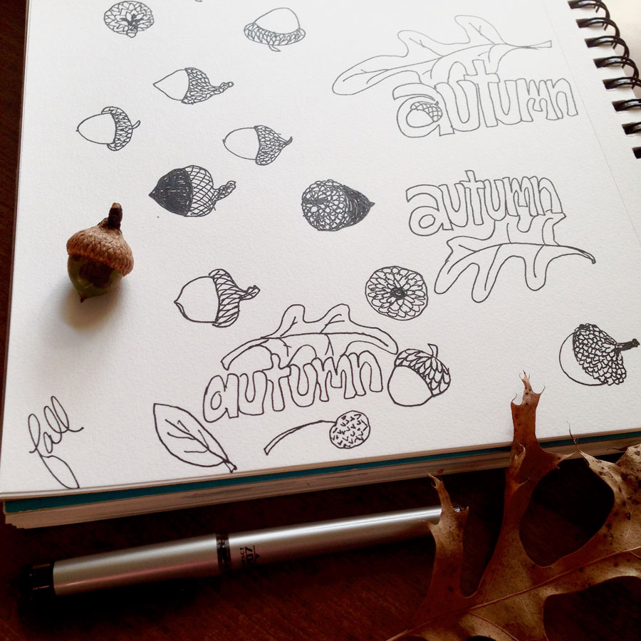


One of the things I’ve learned about myself since starting my creative resolution is that I’m inspired by the seasons. I’m already seeing signs of what’s to come and I’m looking forward to it! Paintings (and sketches) of shells and the ocean will soon be replaced by leaves and trees and other Fall things! I can’t wait for the leaves to change…and the weather to cool down. 🙂
Here are some of my favorites projects from last Fall:

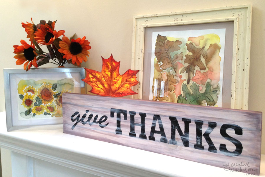
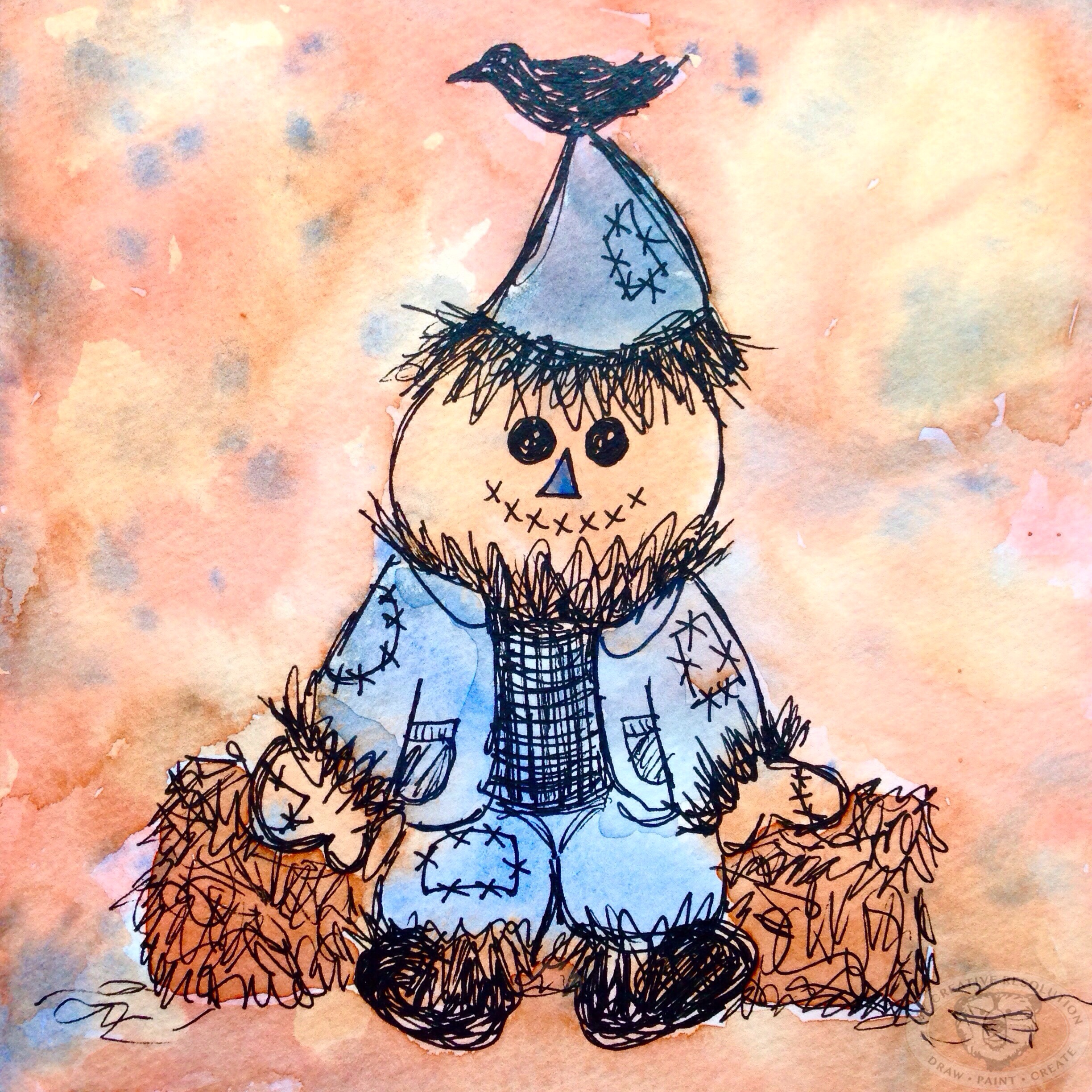
Happy Thanksgiving! My Fall mantle has become a mini gallery of some of my favorite Fall projects: sunflowers, Fall leaf, watercolor and ink leaves and the “give Thanks” Thanksgiving sign. I think tomorrow I need to start on some Winter/Christmas projects!
Enjoy your day with family and friends!
Eileen


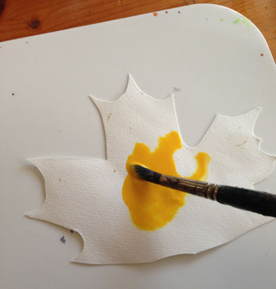
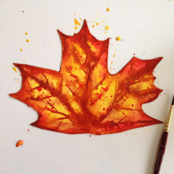
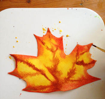
The leaves are spectacular this time of year! It’s hard to even come close to nature’s beauty, but I gave it a try.
My Steps:


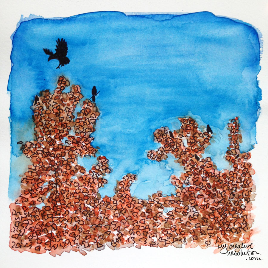
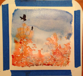
I came across these crows in the Target parking lot. With the bright blue sky, the orange trees, and the crows flying around, it was beautiful, so I snapped a few pictures. Ironic that it was in a parking lot! My husband said a flock of crows is actually called a “murder.”
My Steps:
I started by drawing, in ink, a few of the crows. I added the sky and the shape of the trees in watercolor.

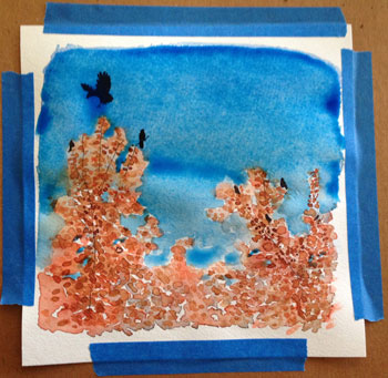
When that dried, I added a few more crows.

I realized the sky wasn’t blue enough, so I added a richer layer of blue. I also added more oranges and browns in more definitive leaf shapes.
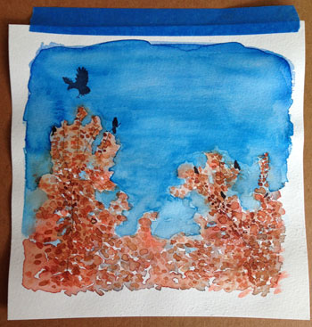
I drew the outlines of the leaves in ink. I added more orange and brown to give the trees more depth. I tried to cover up and soften the line that the second layer of blue sky had created between the sky and the trees.


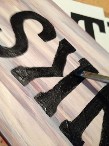
I finally got around to finishing this. I started it back in the summer, when I painted the background for two signs. One sign became my “beach lover” sign, which I finished over a month ago. For this sign, I wasn’t sure what to do with it, what words to paint on it – Fall harvest? With Thanksgiving getting closer and closer, I decided on “give thanks.”
Two years ago Thanksgiving took on a whole new meaning. My siblings, parents, cousins and my aunt were all affected by Superstorm Sandy. They all had major renovations to tackle and some of them couldn’t even live in their homes. Living 20 minutes away, our home was unaffected. So Thanksgiving 2012 was here at our house. We hosted around 40 people. I wasn’t stressed at all. I knew everyone would be happy, just being together in a warm, dry place. There was no need to sweat the small stuff. Although they suffered damage to their homes, everyone was safe and that was definitely reason to give thanks.
Technique:
I used the same technique for the lettering as last time. Using the side of the pencil, I quickly colored on the back of my printout. Then, I flipped the printout over and taped it to my sign. With firm pressure, I traced the letters on the printout, using a Nintendo DS stylus pen. I peeled the printout off and, using the light pencil marks and indentation as a guide, I painted the letters. After the letters were dry I added a little white for effect.