Adding Watercolor to my Sketchbook

I was sketching every other day, until recently. I was getting bored and running out of things to draw. I decided to add watercolor to my sketchbook, but first I had to do a little housekeeping. I did what I’ve wanted to do for a while – scrubbed my watercolor palette. I was starting fresh.

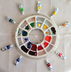
Keeping to the arrangement of the color wheel, I added a dollop of paint to each section. I mixed a few of the colors, that I didn’t have in tubes. It’s been a while since I’ve used watercolor. Some of my tubes would not open. The tubes twisted and paint squirted out from all sides. It was a bit of a mess!

watercolorpalette

I know the sketchbook paper isn’t ideal for watercolor. It will wrinkle, if it gets too wet. But in my mind, my sketchbook is meant to be quick, no pressure, play around, keep the creative juices flowing, and get my skills “in shape.” So, I’m not worried about the paper.

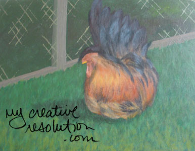
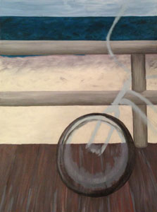
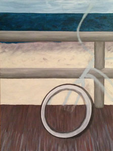
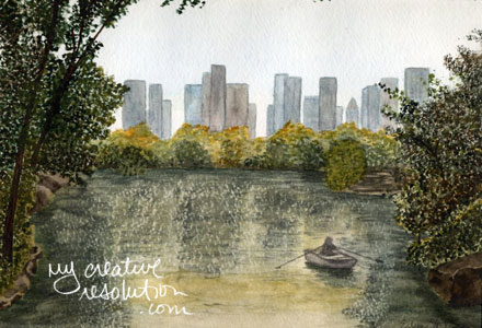
Once I got started I realized I missed watercolor! There is so much you can do! It is fun to wet sections of the page and let interesting things happen, let colors blend. Or add detail to a dry part of the paper, with a dry brush and paint that is directly from the tube. And in between these two techniques (wet on wet and dry on dry), are tons of other options! There was a time that I painted exclusively in watercolor. Here are a couple of my older paintings.

centralpark dogwoodwatercolor

For my second watercolor sketch, I first drew (in pencil) a few flowers and leaves from the Burpee (plant and seed) catalog. There are beautiful pictures in there! I wet the background area, then added in wet paint and let it run. After the background dried, I painted the flowers and leaves, using a combination of wet painting and finally, dry details. It was fun! And “sketching” in watercolor might lead to ideas for paintings – watercolor or acrylic.

sketchbackground

burpee

How my office turned into my studio

Recently, I started hanging my finished paintings in my “studio.” The studio was originally “the office,” until the easel arrived. Then, I started calling it the studio. Makes me feel like a real artist! I feel proud when I glance over and see what I’ve accomplished. The wall motivates me. Plus, the wall, was a plain, boring thing, before the paintings brighten things up!

wall

Another benefit to hanging my work, is “seeing” my development. I try to learn from my mistakes, but not to fixate on them. What’s done is done. I love the orange I painted awhile back. Shortly after it, I tried to follow up that success with limes, but I don’t like them as much. The limes are too flat looking. There isn’t enough shading to make it 3D looking. When I look at my apple, I feel like I made a giant leap forward.

orange limes apples

One thing I need to do, is sign my paintings! My drawing teacher, Eva, always stressed, “Sign your work!” Before the Tootsie Roll painting, I hadn’t signed most of my paintings. I didn’t feel confident signing with a paintbrush. I knew it was a mistake, to not do it then, because I had all the colors mixed and ready. Now, I’m not sure what color I’ll sign them in. Do most painters sign in black? Awhile back I signed a couple of paintings with a paint pen and immediately hated the way it looked. It wasn’t loose enough. You could tell, I didn’t use a paintbrush. When I finished the Tootsie Roll, I practice with a couple of small stiff brushes, and was able to do a decent signature. But, I still need practice. Nothing finalizes a painting, like signing your name!

I’ve also been organizing the office (I mean the studio!). It’s therapeutic to clean, organize and get rid of the clutter. I feel inspired looking through my old stuff and it reminds me of projects I was interested in, but didn’t pursue…yet.

I have a bulletin board that runs the length of my counter top. I’d like to better utilize it as a “project board,” and include reference photos, notes, and inspiration for current and future projects. I spent time on the project board this morning, and I’m already, loving the results! Notice, front and center is the bike, which I have yet to complete. Hard to forget about it now!

Spending time on my workspace, helps me work more efficiently. It clears my mind. Now, I feel ready to get to work!

project board 2

Painting Candy

Happy Valentine’s Day! When I think of Valentine’s Day, I think of love…just kidding…I think of candy!! I love candy. I love sweets. I am a sugar addict. Recently, I was looking through my artwork and I had to laugh at all the sweets I’ve drawn and painted.

Colored pencil:

gumball machine cupcake

Acrylic paint:

hard candy

My favorite candy is Tootsie Rolls. Years ago, I started a painting of Tootsie Rolls and of course, never finished. I decided to dust it off and finish. Sometimes it’s hard going back to an old project. I’ve learned a lot since I started this painting. If I was doing it from scratch today, I would paint it differently.

Tootsie Rolls tootsie1

I decided not to over think it, and move forward with what I have. It was an ambitious project, from the beginning, trying to paint the lettering correctly. That is probably why I put the project aside – I got to the hard part. Originally, my plan was to print something to use as a stencil for the lettering. I’ve decided not to do this, but to do my best, and freehand it. I wish I had a bag of Tootsie Rolls to inspire me!

I used a small stiff brush and white paint, that wasn’t too heavy. I decided to sketch in the placement of the letters and then, fill them in. I realized my Tootsie Roll shape was too long, but as I said, I’m trying to do the best with what I have.

tootsie2 tootsie3 tootsie4 tootsie5

I also realized that, there are letters all over the painting, not just on the primary Tootsie Roll. Ugh, I don’t think I’m going to do those too. I’ll have to tone down the Tootsie Rolls in the background. So, they are not so obvious. I’m also going to have to mix more brown paint, whether I want to or not. I stacked my canvases, probably not a wise idea, and they stuck together in spots. When I separated them, the paint came off.

This project reminds me of the artist who paints in Walmart. He literally pushes his supplies around in a shopping cart and stands in the aisles painting. I especially love his close up paintings, of different packaging.

I filled in the letters a few times, then I mixed brown and refined the edges of the letters. I applied the brown all over, then, mixed a lighter shade to put on the front side of my Tootsie Roll. I used a brownish white for the “Roll” letters on the farther side of the Tootsie Roll. I went over the main Tootsie Roll letters on the front side again. I was getting a little crazy with it. I knew it wasn’t perfect. I tried to remember the “Walmart” artist, and how he paints the logos very loose. I put a brownish wash over the letters to tone down the white.

tootsie6 tootsie7 tootsiealmost

I had to touch up one area, of the letters, that was driving me crazy. Okay now, here is the final painting. It’s probably the Graphic Designer in me, but I find packaging interesting. An idea for the next painting – a can of Redpack Tomato Puree. How very Warhol that would be!

Tootsie-Roll-final

Procrastination and Painting

Today was the first day, in weeks, that I’ve had a quiet house, all to myself. The kids were at school, and my husband was at work. Perfect day to paint, right? Right! After a second cup of coffee, it was time to get started.

But, first I had to clean out my pocketbook, throw in a load of laundry, clean my palettes, find tissues, and search for ‘8os music. What? It seemed like I was doing everything to avoid starting. And the ’80’s music? I have no idea, where that, came from. But, after I got a pandora station playing ’80s alternative music, I was a happy camper and got to work. (After I found hand cream and cleaned the papers off my desk!)

Over the weekend, I painted a purple/blue medium tone for the base coat of my jellyfish painting. As I mixed the color, I thought, “How much should I mix?” Ironically, I had to mix the color, no joke, four times. I, obviously, underestimated how much paint, the raw canvas needed! The color wasn’t the same every time I mixed it, but the base color will be covered, for the most part.

As I worked, I focused on being neater. I took the time to set up the area around my easel. Each time I work with the easel, things go smoother. But, the easel is still a little unstable. Could it be that extra screw, I didn’t use?! Read my recent post and you’ll see why I don’t read instructions! Part of my homework for next time is to fix this problem.)

As I was mixing my colors (from thalo blue, cadmium red, and cadmium yellow), I realized that I may not be able to achieve the electric purple in the photo. I may have to incorporate a premixed color. Not only was I struggling with the background color, I was struggling with the color of the jellyfish. I printed a reference photo and marked a simple grid on it. On my canvas, with painters tape, I marked the same halfway points. I wanted to make sure that the jellyfish, were in the correct spots. I “sketched” the shapes of the jellyfish (using paint).

jellyfish2b

I may have procrastinated starting, but time flew as I worked. I painted for almost two hours, and I think I accomplished a lot. I didn’t achieve the bright purple background color, but I’m happy with the color I have.

jellyfish3

I was so focused on cleaning up, that I almost forgot to write my plan for the next day. Through the process of writing this blog, I’ve come to realize how important, for me, a plan is. For the jellyfish painting, my plan is to work on refining the color of the jellyfish. Since I’ve been struggling, I’m going try using the eyedropper tool, in Adobe Photoshop, to help me pinpoint the colors in the photo.

Is my astrological sign affecting my painting?

I had a bit of an epiphany, while I was working on my apple painting. I’ve written, several times, about how I get anxious on day two of a project. As I wrote in my last post,

“(On) day one, I’m excited and enthusiastic. Day two, I’m reluctant, anxious, intimidated…I have to push myself to continue with a project.” I forced myself, to get back to work on the apple painting, and as I worked, I came up with a plan for the next day. “I realized having a plan, made starting up easier. I didn’t feel as intimidated. Also, I know from experience, once I get started, I’m usually fine. I now know, that, before I step away from I project, I need to have a plan for the next day.”

I decided to search online, for traits that apply to my sign, Aries. I’m not that into astrology, but I couldn’t believe how dead on the description of Aries (on Huffington Post) was.

Aries motto is “Ready, fire, aim!” It may be backwards for others, but you’d rather figure out what to do while you are doing it. Impulsive actions, however, can bring you your share of trouble. While others are gathering information to make informed decisions, you are already on your way. As such, you could suffer from false starts. In fact, you Aries are so good at starting things that you can be off onto your next project before completing the previous one. As you Aries mature, you learn to slow down your reaction time in order to think about the consequences of your actions.”

That is totally me! Whenever, I try to put something together, and hit a snag, my husband will say, “Did you read the directions?” I, of course, am like, directions? Who needs those?! Obviously me, that’s why I’ve hit a snag!

The part about starting projects, but then moving on, really hit home. Since I started mycreativeresolution.com, I’ve been forcing myself to finish projects and it has been really satisfying.

For me, the “Ready, fire, aim!” motto, is so true, and may be the reason, I had all those unfinished paintings. I start a project, but get to a point, where I’m not sure how to finish. Instead of working through it, I put the project aside. This just reaffirms how important “a plan” is (and yes honey, those instructions). I will no longer, step away from a painting, without thinking about what the next steps are.

Today, I finished my apple painting. Words can’t describe how good it feels. I was a little nervous finishing, because I felt so close, and I didn’t want to ruin it. But, I had a plan (to add paint to the stem and the area behind the stem) and I executed it. Yeah me!

apples

I also started the jellyfish painting, that I’ve been planning, since I took this photo. I covered the canvas in a medium tone blue/purple. The plan for next time is, to sketch in (with paint) the jellyfish and then add the water around them. I’m excited!

jellyfish basecolor

Check out your sign’s traits at:
http://www.huffingtonpost.com/horoscopes/

  • Select your sign
  • Scroll down to “about the sign”
  • Enjoy! Let me know if anything rings true for you!

I wish there was an “undo” button, while I’m painting

I was very excited to try out my new easel. I was less excited, to continue painting my apple. I need to coin a phrase, to describe the feeling I get, on day two of a project. Day one, I’m excited and enthusiastic. Day two, I’m reluctant, anxious, intimidated. Whatever the word, I have to push myself to continue with a project. Do other creative people feel this way?

Regardless of how I was feeling, I got to work on my apple. I set the easel up near the window, for natural light. Logistically, it was a nightmare. I was so far away from my palettes, with my mixed paint. And even further from the computer, where my reference photo was on the screen. (The color is never as good when I print it.) I stood at my easel, and every time I tried to get closer to the painting, I’d kick one of the legs and the whole easel would tilt.

I was working on the bottom quarter of the painting, the table, where the apples sit. In order, to be able, to paint the bottom edge, I turned the painting upside down. My acrylic painting teacher told me, to make an area (like a table) less flat looking, paint it dark to light or warm to cool (or the reverse of either). I decided to darken the table as I got closer to the apples. I also added in some greens, for the stem and the area around the seeds.

I was, feeling all over the place (literally), and I was in a rush, as I had to leave the house at a specific time. As I was adding a bit more paint, before I left, I literally said out loud, “I have to stop, I’m ruining it.” Before I left, I turned the painting right side up.

While I was out, all I could think about, was that I ruined the painting. I loved it the first day. Maybe I shouldn’t have done the gradual darkening of the table? Maybe I should have left it “flat” looking? Isn’t that a painting style?

I wish there was an “undo” button. When I work, as a Graphic Designer, any time I don’t like the last couple steps I’ve taken, I just click “Edit, Undo.” There is also “Edit, Step Backward,” and “Revert to Saved.” Basically, there are tons of ways, to go back to where you started. Sometimes, while painting, I wish I had one of these options.

A funny thing happened when I got home. I turned on the light, saw the apple painting on the easel, and thought, “Wow, it looks good!” I was so surprised.

A couple of days later, when I had time to paint, I knew what area I wanted to work on. I realized having a plan, made starting up easier. I didn’t feel as intimidated. Also, I know from experience, once I get started, I’m usually fine. I now know, that before I step away from I project, I need to have a plan for the next day.

Working with the easel, was much better, the second time around. I printed my reference photo and hung it near the easel. I brought my palette to the easel, instead of walking back and forth. Be prepared to laugh. I realized the curved area on either side of my easel, is so I can comfortably hold it! I sat on a stool and didn’t kick the easel once!

palette

As far as the painting itself, I darkened the background directly behind the apples. I added details to all the apples. The only thing I need to finish, is the stem and the area behind the stem. That is my plan, and I am excited to attack it next time!

applepainting

Starting an Acrylic Painting

Before I start a project, I usually have a spark of inspiration. For my new painting, the “spark” came from my breakfast! I cut an apple in half and thought, “That would make a cool painting!” I’ve painted fruit before. One of my favorites is of oranges. The inspiration came from a painting I saw on Modern Family. It hangs in Gloria and Jay’s house. After that, I painted limes, which I don’t love half as much as the oranges.

orange limes

I took several photos of my apple, to have for reference. I cropped the photo and added a grid, to help me transfer it to the larger canvas. I often turn the photo and canvas upside down, to make sure I am drawing things correctly. I’ve heard it said, that turning things upside down, uses a different part of your brain. I definitely think it’s easier to dissect something upside down. You see the lines and shapes instead of (in this case) an apple. I think it works especially well with faces and bodies.

grid

Before I draw on the canvas, I cover the canvas with a medium tone that I think will work well when it shows through (other layers of paint). For this painting I used an orange/yellow color. I never really know what color to paint the edges of the canvas, but I paint them at this time. This way they are covered and I can always add paint later.

basecolor

A while ago, I read an interesting book, “The Acrylic Painter’s Book of Styles and Techniques” by Rachel Wolf. What I liked, about the book, was learning how different people work. Some painters cover the canvas, in one color, first. Some painters draw in detail, before they start painting. A painting class greatly influenced my process. Before the class, I worked mostly in watercolor. I know it sounds silly and basic, but I learned, in that class, how to hold and stroke, with bigger brushes. In watercolor, I was using smaller brushes and it was similar to drawing and holding a pencil. I also learned all about mixing colors. The rest of my “process” is developing as I spend more time painting.

When my base color was dry, I used vine charcoal to sketch out my composition. I tried very hard not to center the apple on the canvas, but no matter what I did, it seemed to fall mostly in the center! I am vowing here and now, not to use charcoal again. My teacher recommended it, but it is messy and hard to get off. I don’t really understand the point of it, if I’m going to erase it! If I don’t erase it, it mixes with the paint. I am probably doing something wrong. After I erased most of the charcoal, I started “sketching” with paint, which worked much better. And, as long as the paint is still wet, I can use a wet brush to “erase” any part of my “sketch.”

orangebase applesketch

After the sketch was completed, I added some of the color. The whole process, not including drying time between steps, was fairly quick – less than two hours. I was pretty happy with what I had accomplished! The next day, I realized, that this is the point, where I usually put the canvas on a shelf and walk away. For some reason it is hard for me to finish. I previously thought it was boredom. I think I am worried about ruining it and am unsure how to proceed. This month, I’ve worked hard to pick up some of these forgotten projects. Doing this, has taught me, that although it is hard to start, within minutes, I’m back “into” the painting. I am committed to finishing the apple!

apple1 apple2 apple3

apple4

I have another painting – an abstract painting – that I’ve been trying to decide how to finish. My problem with this painting is, I didn’t have a well thought out plan from the beginning. I’d love your input on how I should finish it – just fill out my online poll!

Mixing Colors – acrylic painting

I decided to dedicate a few hours today to painting in acrylics. But, I wasn’t necessarily going to focus on my current painting, bike on the boardwalk. I came up with the idea of setting up a couple of canvases on my table and moving from one to another. This way when I inevitabley got bored of a painting, or felt stuck, I could work on a different one. I thought this idea was quite genius!

I looked through my old canvases and pulled out a painting of a carrot, that I had started years ago, but never finished. I grabbed a blank canvas, that I had plans for, and I grabbed the bike painting. Although to be honest, I wasn’t that interested on working on the bike painting.

carrot1

I sat down and started mixing paints. A few years ago I took a class with artist Joe Bucci. He taught me that you should mix your own colors (usually from thalo blue, cadmium yellow and cadmium red). You shouldn’t use mixed colors from a tube because you don’t know what colors are mixed to make that color. His thought was (I’m totally paraphrasing here, this is just what I got from the class and remember) that all the colors in a painting should relate to one other. For example, if I mix a green from thalo blue and cadmium yellow and then, I mix an orange, from cad. red and cad. yellow, add a little of the green so the orange doesn’t look so unnatural and, so, the orange “works” with the green. Who knew? Prior to the class, I was playing around with a set of 10+ colors, never thinking about how they related to one another. He made a lot of sense to me. Here is a painting I did, in his class.

rooster

Back to today, and the carrot painting. I couldn’t remember if I started it pre Joe or post Joe. As I looked at the colors in the painting and the tubes from my set, I had a feeling it was pre Joe. So, I started mixing colors to work on the carrot. I improvised a bit and started with thalo green because I thought that was the tube I had used. I thought it made sense to use it as a base color. When I mixed an orange, I added some of my mixed green, to tone it down, and so, it would work with the green. I also mixed a new brown to add to the dirt. I had decided not to use the brown from the tube, that I had originally used. As I worked on the dirt, I rembered originally working on it, and how I had struggled, because the tubes I had didn’t match the color of the dirt. Joe really opened up a whole new world to me.

I was so “into” working on the carrot – that I hadn’t touched in years – that I never moved on to another canvas! Not only that, but I finished it! And it felt great!

Carrot

Dedicating Time to Painting

I didn’t have much time this past week to work on any of my projects, so I decided I would dedicate Sunday to painting. I don’t often have large chunks of time to be creative, between work, family and home. I don’t think the term “starving artist” came about because there wasn’t time to food shop!

I do think stepping away from a project is a good thing, because when you come back to it you see it with a fresh eye. I was very excited about how I had “sketched” in the bicycle, until I looked at it again. I realized the tire was so small, it looked more like my banana seat bike from the ’70s than a big tire beach cruiser.

bike1

Now, I had to fix the tire, which would involve touching up the boardwalk, ugh. Most people probably start with the foreground and then add in the background. In the case of the boardwalk, I thought it would be easier to paint it first. I’d be interested in hearing how others approach their paintings!

bike2

I was so happy, having so much time to paint, but after less than an hour, I needed a break! I was struggling with the shape and size of the tire. I needed to step away. An hour later, full and refreshed, I came back to the painting. I continued working on the tire, fixing the boardwalk as I went. I then added the bike frame.

bike3

While working on the frame, I realized that freshly applied acrylic paint can be removed as easily as watercolor. With a damp brush I worked on the area I wanted to remove. When the paint transferred to the brush, I blotted the brush on a cloth and rinsed. I repeated this a few times and then used a paper towel to remove excess water.

pink1pink2pink3pink5

pink4pink6

It is always feels great, when you are struggling with something and work through it. I feel so good about where I’ve gotten so far.

bike4