Watercolor Cardinal

I decided to try and paint another bird. We watched the cardinals all winter, so it was an obvious choice. I placed the cardinal in our birch, which has a pinkish tone. I had a lot of fun painting very wet, letting things happen without a lot of control.

Watercolor cardinal

I started by painting the background, which is what I did when I painted the Blue Jay. Painting the background first is very different for me. It was a fun project and I am happy with the results.

cardinal1 cardinal2


Progress on my acrylic Gerbera Daisy

I stole an hour this morning, before the craziness of running around with the kids, to work on my latest painting. I really like how it is coming out! I had a great sense of accomplishment that stayed with me throughout the day.

My latest progress:

gerber this morning

The dark areas really make the flower pop and I didn’t even add any paint to the petals. I plan on continuing to work on the leaves in the background before working on the flower.

The starting point this morning:


my Gerbera

Previous stages:

gerberaacrylic1 gerberaacrylic2 gerberaacrylic2b gerberaacrylic3

Blue Jay Watercolor

I went out on a limb with this painting. ha ha. Seriously, this was a bit of an experiment and I was hesitant to share it with you. Quite frankly, it didn’t come out great, but I’m on a creative journey (dare I say artistic) and trying new things and growing is part of it.

This painting was inspired by two other blogs. Blogging has been great for me, because it motivates me and holds me accountable. The unexpected positive about blogging is the encouragement I’ve received from others – from total strangers! I have even made a few connections that have motivated and inspired me. The bird was inspired by SweetAfternoons. Alisa (of Sweet Afternoons) has taken the time to offer encouragement and tips, which I’m so grateful for. She motivated me to take another stab at painting Gerbera Daisies. And the second time around, I felt I made real progress.

The background (which I painted first), came from a video tutorial that was posted on inkophile. After watching the video, I realized I needed to use these resources to continue to learn and grow.

bluejay

Watercolor Flowers – Happy Spring!

Lately, I can’t stop painting flowers. I think I’m just very happy Spring is here! Before flowers, I was painting fruit. lol! In the past I was intimidated by flowers. Now, I am getting into it. My first (recent) attempts were more graphic, less realistic.

flowers1

Today, I worked hard to get the flower to look like the actual flower. I’ve been loving working in watercolor again!

flowers1a

Patience and Painting

By nature I am not a patient person. The other day as I was painting in my sketchpad, I got annoyed when the painting wasn’t going quickly and easily. This gave me reason to pause and think, “Am I too impatient to ever be a great artist?”

Later that same day, I was back at work on my acrylic jellyfish painting. I had finally gone out and bought some bright colors for the background. (As much as I tried, I was unable to mix a color that popped the way the photo did.) I was working a blend, of these bright colors, into my water background when I thought to myself, “This painting is really hard. It’s taking forever.”

This brought me back to my earlier thought, “Am I too impatient to ever be a great artist?” But, I continued working on the background, getting into a zone. I hit a point where I wished I could “undo” everything I had done that day. I thought I had ruined the painting. My daughter walked by and admired it (and the colors) and I looked at it again and thought, “Maybe I haven’t ruined it.”

jellylast jellyfish new

The jellyfish painting is getting there. I can’t say for sure how long it will take me to get there. I do know, it is on the top of my list for my next painting session. Impatient nature or not, I will continue to persevere.

Developing a Children’s Book Illustration Style (Part III)

I finally developed an illustration style for my Claddagh fairy! Now what? Time to illustrate the whole book. Wow, intimidating. As a graphic designer I had the knowledge (and the software) to design the layout of the book, so that helped. I started with thumbnail sketches (a storyboard) of where the copy would fall and what the illustrations should be.

thumbnails

Even though I had my fairy design, how exactly was I illustrating the book? Watercolor? Acrylic? And I was very worried about getting the fairy right from all angles and keeping her consistent. I read online, about Illustrator, Will Hillenbrand, who draws on vellum (paper) and paints the paper (from the back side). Thank you Will for sharing your technique! I thought that sounded interesting especially because I thought if I drew on the computer, I’d have more luck keeping my fairy consistent.

If you decide to try this technique – printing the illustrations and then painting the back of the vellum – make sure you buy vellum that is compatible with your printer type: vellum for inkjet or vellum for laser.

11 Art Supplies I can't paint without

My Illustration Process:

  • Loose, quick sketch with pencil and paper
  • Scan sketch (to use as guide) and “draw” outlines in Adobe Illustrator using the pen tool
  • Print the drawings on vellum (vellum for inkjet or vellum for laser)
  • Paint the back side of the vellum using Liquitex acrylic paints
  • Scan the drawings and retouch if necessary
  • Using layout program (Adobe Indesign), import artwork and add text
  • Print final book spreads

Vellum with illustration from the computer and back side of vellum painted:

vellum

Using more finalized illustrations, I super sized my thumbnails and arranged them on a giant bulletin board to map out the book. At that point, the type and illustrations were different pieces of paper, so I could move things around. Several times I created an illustration only to move copy around and change what the illustration should be.

It was a very fun project illustrating “The Claddagh Fairy.” But it was a lot of work. So far, no one wants to publish it though! lol! In my mind getting it published was out of my control, but sticking with it and illustrating the whole book, was in my control. It felt like a huge accomplishment! It was a great learning process and I don’t regret spending time on it, even if it never gets published. One of these days I’d like to illustrate another children’s book. Although this time, I’d like to do more of the illustrations with pen and brush instead of the computer.

Here are a couple of my favorite Claddagh Fairy spreads:

castlespread

irishmeadow

claddaghfairy

Related Posts you may enjoy reading:

Copyright Eileen McKenna 2017. Unauthorized use of this blog’s content, text and artwork is prohibited. Re-blogging and/or sharing links is allowed provided that http://www.mycreativeresolution.com is credited and a direct link to the original content is included. Thank you.

Defining paint color with help of the eyedropper tool (in Photoshop)

It has been three weeks since I last worked on my jellyfish painting. Isn’t it ironic that when I last worked on it, I wrote about it under the title, “Procrastination and Painting.” Seems like I’ve been procrastinating getting back to this painting! I know the reason why. I hit a stumbling block.

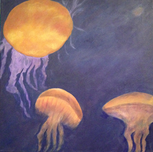
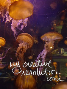
I was struggling with the color of the jellyfish. What I ended up with was a very orange color. No matter how many times I mixed it, I couldn’t get it to look like the photo. When I left off, I planned to use the eyedropper tool in Adobe Photoshop, to help pinpoint the colors in the photo. It certainly seemed like a good plan. Let’s see if it actually works!

jelly1

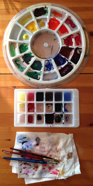
When I opened the photo in Photoshop and starting clicking around on the jellyfish photo, I was surprised to see the colors that came up – maroon, brown, tan, gold. I already felt that it was helping me “see” colors in the jellyfish that I wasn’t seeing. Since I use thalo blue, cadmium yellow and cadmium red to mix my colors, I decided the RGB (red, green, blue) breakdown of the colors was the most useful. I tried to mix and measure following this breakdown.

eyedroppertool

mixnew

My first try wasn’t great. I mixed a color which seem to match, but when I painted on top of my existing color, it didn’t look great. I guess the fact that I was painting on top of color, was an issue. The orange beneath my new color, was having an effect on the new color. I didn’t give up!

jelly2

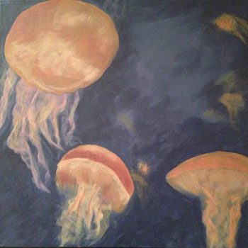
I kept mixing colors until I got something, that when I put it on top, it looked right. I feel like I’m starting to get there, but have my work cut out for me. I’m so inexperienced I pick hard things and don’t realized they are hard until I’m in the middle of it.

jellylast

The thing that I love about this photo is that it glows. The colors in my painting are dull and I’m not sure I can fix it – if I’m mixing the colors. Tomorrow I have off and I plan on attacking this painting to see what I can do!

jellyfish

Ice Cube Watercolor Palette

Ice Cube Tray Palette 2Yesterday, as I set up for my “winter” watercolor I had the best idea. Now, you may not know this but, I recently scrubbed my watercolor palette and set up my paints in the order of the color wheel. Most of the colors were straight from the tube, but I mixed a couple of them. (My palette has sponges that keep the paint from drying out.)

With this setup, I’m ready to paint. I can sit down and paint in my sketchbook without pulling out the tubes and squeezing out paint. The only hiccup is when I need to mix a custom color. I don’t want to dirty my palette! I was able to get away with mixing on a piece of tinfoil, but now I was anticipating mixing several colors. I didn’t want pieces of tinfoil all over the place.

I remembered an ice cube tray, long abandoned, in the back of the corner cabinet, where no one can reach. When I pulled it out, I was excited to see it had 3 rows!

As I rinsed it out, I decided to keep water in the top row. I mixed paint in one of the bottom row cubes. I took some of that paint and put it in the cube above it, and added a little water. Then I cleaned my brush in the top cube – the water cube. I now had, a row of cubes, all the same color, in varying degrees of wetness! Awesome!

I set up rows for the other colors I needed and started painting. It was great. I had 3 options to choose from for each color. It worked like a charm. I’ll use my ice cube palette from now on!