Beach Heart

Beach Heart painting
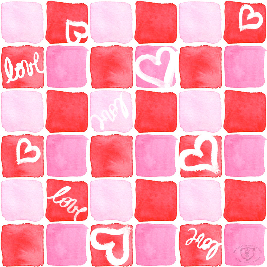
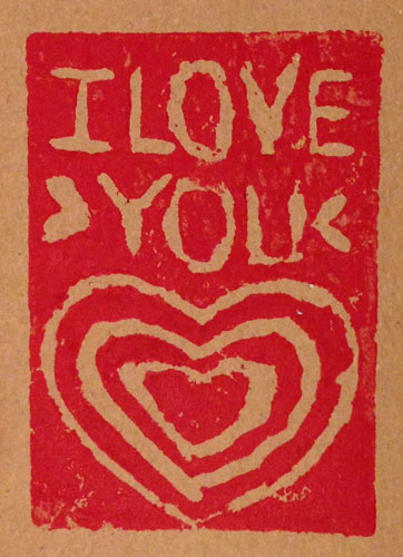
Painting this beach heart was as peaceful and relaxing as sitting on the beach itself. Before I sat down to paint I was looking through my work for something to post on Valentine’s Day. I usually don’t post things from my archives – not that there is anything wrong with that. It just sometimes feels disjointed from what I’ve been working on.

With Valentine’s Day and hearts on my mind, I sat down to paint and thought of a beach scene in the shape of a heart. I think practicing, and working out a process for painting the beach, was a great help in painting the heart from start to finish in one sitting. Ah the sense of accomplishment!

Have a happy Valentine’s Day!

14 tips on painting waves in watercolor


Drawing “cute” illustrations

happyvalentinesday
A while back, I worked hard to learn about illustrating in a “children’s book style.” I really studied up on it. (See below for the links to the posts I wrote on my progress.) This week I wanted to do a cutesy illustration of a boy with a box of chocolates and a little girl. I first bought a box of chocolates – we all need a little chocolate, right? Then I had my ten year old, pose with the chocolates under his arm and then as the opposite figure. I didn’t want the illustration to be realistic, but I figured having some reference photos would be helpful.

I went straight to my watercolor paper (taped down on a board), and drew with pencil. I didn’t like it at all. My son looked more like a man than a boy, and there was nothing cutesy about the illustration.

sketch1cd

I remembered how drawing something over and over, can really help me arrive at the results I want. So, the next day I pulled out my sketch book and did several versions of the little couple. I remembered the things I learned from observing children’s book illustrators:

  • exaggerate features – like big eyes or wacky teeth
  • color palette – stick to 3 colors
  • kids – small bodies, big heads
  • outline

Following this advice, I made the heads bigger and rounder, and the bodies smaller. The illustrations definitely looked cuter.
cutedoodles

I went back to my watercolor paper, erased the original illustration, and started over, following the style from my sketchbook.
sketch2cd

I thought a heart behind them would really emphasize the theme, so I painted a pink heart and a red background. Then I used my pen to create the ink outlines, using the pencil lines as a guide. I waited a bit, so I was sure the ink was dry, and erased all the pencil. I thought about the color palette I wanted. Instead of using blue from the tube, I added pink to it, to mute it, and make it work better with the pinks and reds.

I’m happy with the results, especially compared to my original illustration.

Have a wonderful Valentine’s Day. Lots of love from New York! And if you are also in the Northeast – stay warm!
Eileen

Other posts I’ve written about children’s book illustration style:

A Valentine’s Day Card and a past career

valentineEMcKennasmw
When my daughter was born fifteen years ago, I left my Art Director job to stay home. I did a little freelance work, but focused on starting a custom invitation and announcement business. Since I didn’t draw and paint the way I do now, the business was part work and part creative outlet. For a while I really enjoyed it, and created some beautiful things. I produced everything myself – trimming and folding, and often added hand details – bows, buttons, layered paper, etc.

This slideshow requires JavaScript.

At this point in the industry there were some websites out there, but nothing like the explosion that was to come. I did this on the side, while taking care of my three little kids, from 2000-2007/8. Over time I realized I was spending a lot of time – because it was custom work – designing, finding paper, etc. And I didn’t necessarily get paid for all of it – there was only so much I could charge (that people were willing to spend). It no longer felt like a creative outlet. And by this point, I was taking drawing and painting classes.

The way to make money was to offer a few designs to pick from – and then just fill the orders. But as a designer, what was the fun in that? At the same time, that I was losing interest in the business, the economy shifted. People were not willing to spend money on invitations. Also, the internet was exploding with cute, affordable designs. I toyed with the idea of opening my own online shop. In the end I didn’t, because there was so much competition, and I was burned out.

I started working part-time in an office (email marketing). I found it a nice break from the three little kids at home, and it was much much easier to separate work and home. I spent several years working, outside the house, as a Graphic Designer, dabbling in freelance work from home, and the occasional invitation. I now work exclusively for myself, directly for clients, offering Graphic Design (print/web), and Marketing (social media/email).

What is so amazing, is all that has happened since 2007. Randomly, on Twitter I found Thortful. Thortful is an app, that allows you to upload a card design – make it available to others and/or print it for yourself. They are new, and are just cards. (They are based in the U.K., so I’m wondering what shipping to the U.S. will be.)

Of course there are so many other sites that allow you to upload your designs and purchase and/or sell them on stuff. The one I’ve know the longest is cafepress.com. In the last few years, I’ve learned of society6.com, zazzle.com, redbubble.com, spoonflower.com. Many of these sites have their own twist. I’d love to know, do you have a recommendation?

I’m not sure as a designer, which gives you the best chance of actually making money – again there seems to be a lot of competition. I wonder if there are people out there who make a chunk of their living off these type of sites. It is nice, that you don’t have to handle the production. That you can outsource it without producing large quantities (that you don’t need/might not sell.) You can focus on being a designer. What an amazing world we live in. And what’s coming next?! 

Valentine’s Day Patterns

squarewrap
Last February I designed my second pattern, ever, in the Valentine’s Day theme. As I continued throughout the year, designing more patterns, my style evolved and my techniques changed. I wanted to design another pattern, this year, in the same theme, to see how I would approach it differently. Even though last year’s design was created with hand drawn elements – it was painted digitally.

Last year’s pattern:
valentine2015sm
Learn more about that process here.

This year I painted, in watercolor, several squares in pinks and reds. I thought it would be interesting to arrange them as tiles. The squares would be uneven and irregular because they were hand painted. Then (separately) I painted several hearts and the word love. In Photoshop, I arranged the watercolor squares, and “knocked” the hearts and words out of the squares, and created a repeating pattern.

The original artwork:
heartssquares

This year’s Valentine’s Day Pattern:
redpinksquaresfinal

I got extremely enthusiastic about my design and, even though I haven’t purchased a single Valentine’s Day gift, I ordered a roll of gift wrap from Spoonflower.com. I either have to start shopping for things to wrap, or start crafting. Hmmm, I have some ideas!

My 12 Surface Designs – one a month this year!

I’m really proud, and happy, that I followed through on my goal to start creating surface designs. I designed the first one in January, and decided to commit to “1 Surface Design a Month.” That goal, and the end of the month deadline, really pushed me to put in the work.

12 Surface Designs
January – Art Supplies

artpatternrepeat

February – Valentine’s Day
valentine'sdaypattern
March – Gardening
gardeningrepeatfinal2
April – Dahlias
dahliapatternv2
May – Sandcastles
sandcastleEM
June – Echinacea
echinaceapattern

July – Shells
shellspattern

August – Ice Cream Cones
watercoloricecreamcones

September- Feathers
featherspattern1

October – Leaves
leavespatterncolor

November – Nutcrackers
nutcrackersrepeating
December – Toy Soldiers
toysoldiers2_5inchhigh

I’m always asking you, “What’s your favorite?” And I would love to hear, but I’ll also tell you my favorites.

I really liked when I started using the technique of creating the ink lines and watercolor backgrounds separately and then merging them in Photoshop. I started this with the shell pattern. I think the watercolor really adds a depth that you can’t get with Photoshop brushes. I started this technique with the shells, and continued it with the leaves – which is my favorite design in this style.

My other technique is drawing the elements in my sketchbook and adding color in Photoshop. My favorite design, using this technique, is the Toy Soldiers. They are just so cute!

Will I be continuing with surface design in 2016? Absolutely! As you know, I’ve made the Nutcracker and Toy Soldier patterns available on Spoonflower, where you can have them printed as fabric or gift wrap. It is really interesting to see the designs printed and to think about how it will be used. It makes you think about the design, and what works and doesn’t. It’s a different perspective than just seeing it flat on the computer screen.

In the new year, I’ll be adding a few of the other “12 designs” onto Spoonflower. And I plan to continue designing one new one a month!

Striking while the iron is hot.

cupid-1
It is an amazing feeling when you are “into” a project and the creative ideas are flowing and you’re excited and inspired and motivated. I’m always better off “striking while the iron is hot” and working on a project when the inspiration first hits me. If I wait, sometimes the spark is gone. The enthusiasm dies down and it’s hard to motivate myself to work on the project.

When I’m in the “creative mode” I can move from one project to another and get things done, while new ideas are popping up, and it’s great! I’m on fire! Other times, I spend days thinking, “I should sit down and paint something.” For some reason, it is hard to sit down and do it, and gets harder as the days go by. Once I do sit down, and start, it all seems to come flowing back.

I also feel this way about blogging. I’ll be on a roll with ideas and posting, and then a couple of days go by and I start to question myself – “What should I post? I can’t post that!” I get kind of shy and start thinking, “Maybe I shouldn’t share that mistake.” Sometimes I have to remind myself that I’ve made a commitment (to myself) to be honest about my successes and failures. The best medicine, again, is to sit down and share and get the ball rolling again.

Cupid was a Sharpie doodle in my sketchbook that I scanned and painted in Photoshop. Follow me on Instagram to see my other Valentine’s Day inspired posts!

“Valentine’s Day Love” Pattern

valentine'sdaypattern
I’m in the heart/love frame of mind this week, as I am posting a new Valentine’s Day inspired photo to Instagram, every day from February 1st – the 14th! (@mycreativeresolution) So, it’s no surprise that my digital pattern of the month is also Valentine’s Day inspired.

I’m getting into creating art in Photoshop, especially with doodles that originate in my sketchbook. The process is a lot quicker than I thought it would be. And the amount of different textured brushes is awesome. Where have I been?!

I’m excited to continue trying new brushes – last month I used a watercolor brush for my January pattern. This month I used the Soft Oil Pastel brush. I wanted the background to have texture – but that can be an issue when you repeat the pattern because irregularities won’t line up. I used a fade so that it wouldn’t be an issue, but I’d like to learn more about the technicalities of creating repeating patterns.

It’s ironic that two of the things I’ve been working on so far this year, are so different! Linocut seems like an old craft, and digital illustration is on the other end of the spectrum! Time will tell how things shake out and in what form I continue to work.

It’s been so fun, I may have to do another pattern before February is over!

Here is the pattern without the repeat:
valpatternnorepeat

Linocut – The Mirror Test

heartpattern

I made the critical error of not reversing the type on my last linocut. At the same time as I penciled “Love” incorrectly, I also penciled “I love you” on another block. As I sat down to correct this second block, I realized that holding the block up to a mirror would be a good way to check that the print will read correctly.

Holding the corrected block up to the mirror:
mirrortest

After passing the mirror test, I carved this little block. Here is the print:
iloveu

I need to take more care when I draw the letters. I thought I could easily carve them, and make them look more square, but they came out raggedy. So, I decided to cut the top piece off and create a pattern using just the heart. (First image in the post.) Even though the heart was also raggedy, I like how the pattern came out. The roughness gives it character.

I was off to a great start with linocut. I was so happy with the results of my owl and the acorn. But the last two have been much less successful. I think I need to plan and sketch more carefully and (like anything worth doing) I need to practice with the tools. Also, as a beginner, working on small blocks isn’t helping me. I need to work larger.

Painting without a plan

loveflowers
While I’m sad that vacation is over, it is nice to have some quiet time to paint. What amazes me about these three paintings, is that I had no preconceived ideas until I sat down to paint – I just went with it. All three were done yesterday and they are all so different!

The first one I painted was the flowers in the container. I looked around my patio and picked the container just as I started painting.
flowerscontainer

The second painting was the hearts. I started painting the background, decided to leave the dry areas dry and filled one of them with a heart. Then I started adding more hearts and the word love. It is my favorite of the day – and I have no idea where it came from!

The third painting is the watercolor background with the ink flowers. I decided as I was painting – to make a colorful background and add ink to it. As I chatted with an old friend on the phone – I added the flower doodles. I looked around my yard for inspiration.

I am excited for another quiet day and more painting!