Digital Intervention with Photoshop

boywithleaves1
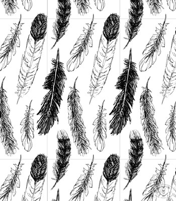
For the most part, I like to keep my art hand drawn or painted. The exception is when I’m working on designing a repeating pattern. But sometimes, my 20 years of experience with Photoshop, comes in handy with my artwork.

I painted this tree a couple of weeks ago and thought, “It really needs a boy playing in the leaves.”
treealone

Separately in my sketchbook I created a couple of version of the boy, based on my youngest son.
boywithleaves

I scanned both, opened them in Photoshop, and started playing around. The possibilities are endless!
boywithleavesfiguring

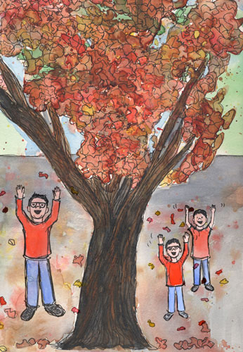
I choose one boy and added a shadow so he wouldn’t seem so “floaty.” I also added some extra leaves in an area that looked weird.

I don’t normally use Photoshop with my artwork because the original goal of “my creative resolution” was to develop my drawing and painting skills. But it is nice to have the tools to use, when the need arises!


Self imposed deadlines {and a leaf pattern}

leavespatterncolor
I remember, way back in elementary school, staring a project early, but never finishing it until the night before it was due. I needed the deadline to motivate me to finish.

All these years later I know the power deadlines have to motivate me. Now, I’m using this to my advantage. If I want to accomplish something I set a deadline. In my work, these soft deadlines are supported by the client waiting for the final product. In my creative life, these “made up” deadlines are supported by you. If I write on the blog, I’m going to do something, I intend to follow through on that promise. Whether anyone remembers or not!

This leaf pattern design is my October surface design. Yes, I’m a couple of days late, but I got caught up in my Halloween creations!

I’ve designed one a month this year! That’s 10 so far! I’m really proud that I set “surface design” as a goal for 2015 and have achieved it. I designed the first one in January. That’s when I committed to “a design a month.’ Setting the monthly deadline has made all the difference in pushing myself and getting it done.

Have you set deadlines for yourself? How did that work out? If you haven’t, are you considering it now? I’d love to hear!

If you’d like to learn how to turn your artwork into a repeating pattern, read this recent post.

How to create a repeating pattern in Photoshop {Feathers my pattern for September.}

featherspattern1d
Here is my pattern design for September. As you may have seen, I’ve been drawing and painting feathers all month, so it’s seemed appropriate to turn them into a pattern. I pieced this pattern together from my sketchbook (see below). I wanted this pattern to be much tighter than ones I’ve designed so far this year. This tighter pattern, required more playing and arranging in Photoshop becauses once I thought the pattern was “set” and I tried repeating it, things would overlap and I’d have to readjust and try repeating it again.
feathersinink

If you know Photoshop and want to try creating a pattern, I’ve included my steps below.

Creating a pattern in Photoshop:

  1. Scan artwork
  2. In Photoshop: separate each element of your design into different layers
  3. Within your artboard, create the area for your “repeat” using guides. (translation: use guides to create a box within your artboard. You can expand the canvas size before this step.)
  4. Arrange your elements. They can go over the guides.
  5. On a separate layer outline the guides to make a box.
  6. Create a group with the box and element layers – call it “original”
  7. Duplicate the “original” group. Drag to the right so the left edge of the box touches the right guide
  8. Duplicate the group again. Drag to the left so the right edge of the box touches the left guide
  9. Select the three groups and duplicate them. Drag the 3 duplicate layers up, so the bottom of the boxes touch the top guide
  10. Duplicate the three groups again. Drag them down, so the top of the boxes touch the bottom guide
  11. If any adjustments need to be made – delete all but your “original” group, make the adjustments and repeat steps 7-10
  12. When you are happy with your repeating pattern, hide all the layers with the box outline.
  13. Crop to the guides to create your “repeat.”


Below, you can see my boxes. The center box is where I have my guides (which are not visible).
featherspatternboxes

Slight variations on my feather pattern.
No distress in the background. 
featherspattern1

Distress shows yellow.
featherspatterndy

Which one do you like best? 🙂

Copyright 2015 Eileen McKenna. All rights reserved.

A Pattern for June – Echinacea


echinaceapattern
Just in time for me to design a pattern for June – our Echinacea bloomed. They are one of my favorite flowers. Today I’ve been painting them like crazy! Yesterday I drew a few of the flowers with a really smooth Pentel gel pen in my super smooth Strathmore pad. Today, I scanned them in and arranged and painted them in Photoshop. Hope you like it! 🙂
strathmorepad

See my past “monthly” patterns here:


Sandcastles (My May Pattern)

sandcastleEM
Sandcastles is the theme of my May pattern (I know, I know it’s already June). I’ve been working extra hard on this pattern because I’m entering it in a Spoonflower contest. This week’s theme is sandcastles and it’s so fitting this time of year!

With Memorial Day behind us, I can’t help but think of beach days! We are counting down to the end of the school year and making our Summer plans. We are lucky enough to live 10 minutes from the ocean. I grew up in a nearby beach town and as a kid, I spent my entire Summer on the beach. When I was old enough to work, it was as a ocean lifeguard.

When I saw that Spoonflower’s pattern contest was a sandcastle theme, I had to give it a try. You know I’m obsessed with creating patterns these days! This would be my first entry into a Spoonflower contest.

Below is my first draft. I made some edits, because I felt there was too much sand and it needed more details. Voting opens Thursday (spoonflower.com). 🙂
sandcastle

I’ve hired myself :)

A while back I mentioned that I started a marketing/graphic design blog for my business. What I didn’t mention is that I’ve been creating illustrations for most of the posts! I did share one of the illustrations here, in the post Painting Digitally. That illustration set the tone for the style I’ve used for the rest of the illustrations. I decided it was wise to keep things somewhat consistent and I like the motivation to work digitally. I usually avoid the computer when I’m illustrating, because I spend enough time on it when I’m doing Graphic Design.

Although it takes time, I enjoy creating the illustrations and I think it is good practice if I’m to have a future in editorial illustration. Plus I only charge myself a small amount – ha ha.

Illustrations for Marketing/Graphic Design blog:

This slideshow requires JavaScript.

Dahlia flower pattern {My pattern for April}

dahliapatterngreenw
Whew! Just in time! I’ve been contemplating April’s pattern for awhile now. I originally thought I’d use some of the flowers I created separately with watercolor and put them together in Photoshop. But it wasn’t working – too stiff looking:
otherpattern

So I went back to what has worked in the past. I sketched some flowers and leaves with Sharpie on Bristol (nice and smooth) and scanned them in. I pieced them together in Photoshop, added color, and repeated the pattern. I’m happy with how it came out. I love the loose sketchy feel.
dahliasketches

I tried to stay true to the colors of the plant I picked up at the supermarket. I think it’s a Dahlia. This little plant has been my inspiration all week! I do feel the color comes across a little Christmasy. Maybe it’s the shape of the leaves? I tried adjusting the hue in Photoshop and liked the results, especially the blue!

pinkdahlia bluedahlias

If you’d like to see my other patterns click here. 🙂


Painting Digitally

citybike

I’m still playing around with painting digitally! The original idea for this illustration was a quick sketch in a lined notebook. I intended on redrawing it more carefully, but I liked the messy one better!

Original sketch:
citybikescrap

I scanned it and opened it in Photoshop. I’ve been using Photoshop for years as a Graphic Designer, but I’m learning and practicing great stuff with brushes that I never used before. This previous post links to an awesome video tutorial. It opened my eyes to another side of Photoshop. Before watching it, I didn’t know it could be so quick and easy to add texture.

In Photoshop, I first went to Image > Adjustments> Levels and made adjustments so the paper didn’t show and some of the blue lines disappeared. Then, following what I learned in the tutorial, I made my sketch one layer and put the “multiply” effect on it. (When you select multiply all the white stuff disappears, only the black remains and the layer underneath shows through.) Then I did all the coloring in a layer underneath it.

My color layer:
citybikejustcolors

The sketch is visible on top of the color layer because “multiply” is selected:
citybikecolor

To give it character, I applied a mask to the color layer, and filled it with black. (The entire layer disappears.) I selected the Soft Oil Pastel paintbrush and painted white onto the black mask. (The white parts of a mask is what shows through.) This gives the effect you see at the top of the post.

It’s fun! Give it a try and let me know your results. 🙂

Valentine’s Day Mantle

valentinesdaymantle
I’ve been having fun the last couple of weeks creating art with Valentine’s Day in mind. I challenged myself to post my creations on Instagram for 14 days in a row. If you’ve been following, let me know which one you liked the best.

It’s been great, working within the same theme – coming up with different ideas and using different mediums. I’ve used watercolor, watercolor and ink, scanned doodles from my sketchbook and painted them in Photoshop, created a pattern, and a linocut. One more to go! Hmmmm.

My daughter’s art teacher gives them one word and they can execute it anyway they’d like. I love seeing her creations. It must be fun to be in the class and see how other people interpret the word. Their words have included – bounce, sticky, and bump. For “bump” my daughter drew a pregnant woman (focus on the bump) with a crib in the background. I thought it was very creative. Maybe I can sneak into the class!

I’m planning on another themed Instagram challenge – March 1 – 17th. The theme is St. Patrick’s Day (of course). Join me in the fun by including #mcrstpatricksday in your Instagram post. Join me for a day or all 17. It will be fun!

Have a happy Valentine’s Day!