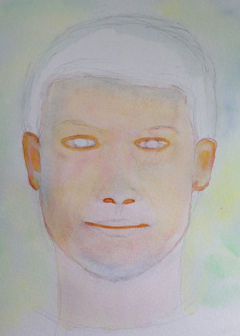
Halfway through my first lesson and I’ve learned a lot so far! Here are the key things:
- Skin color is a mixture of many colors. You don’t pick a tube and say this will be the color. For the demonstration I’m following, I started out using a Yellow, a Rose and Cobalt Blue.
- Work wet with light washes. I first painted a wash of the yellow and then added the rose to it. In certain spots I dropped in the Blue.
- One of the most important things I learned was – soften the edges! Whenever I added a “shadow area” I would soften the edges. This was one of my main mistakes in the past. I would paint a shadow area, not soften the edges and the result would be blotchy looking skin.
- Painting skin is a gradual build up of colors. Before, I would paint the face a solid and then try to add in the shadows.
I am excited about my progress so far! Watching TV last night, I was noticing the shadows that make up the face.
My “lesson” is from “Realistic Watercolor Portraits: How to Paint a Variety of Ages and Skin Tones,” by Suzanna Winton. I picked one of her demonstrations and I’m following along, trying to recreate it.
Here are my steps:
His face looks like a rainbow.

The “crevices” aren’t black shadows.

Even the lips have soft edges and are made up of different colors.


A success!
Thank you so much!
The portrait is very good!
Thank you! 🙂
Hi. Were you working from a photo to paint this portrait? Sometimes working from photos can make a portrait painting a little flat, until you get the hang of shadows. My first portrait painting teacher when I was sixteen was Caroline Wilhelm, (in Pacific Northwest) and she taught me not to be afraid of the bold shadow. That we tend to go lighter out of fear the shadow is too dark. Taking browns and blacks out of the caucasian skin tone palette and finding where there is actually orange or purple for example, created a truly three dimensional effect without making it muddy. Mixing the color black from viridian green, ultramarine blue and alizarine crimson instead of using it directly from a black tube brought the others colors in the face out subtly and into balance. Avoiding chromium colors was a big recommendation as chromium paints muddy colors. Painting is also about shape next to shape and not drawing lines to color in. The colors side by side create “lines” of their own. I primarily work in oils which is vastly different from watercolor and the layering or texture, but the principles are the same, you just have to be more careful with watercolor. Oil can be wiped off and started over…watercolor is easily lost. Looking up from your model and back to your paper is crucial to seeing the shapes that are really there and not relying on your preconceived eye of what an eye or nose looks like. I don’t know if I’m being helpful or clear…Anyhow, I don’t mean to be presumptuous or offer you advice you don’t want, but I see your potential. I loved your portrait of the bear. Your large signature of My Creative Resolution, tends to detract from your work as well, but that’s a personal choice and I understand wanting the credential especially on line. No matter what your commitment to painting is admirable and your nature work is very pleasant. I enjoy visiting your site very much.
Thank you so much for taking the time to offer such specific advice! I appreciate it and welcome it. I am trying to learn as I go and your advice is so helpful. This particular portrait was following along with a demonstration in a book and I am excited to try it on a portrait of my choosing. Soon hopefully. What are chromium colors? I was probably a bit aggressive with my signature on the bear. Lol! I was a newbie blogger back then. I am flattered that you enjoy visiting. Thank you for your compliments. You made my day and gave me a creative boost! 🙂
Hello again. I’m sorry, I meant cadmium not chromium. It’s in oils I know, and maybe not watercolors, so you are probably safe, but if you ever see cadmium as an ingredient, the mineral does cause a muddying of colors. Keeping the colors pure as they blend can be hard, so I also found the handy tip to mix no more than three colors generally to make one. You are right to not just use directly from the tube but to mix your own. A good book on “seeing” or “looking” that my grandfather gave me when I was a child but that is still immensely useful to people today is Drawing on the Right Side of the Brain by Betty Edwards. Maybe you’ve heard of it? She has great exercises like drawing a portrait upside down and other ways to challenge your normal approach. I’m glad you got a creative boost from my comments, as your process is so inspiring to see. I hope you always find the time to make your art.