Watercolor Week!

ocean
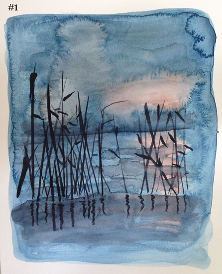
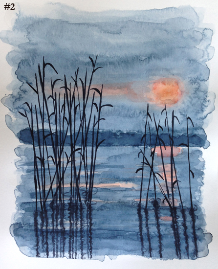
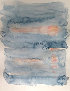
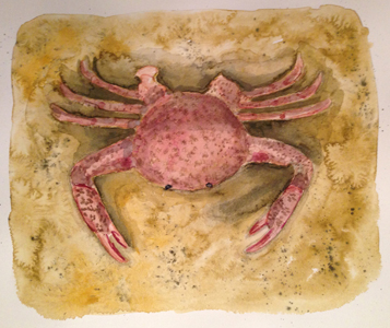
This week, I’ve ignored my “weekly checklist” and instead ended up being free and loose with watercolor. After struggling to paint faces the last 2 weeks, it’s a relief to just play, with no expectations and it was fun!

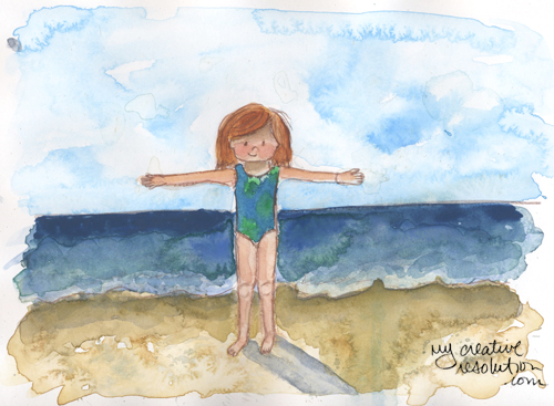
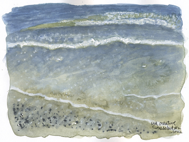
It’s been a while since I attempted a landscape of the beach. I didn’t have high expectations, I just thought, “Let’s give it a try.” I took the reference photo a couple of weeks ago. I grew up at the beach and love everything about it. I’ve always tried to capture it with paint and I’ve had some success and some failures. Water and sand are hard!

For this painting I decided, before I started, that I was going to use white. I think I’ve used white once before – and it wasn’t pretty! I started laying the background colors:
ocean1

Then, I added in darks and details, including the white foam. I have to admit that I’m proud of how it came out. It’s amazing how just playing can lead to unexpected success. I feel like each painting is a learning experience. 🙂

Fun and loose in the garden

garden
Today, I decided to sit outside and do a loose, fun watercolor. I didn’t overthink it. I tried hard not to overwork it and I’m happy with the results! It feels good to have some success after two weeks of torment! The week before last, I struggled with beach girl’s face. Then, last week I took a step back and tried to figure out watercolor faces. She is still a work in progress.

Today’s steps:
garden1 garden2 garden5

Back to the drawing board with Beach Girl’s Face

backtodrawingboard
Last week I struggled with the face of my “beach girl” in a fun watercolor painting where she was floating in a pool. I “erased” her face several times and destroyed the paper. It was extremely frustrating.

Looking back I realized that just diving in to paint her face was a bit of a mistake. I haven’t quite figured out how to paint her face. A while back I arrived at a cute pencil drawing of her face, but how does that apply to watercolor? I’ve decided I don’t want her to have just a couple of lines and dots – for eyes. I want to add a little more detail. But I’m not sure how.

It was naive of me to think I could just wing it. If I had started with her face, in the floating painting, I would have thrown away several versions. Instead I painted everything around her face and thought I’d figure it out. (That is the Aries in me!) I now realize figuring it out is going to take time, work, patience and lots of practice.

I’ve been working on this all week. First I did pencil sketches using photos of my daughter (the inspiration behind beach girl). It is amazing how hard it is to capture the essence of a person. Is it the shape of her eyes? her chin? Then I spent time mixing colors, to figure out the right skin tone. I mixed Permanent Rose and Cadmium Yellow pale. Then I added Yellow Ochre. I’m still playing around with how much of each. And I’m still struggling with what color to mix for the shadows on her face. Add payne’s grey? or the compliment?
mix2mix

I painted the shape of her head in the skin tone. Then I experimented with adding the detail – the hard part! I hated all of them. But, I learned from them – the pencil is too sharp and fine, too much detail in this one, etc.
skintone

Today, I decided to try again. Before I started I looked at sample watercolor illustrations. Then, I tried again. I haven’t gotten there yet, but I am further along then last week!

Floating in the pool

floating
Beach girl is playing in the pool! I can’t wait for the lazy days of summer! With two kids “moving up” this past week was crazy busy. I’m looking forward to the summer days when we say, “What should we do today?”

Painting the water was fun.
floating1

I struggled a lot with the shading on beach girl’s body. I can’t tell you how many times I “erased” watercolor and tried again – too brown, too black, etc.
floating2 floating3

And her face! I wasn’t sure I’d ever be able to present this piece too you. I erased her face so many times, the paper was a wreck and she looked scary. Because I was “done,” I scanned it in and did the best I could to give her a new face (in Photoshop). What are you going to do? Time to move on.

BTW – When I was in high school (a while ago) I saw a painting at MOMA called “Drifting.” What was so cool about the painting was that the dingy in the painting wasn’t centered on the canvas. It was literally drifting off the canvas. What a lesson in composition! I’ve never forgotten it. I’d like to say that beach girl is purposely floating off the page. In reality, I was following a photo I had taken.

I’m looking forward to more time for art next week and more successful projects!

Watercolor redo

reeds1
Which one do YOU like better? Above is my first attempt. I started very wet – probably too wet. It was for fun and I really didn’t have any expectations. So I worked wet, messy and quick. But when it was finished I thought – It’s kind of cool. There is some real potential here. Maybe I should try it again and be more careful.

Below is my second attempt.
reeds2

With the first one, I did the background sky/water and sun all at the same time.
reeds1a

With the second one. I first painted the sun and reflection, waited until it was almost dry and then added the blue.

reeds2a reeds2b reeds2c reeds2d

The inspiration for these paintings came from a cool photo I found in the book “A Pocket Guide to Seashells & the Seashore.” The picture credit is “Digital Vision.” I was drawn to the colors. Specifically, that all the color was in the background and the foreground (the reeds) were black.

I was trying out a new paper – unsuccessfully. I’ve been using Strathmore “Bristol” for my watercolors, because it is bright white and smooth. For these paintings I used Strathmore “Vellum.” I know that I need to find better watercolor paper! I just don’t love the textured watercolor paper. I also bought an Arches hot press art board to try out.

Beach girl – 2 different approaches

beachgirl3
I decided to try my recent approach to watercolors: Start with the background and play. I wet the paper, brush on color, add drops in areas, even splatter! It’s amazing what a difference in the backgrounds (above and below). Which is better? Hmmm. I love the sky above. (btw – This exercise was more about the background than beach girl herself.)
beachgirl2a

It’s been a while since I worked on my beach girl! Last time I worked on her, I practiced her face. I found a face I liked, but I’m having a bit of difficulty. When I redraw her, she looks different and if I use pencil instead of ink, she looks different. There is more playing and practicing to be done!

The inspiration to try the “background first” approach to beach girl came from an interesting blog post – “10,000 hours” and the link contained in it (Alina Chau’s watercolor tutorial.) Wisteria Interior’s post inspired me to not give up and keep trying. And as I read Alina Chau’s tutorial I started to wonder, “Why wasn’t I using all my watercolor techniques on beach girl?” It was like an “aha” moment. So, thank you!

In a beachy kind of mood

crabfinal
I am really looking forward to summer. I’m a beach girl, so naturally I love painting anything that has to do with the beach.

Here are the steps I took to paint my crab:
1. After sketching the crab, I wet the background and added paint. I really love doing the background first. I think I feel more free to play with the watercolor, adding splotchy areas and even flicking spots on it. I tried hard to make it look like sand.
crab1

2. I worked on the crab, adding in the red parts on the claws and legs and the dots to the shell. It still needs work, it looks too flat, like it’s one with the background.
crab2

3. I added shadows under the crab and to the shell added shadows and more details.
crab3
I added even more detail to arrive at the final crab.

I was inspired by fellow blogger, Sara Gourley’s painting of a blue crab. I decided to paint one that looks like the kind of crabs we see at the beaches around here.