
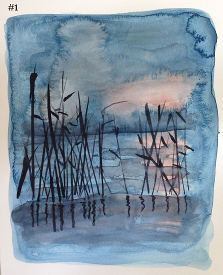
Which one do YOU like better? Above is my first attempt. I started very wet – probably too wet. It was for fun and I really didn’t have any expectations. So I worked wet, messy and quick. But when it was finished I thought – It’s kind of cool. There is some real potential here. Maybe I should try it again and be more careful.
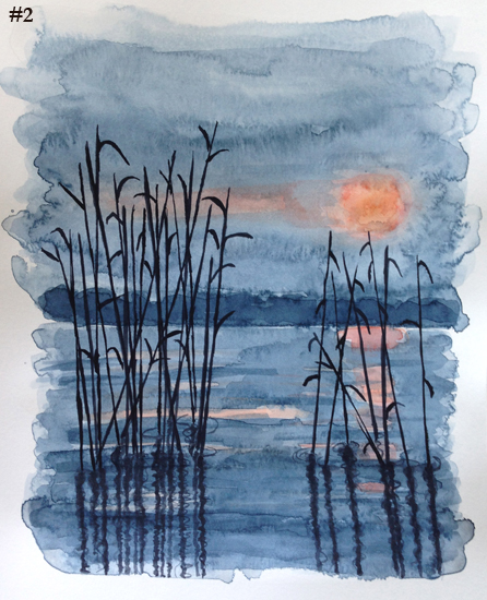
Below is my second attempt.
With the first one, I did the background sky/water and sun all at the same time.

With the second one. I first painted the sun and reflection, waited until it was almost dry and then added the blue.
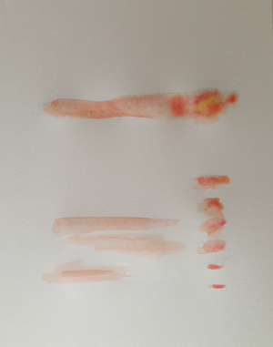


The inspiration for these paintings came from a cool photo I found in the book “A Pocket Guide to Seashells & the Seashore.” The picture credit is “Digital Vision.” I was drawn to the colors. Specifically, that all the color was in the background and the foreground (the reeds) were black.
I was trying out a new paper – unsuccessfully. I’ve been using Strathmore “Bristol” for my watercolors, because it is bright white and smooth. For these paintings I used Strathmore “Vellum.” I know that I need to find better watercolor paper! I just don’t love the textured watercolor paper. I also bought an Arches hot press art board to try out.


#2 looks great. I find watercolors so tricky. I seem never to wait long enough for things to dry before I add more paint, then everything gets smudgy.
I still have some improvements to make on my bench painting. Got sidelined this week by a virus generously shared by the youngest member of the household. But I’m on the mend now. I’ll probably work from the photo–seems easier.
Have a great weekend!
Thank you. They are tricky, because they do what they want. I had a teacher who said if the paper feels cold, it is still wet. I usually wait overnight, if I want it totally dry. Glad your feeling better!
Both are nice, but I like better the second one because of more depth and details. 🙂
Thank you, and thanks for letting me know. 🙂
there is a nice spontaneity to the first one 🙂 Somewhere in-between is probably perfect!
I totally agree! ugh. It’s hard to fix it and keep all the good aspects too.
I like the one where you let the orange dry a little.
thanks! I appreciate your comment. 🙂
They’re both nice. The second one shows you took more care, so it’s a little stiffer. I think you’re right that you need better paper. I’m surprised you like the smooth, but not the rough. Did I read that right? The rough will let you do what you wanted in the first attempt and, thus, preserve the spontaneity without spreading out of control~~as long as you get the right amount of water. Oh, the woes and joys of watercolor! I really enjoy your experiments and letting us choose! Very fun.
Thank you! I agree the second is stiffer. That’s the problem with trying again – you fix some things, but might loose some of the good things. I am going to try the rough paper again. You convinced me. lol! I’m glad you enjoy choosing! 🙂
I like aspects from both: the reeds and rushes are much more interesting in #1 (a tad too “perfect” looking in #2); the sunset (orange in sky and on water) in #2 is spectacular–gives it great oomph……in a laid-back way 🙂
I like the elements of both. Maybe you need to do a 3rd one? 🙂
Beautiful work! I cant wait to see some more. Remember though keep those brushes away from that coffee =]
Thank you! I’ll try, lol!