Watercolor: Building up the Layers

finalsunflowersketchbook
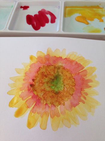
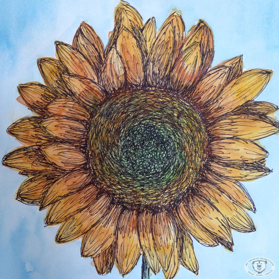
When I first started working in watercolor I was intimidated by paintings with highlights and shadows. I thought I couldn’t possibly paint several layers. I hoped I could paint one layer and make it good enough. As I got comfortable with watercolor, I realized it’s all about building up the layers of paint. You start out in the ugly stages and as you add, and add, you [hopefully] turn the ugly duckling into a beautiful swan. I liked that you built it up, because mistakes could be covered or fixed. Each brushstroke wasn’t make or break. It’s a process.

This is what I was thinking about when I painted this sunflower this morning. How the ugly stage was awfully ugly! And how each layer of watercolor I added made the painting better. Originally I planned to add ink to the flower when I was done painting. As I got closer to finishing, I liked it the way it was. My daughter agreed.
sunphasebsunphase1
sunphase2sunphase5

Gardening Pattern

gardeningrepeatfinal2
Now that the snow has melted in the backyard, I have gardening on my mind. And painting outside! I can’t wait to have inspiration growing in the garden! My husband likes to call gardening “digging in the dirt.”

This gardening pattern, my March pattern, is the first I’ve painted in watercolor. The other two patterns (art/January and love/February) were painted in Photoshop. I limited the number of colors I used, so the items would be uniform. I scanned the illustrations and arranged them in Photoshop.
gardeningelements

After I liked how the elements were arranged, I created a frame and duplicated the entire group several times. First, I checked how the items repeated left and right.
gardeningrepeat1

Then I checked how the elements repeated top and bottom. I had to make some adjustements when things overlapped.
gardeningrepeat2

I am happy with how it came out. It’s my favorite pattern so far. It’s amazing to see sketches turned into a pattern and looking so finished. Happy Spring! 🙂

Many Versions…

leprechaunversions
For the last couple of weeks, I’ve been creating illustrations for St. Patrick’s Day and posting to Instagram. For each idea I have, I draw/paint multiple versions to see which one I like the best. It dawned on me, the it isn’t just hand-lettering that takes “Practice, practice, practice.” I have to draw several “takes” before I create an illustration that I like. I also take pictures along the way to see how the illustration will look when it’s finished, and to make sure I like the background and how it fits in the shot.

This way of working is new to me. In the past, I’d sit down to create a painting, and try to make it work. I began working in this way since starting my themed postings (first Valentine’s Day, then St. Patrick’s Day). I doodle, I paint, I plan in pencil. I try again. I wouldn’t say it’s about getting it perfect, it’s more about warming up and trying different things.

I really enjoy following one theme. The first couple of days are easy. After that, there is the period where I’m like, “What am I going to do now?” In both cases, the more creative ideas came to me towards the end of the campaign. I guess it’s the time when I dig a little deeper. All the obvious ideas are out of the way, so I have to think harder.

This Valentine’s Day post was one of my favorites:
helovesme

This grumpy guy is my favorite St. Patrick’s Day post so far:
leprechaun

Exciting News…

countrylivingpost
Yesterday, Country Living Magazine reposted my Instagram pic! In their April issue they asked readers to post “how and where” we enjoy Country Living. I shared the above picture of my sketchbook, where I created illustrations from the April issue.

Here is the back story, so you can fully understand why this is so awesome to me. 🙂

  1. Sometime after 2001 – Girl (new mom, me) from the suburbs of NYC falls in love with Country Living Magazine. She finds it creatively inspiring.
  2. 2014 – Girl starts mycreativeresolution.com and includes Country Living as one of her inspirations.
  3. Girl sees illustrations in Country Living and dreams about one day creating illustrations for the magazine.
  4. 2015 – Girl thinks about approaching Country Living with a sampling of “country” illustrations. She works towards this but doesn’t follow through.
  5. Girl reads April issue of Country Living and sees the call out to share on Instagram. She pulls out her watercolors.
  6. Girl posts picture of sketchbook with #mycountryliving.
  7. Country Living “likes” girl’s post. Girl goes crazy with excitement. Shares news with family.
  8. Country Living starts following Girl (@mycreativeresolution). Girl gets more excited. Shares news with family.
  9. Several uneventful days pass.
  10. Girl checks Instagram and sees numbers – next to the likes and follows – that don’t make sense. 44 likes? 23 new followers? Instagram must be broken.
  11. Girl realizes that Country Living Magazine reposted the sketchbook picture – thereby sending people to Girl’s Instagram. Girl passes out from excitement.
  12. Girl recovers and at the end of the day, realizes she has 43 new followers. 888 people liked her picture on Country Living Magazine’s Instagram!


Is this story over? I hope not. 🙂

Practice, practice, practice…

hlerin
Last week I participated in an online hand-lettering workshop. Impatient person that I am, I quickly realized that this craft takes a lot of practice! Today I sat down to write a Gaelic phrase, “Erin Go Bragh,” which means, “Ireland Forever.” (It’s March, I can’t help but celebrate my Irish roots.)

hlpractice

I wanted to write the phrase perfectly, so I kept practicing. After a couple of tries I started to “get” how the words best fit together. Thirty-four tries later, an hour later, my hand was tingling and it still wasn’t perfect! My letters were definitely improving, but I have a long way to go. To get the hang of hand-lettering, I’ll have to work at it. And this is only one style of the alphabet!

I’ve hit on several of my goals for 2015 and it’s only March. Here’s the list of things I wanted to try:

  1. Linocut
  2. Lettering
  3. Online workshops
  4. Painting on dark paper
  5. Doodling
  6. Video
  7. Patterns
  8. Maps
  9. Digital Brushes
  10. Watercolor Parties


I’ve tried linocut, practiced lettering (with the help of the online workshop), doodled, made a few patterns, and used digital brushes. I’m happy I’ve achieved this much already. The problem is – to excel at any one thing, takes time and work. And time is in limited supply. As I continue trying these things, I have to decide which things I’ll stick with and which I’ll have to say goodbye too. 😦

Finding my groove.

I’ve been all over the place this week, creatively speaking. With extra time on my hands, I participated in an online hand-lettering workshop, I painted with acrylics (for the first time in months), I created St. Patrick’s Day art, and I painted in my sketchbook. Even with all of these different projects, I’m realizing what I love and what my focus should be.

Not that long ago, I worried that my creative journey didn’t have a clear path. That I was headed in too many different directions. Back in January I wrote a post, “But where am I going?” As I mentioned in that post, I found the book, “Making Art A Practice: How To Be The Artist You Are,” very helpful. The Author, Cat Bennett, suggests that you analyze your work and look for connections in theme and style.

I’ve been looking through my work and I’ve noticed what current projects make me happiest. It’s funny because I started scratching away with the ink pen (on watercolor) on a whim, but each time I do it I love it. I feel like I’ve found my style. I won’t stop exploring other things – lino, lettering, patterns, etc., but I now have a focus.

Here’s a collection of new and old illustrations that feels like “me.”

So excited! (Calligraphy Workshop)

calligraphyworkshop
Today I started an online Calligraphy workshop. I really like it. One of the supplies for the workshop is a Tombow brush pen. I have smaller Tombows, but this pen is awesome! This is exactly what I was looking for – hand lettering with a brush (not a nib and ink). The pen makes it almost easy.

The workshop is about an 90 minutes. I made it halfway through. I still have to do the lowercase letters. I’m so impatient, I want to jump right to the fun stuff! I know taking the time to learn each letter and practice will pay off. Can’t wait to show you!

Happy March! Time to pull out your green!

shamrock1
I’m planning another Instagram art series and I’d like you to join in the fun! The theme is St. Patrick’s Day. Include #mcrstpatricksday in your Instagram post. Join me for a day or all 17 days (March 1 – 17th).  It will be fun!

I had a great time last month posting Valentine’s Day art for 14 days. Working within the same theme was really interesting. You really explore the theme as the days go by, and you come up with different ideas. I used several different mediums: watercolor, watercolor and ink, scanned doodles from my sketchbook and painted them in Photoshop, created a pattern, and a linocut.

Hope to see you on Instagram! Look for me: mycreativeresolution 🙂

Painting Digitally

citybike

I’m still playing around with painting digitally! The original idea for this illustration was a quick sketch in a lined notebook. I intended on redrawing it more carefully, but I liked the messy one better!

Original sketch:
citybikescrap

I scanned it and opened it in Photoshop. I’ve been using Photoshop for years as a Graphic Designer, but I’m learning and practicing great stuff with brushes that I never used before. This previous post links to an awesome video tutorial. It opened my eyes to another side of Photoshop. Before watching it, I didn’t know it could be so quick and easy to add texture.

In Photoshop, I first went to Image > Adjustments> Levels and made adjustments so the paper didn’t show and some of the blue lines disappeared. Then, following what I learned in the tutorial, I made my sketch one layer and put the “multiply” effect on it. (When you select multiply all the white stuff disappears, only the black remains and the layer underneath shows through.) Then I did all the coloring in a layer underneath it.

My color layer:
citybikejustcolors

The sketch is visible on top of the color layer because “multiply” is selected:
citybikecolor

To give it character, I applied a mask to the color layer, and filled it with black. (The entire layer disappears.) I selected the Soft Oil Pastel paintbrush and painted white onto the black mask. (The white parts of a mask is what shows through.) This gives the effect you see at the top of the post.

It’s fun! Give it a try and let me know your results. 🙂