12 Tips to Improve your Watercolors

1. Look before you paint. I’m so impatient I want to dive in and start painting. I need to remind myself to stop and observe before my brush hits the paper.

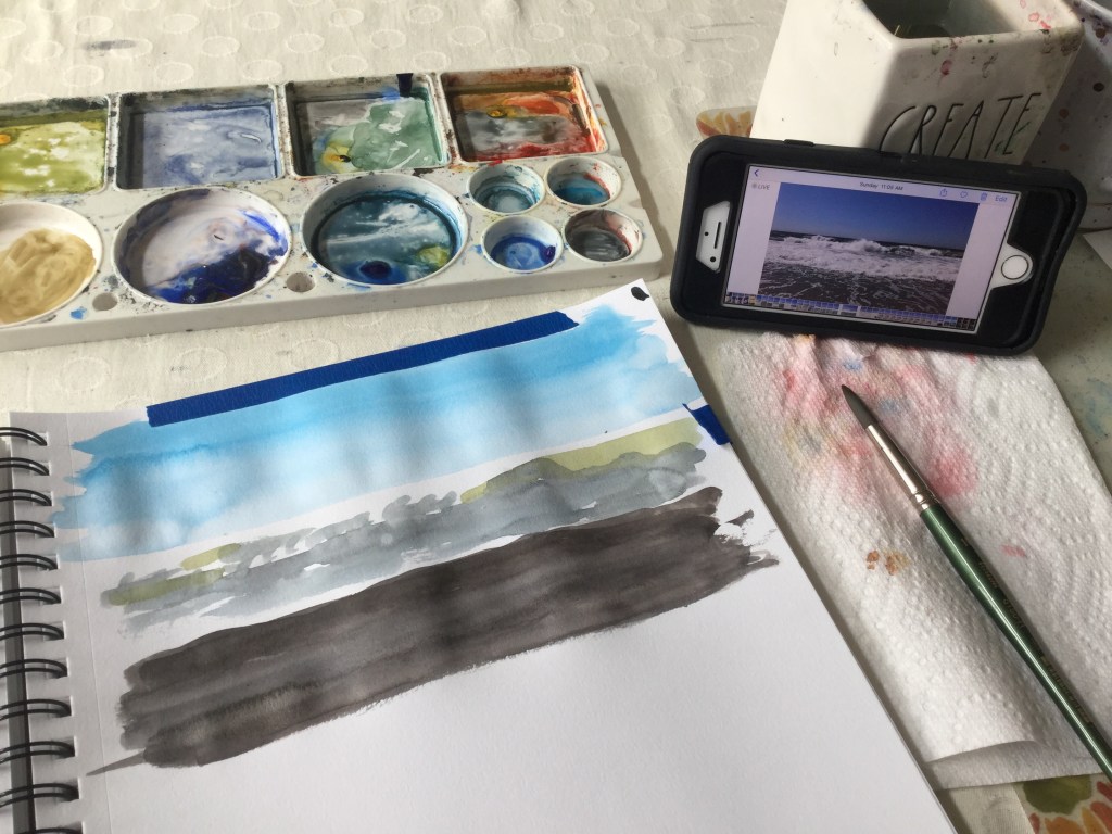
2. Paint the same subject over and over. Painting is seeing. The better you see your subject, the better your paintings will be.

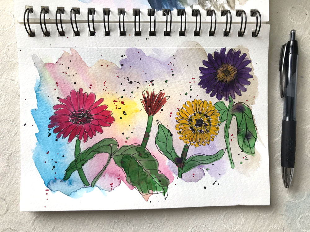
3. Play in a sketchbook regularly. You’ll feel more free to experiment. A sketchbook takes away some of the pressure and the fear of “ruining” a painting. My favorite is the Canon Mixed Media XL.

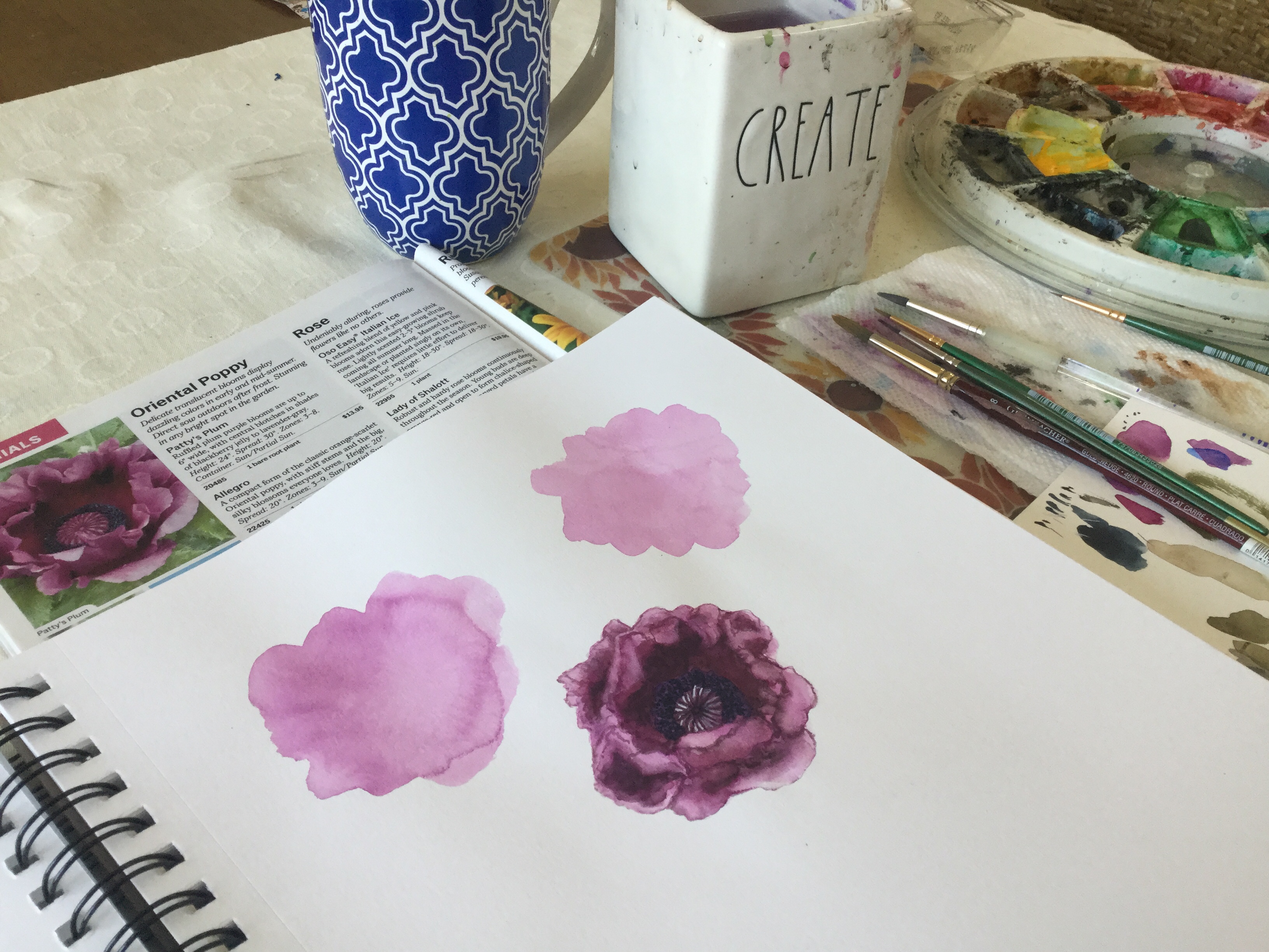
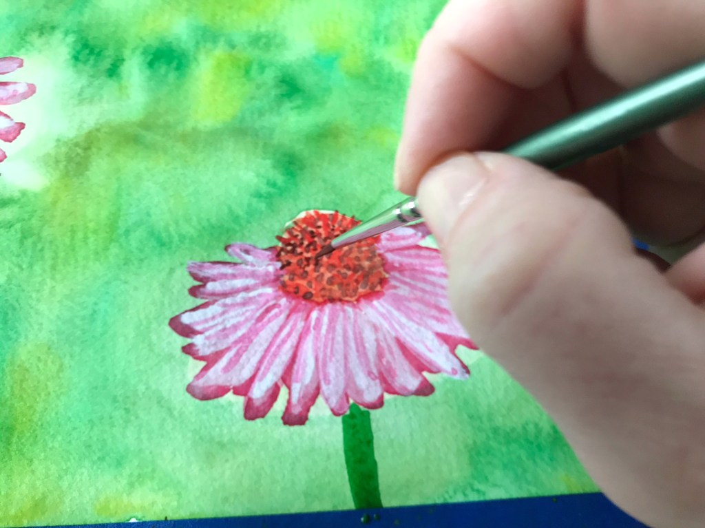
4. Add more layers of detail for more realistic looking paintings. Don’t forget to allow for drying time between layers.

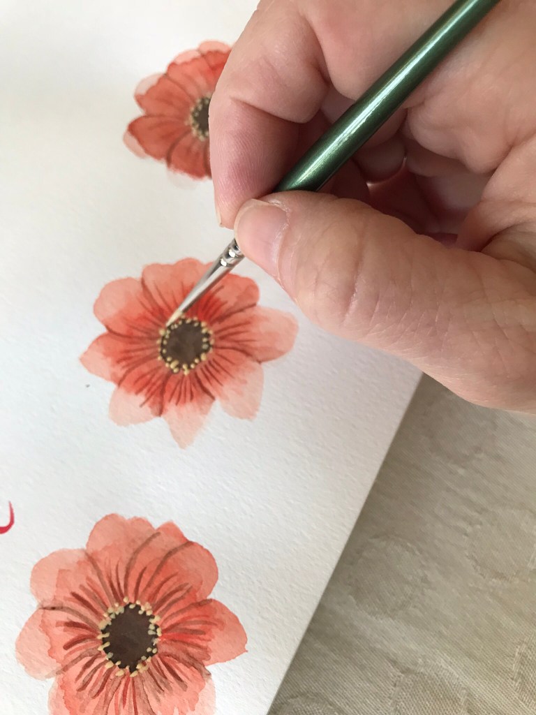
5. Invest in thin brushes for finer details. I use a 3/0 brush and 5/0 brush. These brushes have made a huge difference for me.

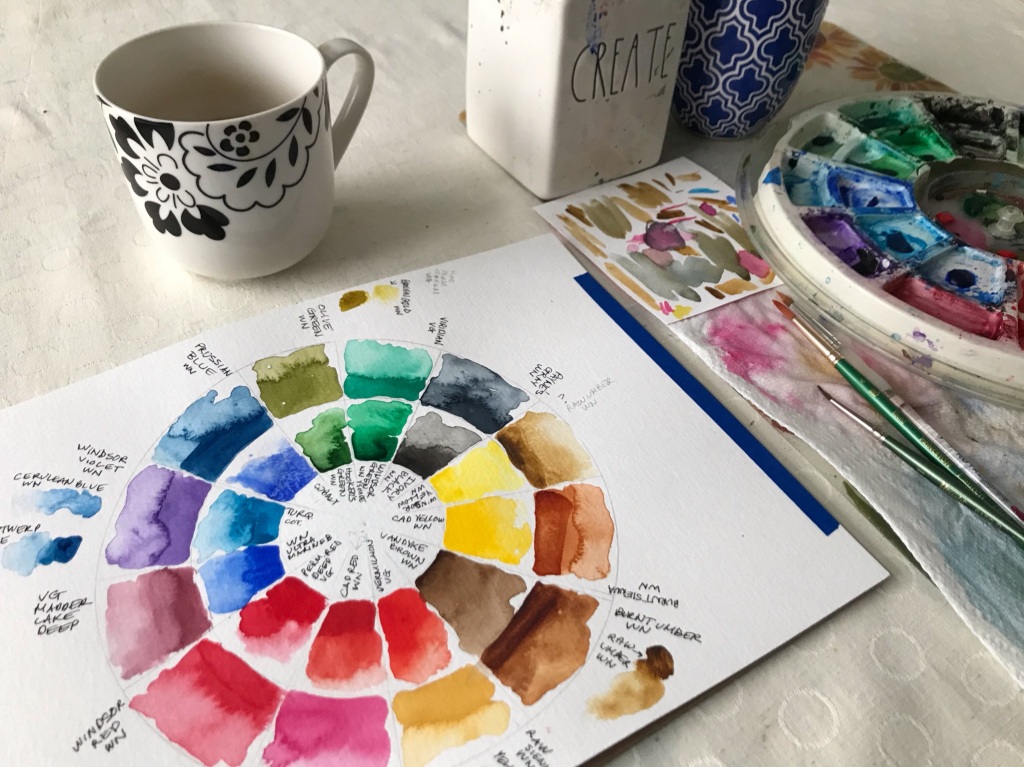
6. Create a color key of all your paints. Paint each color at the darkest (less water) and the lightest (more water). This color guide will help when selecting your colors. It will show you what your paints are capable of.

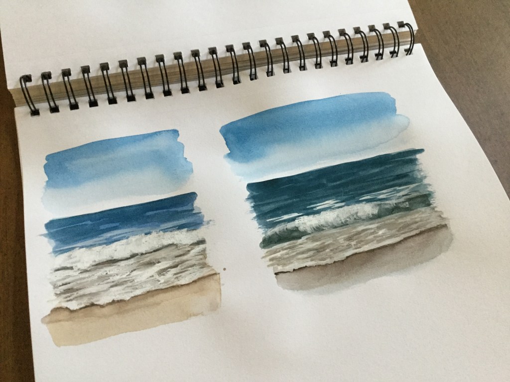
7. Mix your colors from the primary colors. Even though I have tubes of paint in many colors I often use Winsor & Newton cadmium red, cadmium yellow and ultramarine blue to mix almost all of the colors in a painting. I especially do this when painting seascapes, as it allows for more natural looking ocean colors and allows me to mix more variations on the blues, greens and browns.

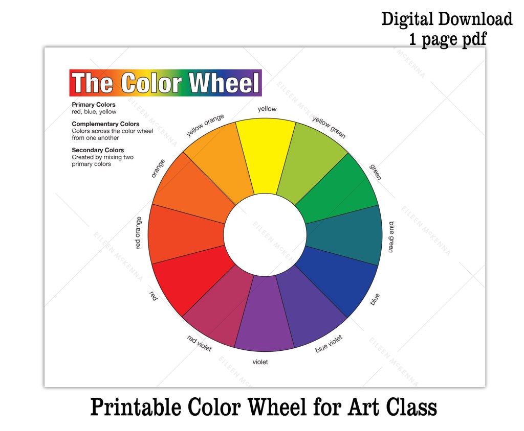
8. Create shadow colors by mixing a color with its complement. Sometimes using black for shadows can be harsh and unnatural looking. Instead mix a color with its complement. Colors across the color wheel are complements – red and green, blue and orange, etc. If you need a color wheel – I have a printable one in my Etsy shop – click here.

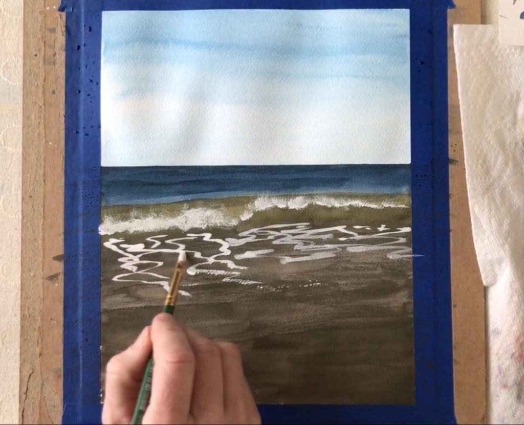
9. Use painter’s tape to mask areas and to “draw.” I use painter’s tape to tape my watercolor paper to a piece of cardboard to keep the paper from buckling when it gets wet. I also use tape to help me paint a straight horizon line. Sometimes I use it to “draw” a shape and mask an area.

For example a couple of pieces of tape can create the shape of a lighthouse. Then you can freely paint the sky without having to paint around the lighthouse. You paint right over the tape and then peel it up (carefully), when the sky color dries.

10. Add white back in by using white gouache. Instead of leaving white areas blank (the color of the paper), I often add back the white at the end of a painting using white gouache. Gouache is thicker and more opaque than watercolor. I use this when I’m painting seascapes.

11. Try new things and experiment. It’s easy to get comfortable in the way you paint. But it can be beneficial to mix things up. I was “stuck” using 6” x 6” paper until I accidentally ordered bigger. I never went back!

12. Learn from others. Read a blog post, watch a YouTube video, do a painting tutorial. Getting other people’s perspectives and painting tips can be invaluable to your painting process!

I have variety of printable tutorials and video lessons that teach watercolor fundamentals and techniques while you create a beautiful final painting. Browse painting tutorials here.

Coneflower painting lesson

Read Next

Watercolor Wisdom – 12 tips from 12 years of painting

watercolor wisdom – 12 tips from 12 years of painting

Learn Watercolor

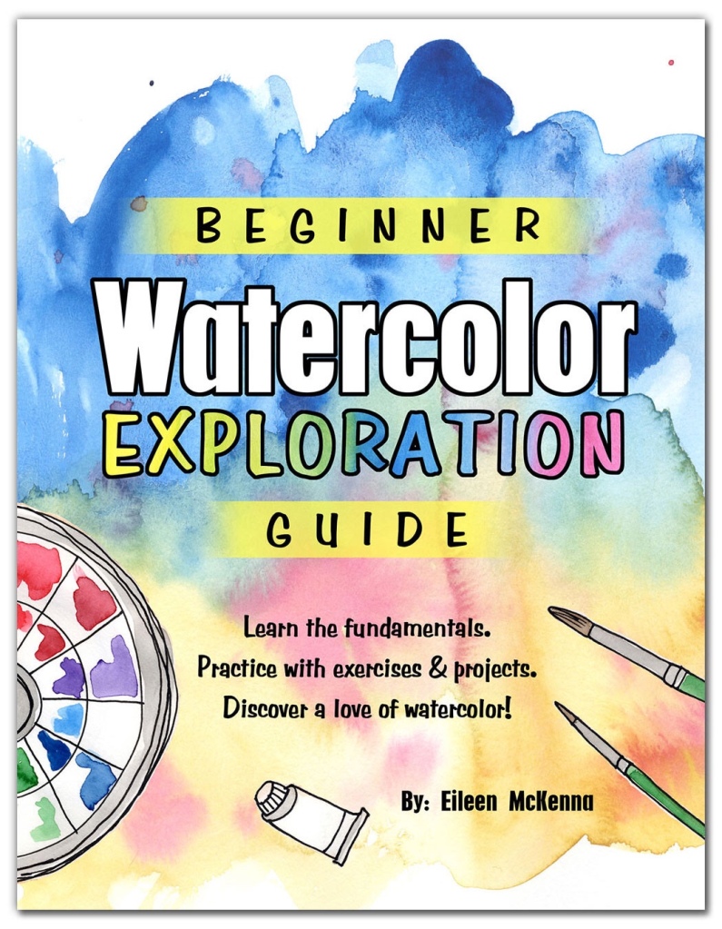
Learn the fundamentals with fun painting exercises and projects! Click here for more info.

This post contains affiliate links to products/brands I use and recommend. I earn a small commission whenever you buy using these links, at no additional cost to you. Thank you for supporting my blog!

6 Tips for Watercolor Success

Watercolor Seascape by Eileen McKenna

Watercolor is such a magical medium! I love it. As I sit and paint I often think that no matter what the subject – a landscape or illustration – the painting process is similar. There are basic concepts that apply to almost every painting.

If you are new to watercolor – welcome! Think about these concepts as you paint:

Basic Watercolor Concepts

  1. Work light to dark.
  2. Work wet to dry.
  3. Work bigger brush to thinner brush.
  4. Build up the layers of paint, remembering tips 1-3. Allow time for paint to dry between layers.
  5. Unless you want colors to bleed into one another, do not paint next to wet paint.
  6. Find opportunities in your subject for the bleeding and blending of colors – that is the magical quality of watercolor! 

Basic Watercolor Concepts explained

1-3. Work light to dark. Work wet to dry. Work bigger brush to thinner brush.

When you begin a painting your brush should be fairly wet (with paint and water). The paint should glide onto the paper. You can even wet the page or an area of the page with water before you touch the brush to the wet surface.

These beginning blobs are the first layer of your painting. Usually they are the lighter colors. After they dry you can add more paint on top of them. With each layer your brush should be less drippy, so you can paint finer and finer details. With a drier brush the paint spreads less when it touches the paper.

4. Build up the layers of paint

The stages of a watercolor painting are like a camera coming into focus. The first layer is blurry. Each layer gets more and more crisp and detailed. Let the paint dry before adding another layer, so it doesn’t bleed into the last layer. As you paint the later layers, work with a thinner brush. It makes it easier to paint fine lines.

5-6. Watercolor bleeding and blending

When you want it to happen, the bleeding and blending of colors is beautiful. It creates such interesting effects. The watercolor paint is doing the work for you! Think reds and greens bleeding into one another to create fall foliage. When you don’t want this happen, let paint dry before adding wet paint near it.

For more watercolor tips sign up for my weekly newsletter:

Processing…
Success! You're on the list.

Ready to start in watercolor?

Try my “Beginner Watercolor Exploration Guide” where I walk you through the fundamentals of watercolor with exercises and projects. Learn by doing. Discover a love of watercolor today –> Learn more here!

Beginner Watercolor Exploration Guide
Six tips for Watercolor Success

Watercolor Basics free download!

Watercolor Basics free pdf download
I have been painting in watercolor for over twelve years. When I first started out I didn’t know anything about paper or paint or even brushes. For months I used the wrong paper and it showed! Over the years I’ve tried different paints, papers and brushes. I created the “Watercolor Basics” pdf to give you the information I was missing when I started. I want you to start your watercolor journey with the right tools and tips, so that you’ll have success and develop a love of watercolor like I did! 

To receive the free pdf, just sign up for my weekly newsletter – a collection of all the things inspiring me, in hopes of inspiring you! 

Sign up for the Watercolor Basics free download here!

*****

Ready to get started in watercolor? The “Beginner Watercolor Exploration Guide” is for you!

  • Learn the fundamentals.
  • Practice with exercises & projects.
  • Discover a love of watercolor!

Learn more here!

Beginner Watercolor Exploration Guide pdf download | how to guide beginner watercolor

Watercolor Wisdom

I started painting in watercolor about twelve years ago when I enrolled in a class. A few years later – during the early days of my blog – I gave myself the freedom to explore everything and anything. I came back to watercolor to make working in my sketchbook more fun, and remembered how much I loved it. Watercolor has been a focus of mine ever since. Here are the most impactful things I’ve learned.

Tips for Painting in Watercolor

Embrace the magic. When I showed my teacher my first watercolor painting she said, “No, no, no, you’re drawing.” I was quite proud of my painting and didn’t understand what she meant. But as my familiarity with watercolor grew, I began to understand. Allow watercolor to do its thing. Colors bleed into one another creating interesting effects. It’s magical!

Watercolor Sunset Painting by Eileen McKenna

Go with the flow. Give up control. Some people say they don’t like watercolor. I think it’s because you don’t have as much control as with other mediums. Colors will bleed into one another whether you want them to or not. But over time you will better be able to predict what will happen – how the paint will react. You have more control then you think. Embracing the fluidity creates beautiful effects.

It’s not (quite) permanent. A damp brush can “erase” watercolor. This is more effective when the paint is still wet. A wet brush can also soften edges. You can “work” at a painting to turn it into your desired outcome.

Paper matters. Always use watercolor or  multimedia paper. Other papers are not made for watercolor and will wrinkle and tear, especially the more you “work” your painting. Tape your paper to cardboard if you are painting to the edges, to prevent buckling.

It’s all about the layers. Add more and more detail with each “layer” using a finer and drier brush as you go. Allow drying time between each layer. A watercolor painting is like a camera coming into focus. It’s starts out blurry – the first layer. With each layer the painting comes more and more into “focus.”

Use super thin brushes for fine lines. Years ago I began using a black gel pen for thin lines. I really liked this illustrative effect and used it for years, but unfortunately unlike watercolor every pen line is permanent. You can’t erase and adjust. Just this year, I saw on Instagram an artist using super thin brushes. I’ve been using them ever since.

A simple paper towel is one of your most important tools. How wet your brush is (with water and/or paint) is an important factor in how your brush stroke will react to the paint on your page. To control how wet your brush is, blot it on a paper towel to absorb excess water. I do this constantly as I paint.

Test what’s on your brush before painting. Use scrap paper to test color mixes and saturations. I test what is on my brush often to see how watery or dark a color is, before I touch my painting.

Painting a poppy in watercolor | my watercolor setup

Mix your shadows instead of using black. Mix a color with its complement to desaturate it – make it less bright – or to create darker values. Complementary colors are those across the color wheel from each other. I keep a color wheel with my paints. There’s a printable color wheel in my Etsy shop – click here.

Preserve your brushes. Don’t leave your brushes sitting in water. Lay them flat to dry. Use an old beat up brush to mix colors or to mix water to dried up paint.

Repurpose. The top of a plastic egg carton makes a great mixing tray.

Try white gouache. White gouache (more opaque than watercolor) was a game changer for me. Instead of using frisket to keep areas white, I use white gouache at the end of a painting to “add the white back in.” (Frisket is like a glue that keeps paint off the areas you apply it to. You peel it up when you are finished painting.)

Want to learn more?

Visit my website at www.eileenmckenna.com/shop. You’ll find:

  • Printable painting tutorials
  • Video lessons
  • Live Zoom lessons!

For a steady stream of watercolor tips and tricks…

Sign up for my weekly newsletter here. You’ll get the “Watercolor Basics” download for free!

Ready to get started in watercolor?

This guide is for you!
Learn the fundamentals. Practice with exercises & projects. Discover a love of watercolor! Learn more here.

Beginner Watercolor Exploration Guide

This post contains affiliate links to products and brands I use and recommend. I earn a small commission whenever you buy using these links, at no additional cost to you. Thank you for supporting my blog! 

watercolor wisdom - 12 tips from 12 years of painting
watercolor wisdom – 12 tips from 12 years of painting

More Confidence with Acrylics on Canvas

More Confidence with Acrylics on Canvas | tips on painting seascapes
I’m back to painting with acrylics on canvas (instead of my usual watercolor). It was last May that I bought a stack of small canvases and painted seascapes on them – learning with each set. Since then, I’ve dabbled here and there with acrylics.

This time around, I feel more confident and freer. I was thinking about why that was, and I figured it out. When starting with a brand new canvas, I feel pressure about the final product. Since I’ve been reusing old canvases, it has felt like play. I feel free to learn and experiment. I’m not as worried about the final product or about making mistakes. And if I don’t like something, I’m diving back in to change it. In the painting below, the horizon was so high up the perspective felt weird and unnatural, so I lowered it.

Years ago in a drawing class I created a drawing of a bear that we loved. It was an awkward size and was expensive to have custom framed. After that I began mapping out the frame sizes of my drawings before even starting them! The pressure of creating frameable pieces paralyzed me. I was afraid to make a mark and ruin a drawing. When I realized what I had done to myself, I began approaching my drawings and paintings as play. It was so freeing. But it’s easy to feel free with paper. The weight of a canvas did the same thing to me!

I just went to the art store for new paint and brushes. Eventually I’d like to create a 2 panel painting for over the couch, but I didn’t buy the canvases yet. I’m going to continue playing with the canvases I have, until I feel ready.

Prints and original seascapes are available on my website shop.eileenmckenna.com Come visit 🙂


My Creative Collection a creative newsletter
Want a dose of creative inspiration?
Sign up for my newsletter “My Creative Collection” where I feature artists and makers, and link to inspiring art, design, and craft, inspiring places, interesting books, movies, and more. It’s a collection of all the things inspiring me, delivered to your inbox every two weeks. Click here to sign up.

10 “How to” Posts on Painting, Graphic Design, Creativity and more!

10 "How to" Posts on Painting, Graphic Design, Creativity and more! | acrylic painting watercolor tutorial diy round up post
It’s still amazing to me that I made a commitment to be creative, created this blog to hold myself accountable, have continued with it for over five years, and have published over 600 posts! This from someone who previously couldn’t finish a creative project. Here’s a round up of my best “How to” posts.

How to Design Invitations. I’ve been a Graphic Designer for over 20 years. I wrote this post to share the process of designing invitations. Designing invites has always been one of my favorite projects. Visit my Etsy shop for invitation borders, backgrounds, and clipart that make the invitation design process easier!

How to Design Invitations | DIY Invites | Invitation Tutorial | Easy Invites

How to Paint the Ocean. For the last few years I have dedicated myself to capturing the ocean in watercolor. This post shares my step by step process and my secret ingredient.
How to paint the ocean in watercolor and gouache | tutorial | step by step instructions | painting tips 

Transitioning from Watercolor to Acrylics was such a challenge and I’m still learning every time I pull out a canvas. In this post I share the top differences between the two, to help others make a more smooth transition.
Going from watercolor to acrylics, painting acrylic seascapes

Easy Forest Watercolor Project – is a great one for watercolor beginners. Create an interesting forest and learn and practice five watercolor techniques along the way. It’s actually one of my most popular posts and I’ve heard such nice things from the people who have tried it. There was even a group at a library that tried it.
Easy Forest Watercolor Painting for Beginners | Learn watercolor techniques! #winter #forest #watercolor #beginners

Creating Repeating Patterns. Early on in my blogging days I began noticing the art of Surface Design. This post explains how to turn your art into a repeating pattern.
How to create a repeating pattern in Photoshop. For fabric prints, gift wrap, wallpaper and more.

Creativity is for everyone. For me being creative is less about the final product and more about the joy I get from being creative. I wish I realized sooner that talent doesn’t mean much. It’s just a starting point. If you have the desire to be creative and work at it regularly, your skills will improve.
Want to be creative? Start here! creative inspiration | how to be creative

Winter Birch Tree Painting. I wanted to add wintery art to my living room so I created these birch tree paintings in acrylic and shared my process in this post.
Easy Acrylic Birch Tree Painting #beginner #painting

Developing your own Illustration Style. When my kids were small I desperately wanted to illustrate a children’s book. But, not only were my skills not there, but I didn’t have a style. I scoured the internet looking for ways to develop my own style. In this post I share what I learned.
6 Tips on Developing your own Illustration Style 

Ways to Find Inspiration. It’s very rare that I don’t have ideas. For me time is more of a struggle, as well as following through on ideas. This post shares ways to find inspiration.
10 Ways to come up with ideas for your creative projects

Logo Design Process. I shared a peek into my life as a graphic designer in this post about designing logo.
Logo Design Process

Want a dose of creative inspiration? Sign up for my newsletter -“My Creative Collection.” A collection of all the things that inspire me, in the hopes of inspiring you! Sign up here!
My Creative Collection

4 Tips for Professional Looking Invitations

4 tips for professional looking invitations | Christmas holiday invites | Cookie Swap invitation
It’s not hard to make your invites more professional looking. Think about the type occasion – is it formal or casual? For children or adults? Design the invite with the vibe of the party, and these four tips in mind:

  1. Size. Don’t design your invite to be 8.5” x 11” (letter) size. Instead choose a standard invite size (so it fits in a standard size envelope.) Popular sizes are 5” x 7” and 4.25” x 5.5”. You can fit 2 invites (next to each other) on a letter size sheet when printing. Then trim to desired size.
  2. Fonts. Use two fonts. Highlight important elements on your invite with a font suitable to the vibe of the occasion. Make important information bigger. Use a simpler font for details.
  3. Artwork. Use artwork – there’s so much affordable artwork to download online on sites like Etsy. Visit my Etsy shop here. Choose border artwork, or clipart for the top of the invite, or even use artwork in the background – making sure the text is still readable. A photo of the guest of honor is also a good option especially for kid parties.
  4. Text Color. Use one or two colors. Black plus one color is a safe way to go. Select the colors from the artwork or photo.

Added details for added interest:

  • Make the paper with the text a little smaller and layer on top of a piece of interesting paper (that is the final invite size). Attach the two pieces of paper with glue or hole punch, and tie them together with a ribbon.
  • Glue an element or two – like sequins, or anything that fits your occasion’s theme.
  • Order envelopes in one of your colors.

Browse my Etsy shop for downloadable holiday art, borders, and backgrounds for your next invitation project!

Download a free editable text template file (word doc):
invitetemplate_eileenmckenna

4 tips for professional looking invitations | fall halloween holiday invites

How to Paint the Ocean with Watercolor and Gouache

The beach has been the backdrop of my life. It’s where I was born and raised, played, worked as a lifeguard…and now enjoy summer days with my family. I spend a lot of time learning and practicing capturing the ocean in watercolor.

Printable Watercolor Seascape Tutorial
Download the full  “Waterscape Seascape Painting Tutorial,” in my Etsy shop.

How to Paint the Ocean with Watercolor and Gouache:

1. Use a reference photo. It is very important to paint from a reference photo. All the details you want to capture to make your painting look realistic are in a photo.

2. Tape your paper to a board. Tape your paper down to prevent it from buckling when it gets wet.

3. Tape your horizon line. To ensure a straight horizon line, use a ruler to measure and mark each side of the paper where the horizon line should be. Then tape across your paper above the pencil marks.

4. Mix your colors. I always mix my ocean colors to achieve more natural looking colors. In general from the horizon line to the sand the colors go from blue, to green, to brown.

5. Paint the first layer. Starting at the tape paint the distant ocean all the way to the dry sand, changing colors as you go. Don’t be afraid to overlap the colors.

6. Darken the first layer as needed. Add darks in the ocean for waves, etc. Refer to your reference photo. If the first layer is dark, consider lifting color with a damp brush to create highlights.

7. Paint the sky. Paint a simple fade where the color lightens as it gets closer to the horizon.

8. Paint the foam with white gouache. Gouache is more opaque than watercolor and you can paint over watercolor. I add white over the first layer of ocean colors to create the foam of the waves.

9+. Add details. Study your photo for little details – shadows in the breaking waves, etc. The details are what will make your painting more realistic looking.

Call it done! Every painting is a learning experience and information for the next painting. Call this one done and then try another one. The more you paint a subject, the better you’ll get at it.

I dive deeper into the process of painting seascapes in my video lesson and pdf tutorial. Give one a try!

Seascape painting video lesson

seascape painting video lesson
Learn more about the seascape painting video lesson here.

Seascape painting printable tutorial

Watercolor Seascape Tutorial Download
Download the printable Seascape Painting Tutorial PDF in my Etsy shop.

Sign up for weekly watercolor tips & Techniques

Processing…
Success! You're on the list.
How to paint the ocean in watercolor and gouache | tutorial | step by step instructions | painting tips

This post contains affiliate links to products/brands I use and recommend. I earn a small commission whenever you buy using these links, at no additional cost to you. Thank you for supporting my blog!

Making the Transition from Watercolor to Acrylic – Week 1

Transitioning from watercolor to acrylic
Final acrylic work for week 1.

I’m happy with the results and learned a lot this week as I try painting in acrylic after working for so long in watercolor. Admittedly, the first day in my acrylic challenge was frustrating.

I’m so used to working in watercolor where:

  • A little paint goes a long way
  • Water lightens color
  • Paint goes on the paper so easily, especially wet paper with a wet brush
  • You need just a cup or two of water for brush cleaning
  • One paper towel is all you need to occasionally dry a brush

Day 1 with acrylics:

  • The paint wasn’t going on smoothly
  • I was brushing off paint and creating messy clumps
  • I had to change out my cups of water frequently
  • My paint mixes were so dark I had to mix in a lot of white

Lessons learned the first day:

  • Mix in a little water for smoother brushing (helpful site: www.artisfun.com)
  • Perhaps apply gesso prior to painting (recommended by above website)
  • Let layers dry to avoid brushing off paint and creating clumps
  • Have lots of rags handy!

Day 2 with acrylics:
Transitioning from watercolor to acrylic

  • Mixing in a little water helped. Paint went on smoothly.
  • When I want to create a fade in watercolor, I apply the color and then use water to fade it out. Doing this in acrylic, adding too much water, creates a strange look and I worry it will rub off.

Overall, I was proud of my progress on Day 2.

Day 3:
Transitioning from watercolor to acrylic

  • Similar struggle with how to fade colors (without too much water)
  • Struggled with mixing the right color for the sand

Lessons learned on Day 4. (I combined painting with watching instructional YouTube videos.)

  • Fading colors. This video was very helpful regarding fading:.
  • How much is too much water? This video answered my question on mixing in water. 80% paint, 20% water max.

I’m still trying to figure out the right color mixes, especially sand, which is ironic because back at the beginning of my blog (2014), I was painting in acrylic and trying to figure out what color sand is! Overall I’m happy with my progress and am looking forward to learning more next week!

Click here to view my collection of watercolor seascapes. Prints are available on watercolor paper or canvas, in many sizes.

Want a dose of creative inspiration? Sign up for my newsletter “My Creative Collection” by clicking here. Learn more here.