Exciting News…

countrylivingpost
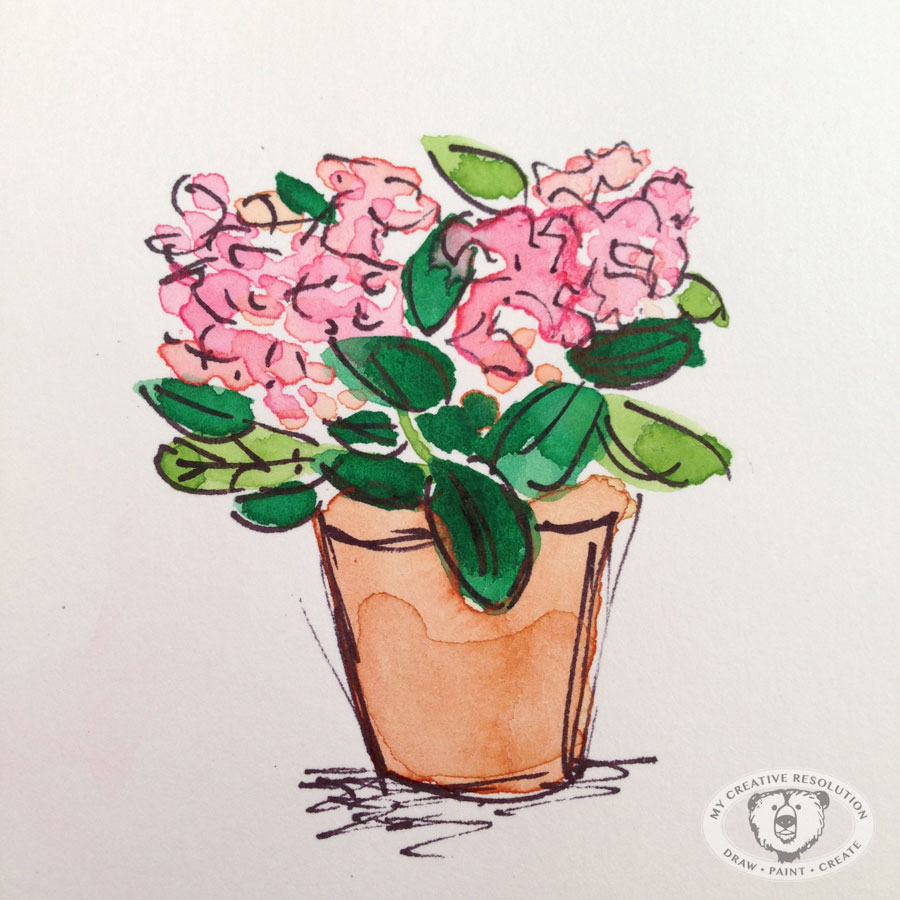
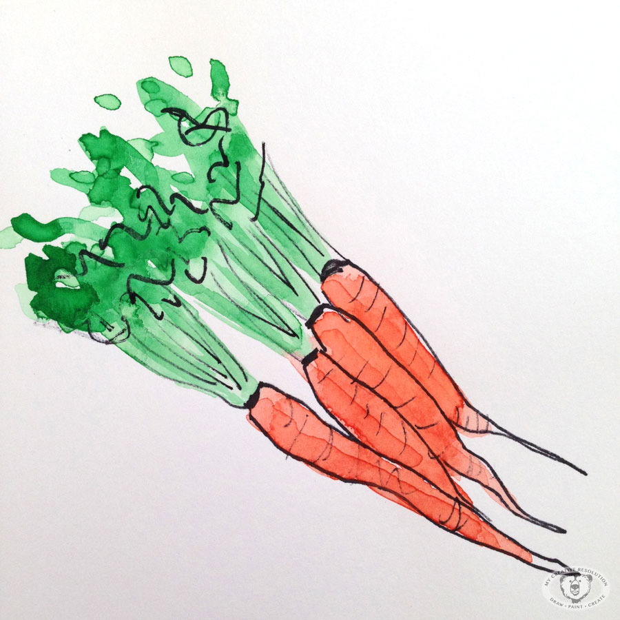
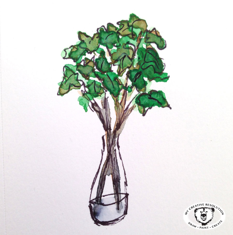
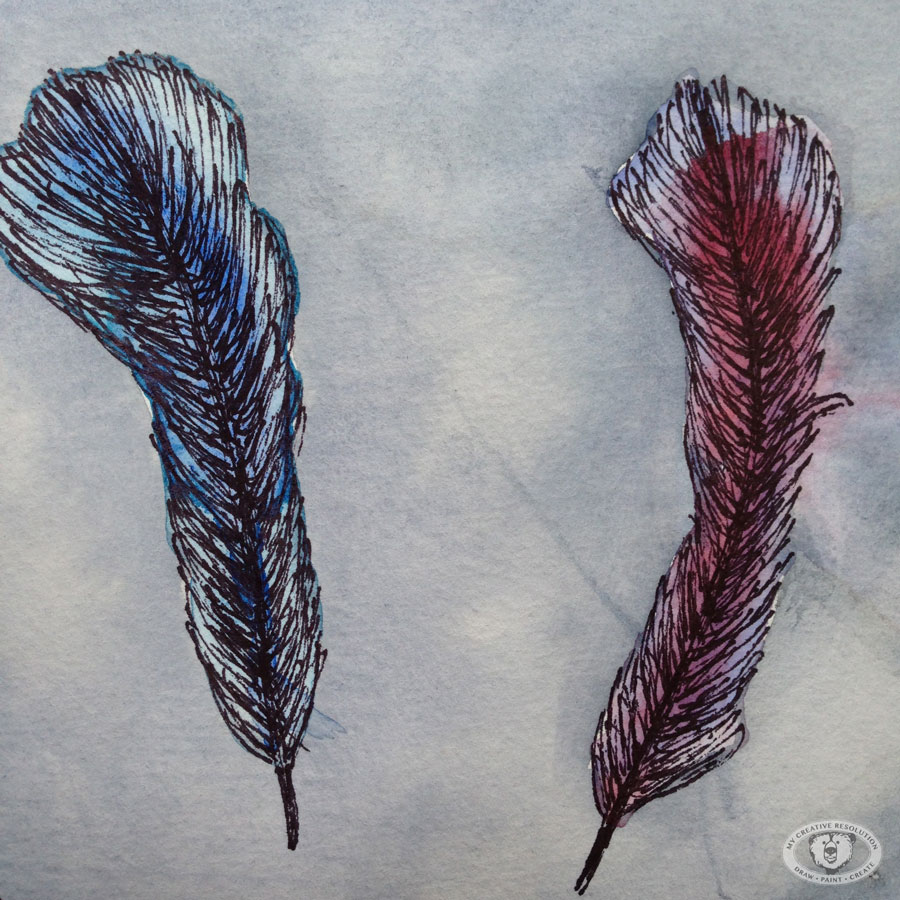
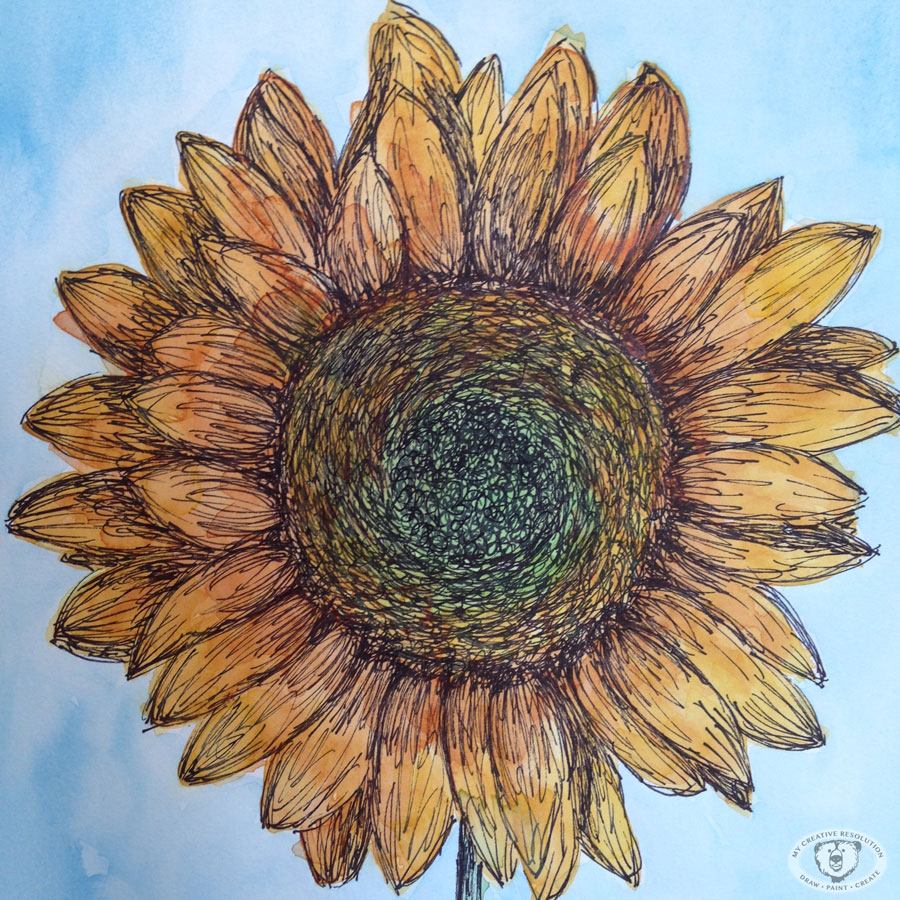
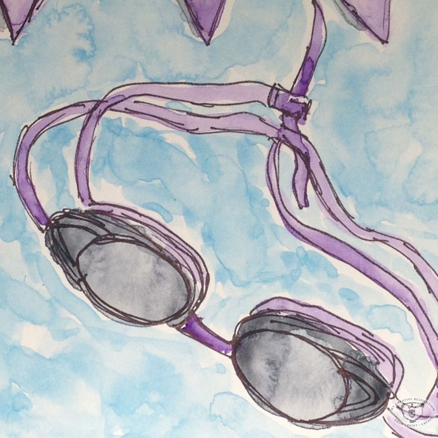
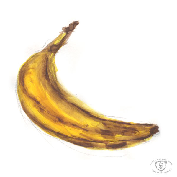
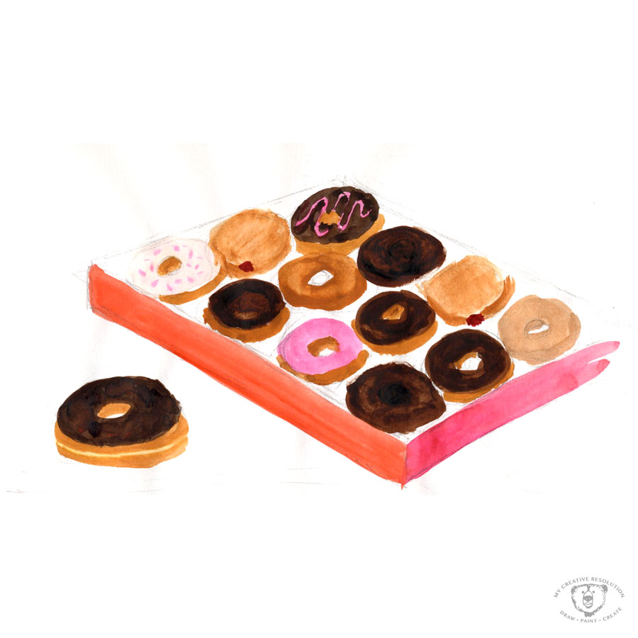
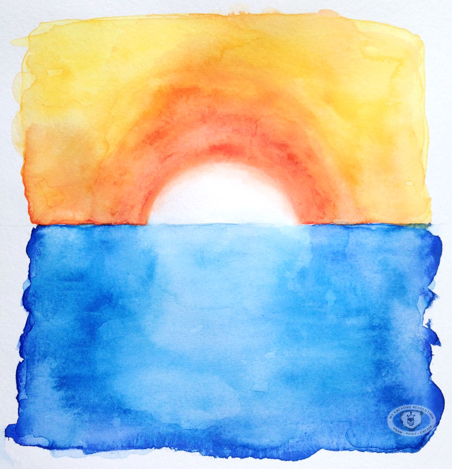
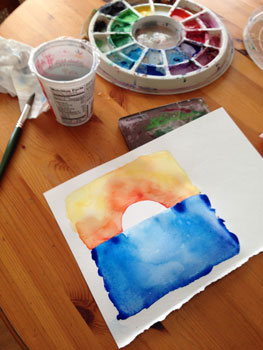
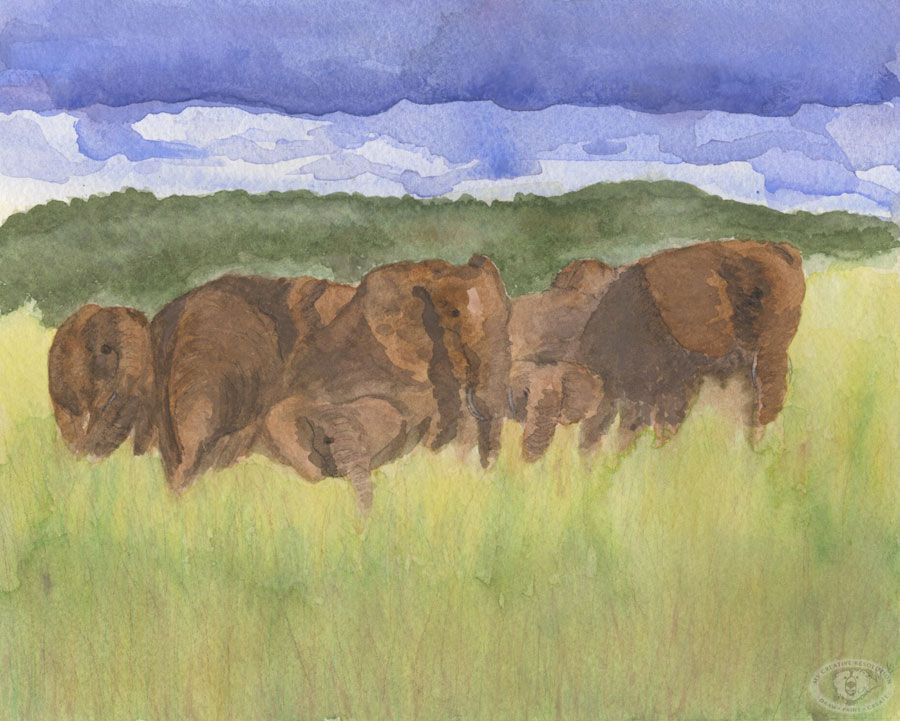
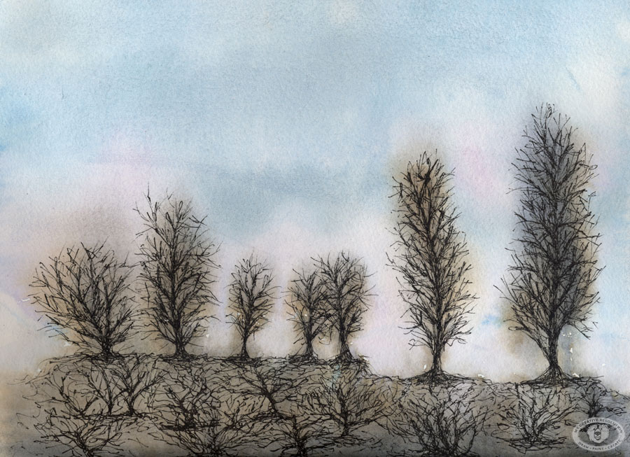
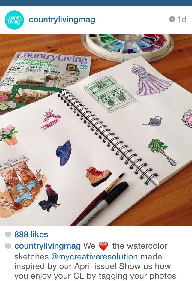
Yesterday, Country Living Magazine reposted my Instagram pic! In their April issue they asked readers to post “how and where” we enjoy Country Living. I shared the above picture of my sketchbook, where I created illustrations from the April issue.

Here is the back story, so you can fully understand why this is so awesome to me. 🙂

  1. Sometime after 2001 – Girl (new mom, me) from the suburbs of NYC falls in love with Country Living Magazine. She finds it creatively inspiring.
  2. 2014 – Girl starts mycreativeresolution.com and includes Country Living as one of her inspirations.
  3. Girl sees illustrations in Country Living and dreams about one day creating illustrations for the magazine.
  4. 2015 – Girl thinks about approaching Country Living with a sampling of “country” illustrations. She works towards this but doesn’t follow through.
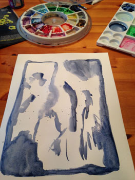
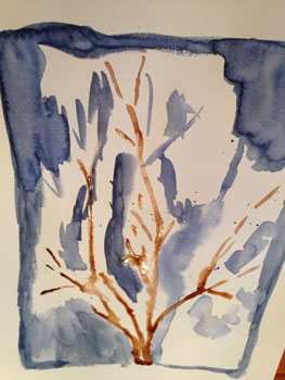
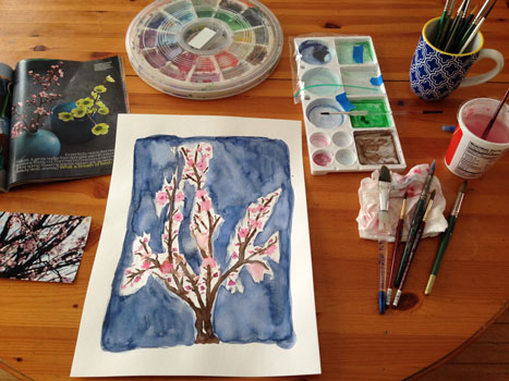
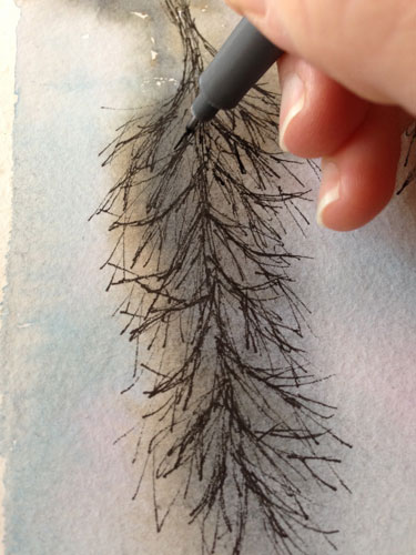
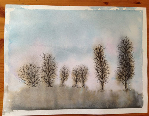
  5. Girl reads April issue of Country Living and sees the call out to share on Instagram. She pulls out her watercolors.
  6. Girl posts picture of sketchbook with #mycountryliving.
  7. Country Living “likes” girl’s post. Girl goes crazy with excitement. Shares news with family.
  8. Country Living starts following Girl (@mycreativeresolution). Girl gets more excited. Shares news with family.
  9. Several uneventful days pass.
  10. Girl checks Instagram and sees numbers – next to the likes and follows – that don’t make sense. 44 likes? 23 new followers? Instagram must be broken.
  11. Girl realizes that Country Living Magazine reposted the sketchbook picture – thereby sending people to Girl’s Instagram. Girl passes out from excitement.
  12. Girl recovers and at the end of the day, realizes she has 43 new followers. 888 people liked her picture on Country Living Magazine’s Instagram!


Is this story over? I hope not. 🙂

Finding my groove.

I’ve been all over the place this week, creatively speaking. With extra time on my hands, I participated in an online hand-lettering workshop, I painted with acrylics (for the first time in months), I created St. Patrick’s Day art, and I painted in my sketchbook. Even with all of these different projects, I’m realizing what I love and what my focus should be.

Not that long ago, I worried that my creative journey didn’t have a clear path. That I was headed in too many different directions. Back in January I wrote a post, “But where am I going?” As I mentioned in that post, I found the book, “Making Art A Practice: How To Be The Artist You Are,” very helpful. The Author, Cat Bennett, suggests that you analyze your work and look for connections in theme and style.

I’ve been looking through my work and I’ve noticed what current projects make me happiest. It’s funny because I started scratching away with the ink pen (on watercolor) on a whim, but each time I do it I love it. I feel like I’ve found my style. I won’t stop exploring other things – lino, lettering, patterns, etc., but I now have a focus.

Here’s a collection of new and old illustrations that feels like “me.”

Color!

burpeecatalog
It may be shades of white and brown in my garden but inside there is color! The Burpee (seed, plant, and flower) catalog arrived. I couldn’t be happier using every color in my palette to play in my sketchbook. There is something very freeing, for me, when I work in my sketchbook. The pressure is off! And my new sketchbook is a heavier weight paper, so it’s better for painting with watercolor.

I’m especially proud of my Zinnia. 🙂

IMG_5648

Creating fades (Gradations) with Watercolor

sunsetfinal
I’m looking forward to the warm days of Spring and Summer. The weather this weekend was a combination of extreme cold (4 degrees), followed by snow and rain. I’ve had enough! I tried to stay busy, which included painting. 🙂 First I painted some blobs, with the intention of adding ink and turning them into feathers.

3feathers1 3feathers2 3feathers3 3feathersf

Then I painted the sunset above. I was inspired by a watercolor heart I created a few weeks ago, where I blurred the edges of the heart so there was a soft edge. To blur the edges I let the paint mostly dry. With a wet brush, I pulled up some of the color at the edge of the shape. Then I soften the edge into the white area to create a fade.
featheredheart

I wanted the sun to have the same soft effect as the heart and I wanted to keep the sunset simple. I painted the sky part first and let it dry before painting the bottom. I didn’t want the bottom bleeding into the sky! In addition to softening the edge of the sun, I added water (to the water) to soften the blooms.* (This word was on the tip of my tongue, but I couldn’t remember what they are called. Thank you to this link for the definition below.)

*Blooms or blossoms – are cauliflower looking marks created when extra moisture creeps back into a damp or partially dry area of a painted. As the excess water levels out it will “push” the tiny pigments of paint to the outside edge of the watermark. A back run can totally ruin a smooth flat area of a painting, unless you add the excess water intentionally. (also known as back runs, back wash, and water blossoms)

sunset1 sunset2

I’m not sure what my next project will be, but that’s part of the fun, right?

Watercolor (Throwback Thursday)

beachpaint
After taking drawing classes, and falling in love with colored pencil, I decided to try watercolor. My teacher was the same woman, Eva, who I loved and who was very encouraging and supportive. You need that when you are starting out (or maybe always) – someone to recognize that you have something, a little bit of talent, that merits nurturing.

Imagine my surprise when I created my first watercolor piece and she didn’t like it. “No, no, no, you are drawing! You need to paint with watercolor.” Here it is:
girlatlake

I didn’t really understand what she was saying – that there is an unexpectedness and beauty when you let watercolors “do their thing,” when you add paint to a wet surface and let something magical happen! Shortly after, I created this painting below, of the elephants. I was especially proud of how the clouds came out. I let it “happen” by picking up the paper and letting the paint roll around.
elephants

It took me awhile to let go and loosen up. During the drawing class, I was trying to be perfect, to draw perfectly. Now, years later, I’m loosening up more and more and I’m finding that “not perfect” has a style to it. A style I’ve been aiming for, for years. Now, I enjoy letting the watercolor do something unplanned and then creating a piece around that.

As the years went by I started using watercolor pencils in some areas, to add detail. The first painting in this post, of my kids at the beach, is my favorite watercolor to date.

Click here to see my favorite watercolors.

What to paint?

cherryblossom
I wanted to paint, wanted to get “into” a project, but I had no ideas or inspiration. I couldn’t go outside and take pictures of the garden. It’s covered in snow. Not a pretty snow, a solid, icy, block of snow. As I was trying to come up with an idea, I grab two magazines and remembered the post I wrote about coming up with ideas. Looking through magazines was on my list.

Both magazines had pictures of cherry blossoms in it. This was ironic, because just that morning I booked a Spring trip to Washington, DC, which is famous for it’s cherry blossoms. I was really inspired by a picture in Martha Stewart Living with the cherry blossoms on a dark slate background. I love the look of a dark background. One of my goals for 2015 is to paint on dark paper.

My steps:
cherryblossom1  cherryblossom3 cherryblossom2

cherryblossom4

It felt good to get into my project. My goal was to stay loose and not paint each flower – which is why I started the flowers and buds by splashing the pink on my paper. I wanted the background to be dark. To achieve this, I had to apply a couple of layers to the background. I think buying gouache paint is in my future!

For me this painting is not so much about the final product, but about getting started, and getting ideas flowing again.

I can’t wait for Spring and for the Cherry Blossoms!

Valentine’s Day Mantle

valentinesdaymantle
I’ve been having fun the last couple of weeks creating art with Valentine’s Day in mind. I challenged myself to post my creations on Instagram for 14 days in a row. If you’ve been following, let me know which one you liked the best.

It’s been great, working within the same theme – coming up with different ideas and using different mediums. I’ve used watercolor, watercolor and ink, scanned doodles from my sketchbook and painted them in Photoshop, created a pattern, and a linocut. One more to go! Hmmmm.

My daughter’s art teacher gives them one word and they can execute it anyway they’d like. I love seeing her creations. It must be fun to be in the class and see how other people interpret the word. Their words have included – bounce, sticky, and bump. For “bump” my daughter drew a pregnant woman (focus on the bump) with a crib in the background. I thought it was very creative. Maybe I can sneak into the class!

I’m planning on another themed Instagram challenge – March 1 – 17th. The theme is St. Patrick’s Day (of course). Join me in the fun by including #mcrstpatricksday in your Instagram post. Join me for a day or all 17. It will be fun!

Have a happy Valentine’s Day!

The Winter Sky and Bare Trees

baretrees
I’m somewhat obsessed with the Winter sky – the different colors at sunrise, sunset, the clouds throughout the day. All of this shown through the bare branches of the trees. I love how the bare brown trees have a bluish tint to them.

A sunset from my window:
sunsetsky
Another pretty sky.
wintersky2

The start of the painting – watercolor.
thestart
Letting it drip.
starttwomorepink

Adding the ink to the trees. I was hesitant to even do it, but the painting didn’t look complete without it and I wanted to follow through on my vision.
inkingtrees baretrees2

Cutting away the mistake

boardwalkmatted
and I cut my first mat too!
Mom’s painting is finally done. I’ve been struggling with it since Thanksgiving, when she requested it. I love the beach and feel so inspired by it, but I often struggle with trying to paint it. She requested a landscape. Sometimes I think I’m more of a “zoom in” and paint the details type of person. When things are so far back – you can’t even see the details. My attempts at beach paintings often look a little flat and boring. But she asked for it, so what could I say?

I decided this time I’d add ink to the painting and try to incorporate my “still developing” style. I was so nervous to add the first ink marks! You can’t get rid of them or cover them up, the way you can with watercolor. Another challenge for me – perspective! The photo I chose was perfect for my mom, but the perspective was a challenge for me. After I added the lamppost, I knew I’d messed up. It was way too tall. To be honest, if the painting wasn’t for my mom, I would have ditched it.

But I persevered. I pulled it out every so often and continued working on it. I already bought a frame. This week I measured the frame and decided to cut the painting and get rid of the too tall lamppost. In doing that, I’d need a custom mat. About 3 months ago, inspired by the Frugal Crafter, I bought mat board and a mat cutter. It was the first time I’d seen a tool that wasn’t an expensive table top cutter. The Logan 2000, has a line that you line up to prevent you from cutting past the corners. Since I already have a cutting mat and a straight edge, and am used to trimming with an exacto knife, it seemed perfect for me.

Isn’t it amazing how something sits for months and then in two days, you’ve completed the job. (It only took 2 days, because on the first day I mistakenly thought the Logan 2000 didn’t come with the blades. I was so disappointed! Eventually I realized I had everything I needed.) I found it a little hard, especially the corners, but I was happy with the outcome! I think with practice it will get easier.

I posted Mom’s painting on Instagram (mycreativeresolution) to see if she’ll notice. I hope she likes it! Wait, breaking news: She saw it and she likes it! 🙂 And it feels good to be done and to finally have used my new cutter!

My Steps:

See the start of this painting in the post “Pressure and Painting,” and the middle in the post “Mom’s present has entered the ugly phase. Can it recover?”

Cutting off the lamppost.
boardwalkmistake

Figuring out the correct height of the lamppost, before drawing a new one.
boardwalkfix

Logan 2000
logan1 logan2