Color!

burpeecatalog
It may be shades of white and brown in my garden but inside there is color! The Burpee (seed, plant, and flower) catalog arrived. I couldn’t be happier using every color in my palette to play in my sketchbook. There is something very freeing, for me, when I work in my sketchbook. The pressure is off! And my new sketchbook is a heavier weight paper, so it’s better for painting with watercolor.

I’m especially proud of my Zinnia. 🙂

IMG_5648

What to paint?

cherryblossom
I wanted to paint, wanted to get “into” a project, but I had no ideas or inspiration. I couldn’t go outside and take pictures of the garden. It’s covered in snow. Not a pretty snow, a solid, icy, block of snow. As I was trying to come up with an idea, I grab two magazines and remembered the post I wrote about coming up with ideas. Looking through magazines was on my list.

Both magazines had pictures of cherry blossoms in it. This was ironic, because just that morning I booked a Spring trip to Washington, DC, which is famous for it’s cherry blossoms. I was really inspired by a picture in Martha Stewart Living with the cherry blossoms on a dark slate background. I love the look of a dark background. One of my goals for 2015 is to paint on dark paper.

My steps:
cherryblossom1  cherryblossom3 cherryblossom2

cherryblossom4

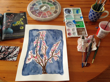
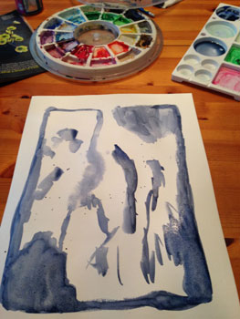
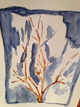
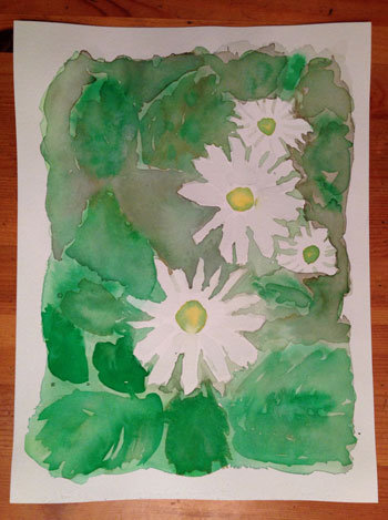
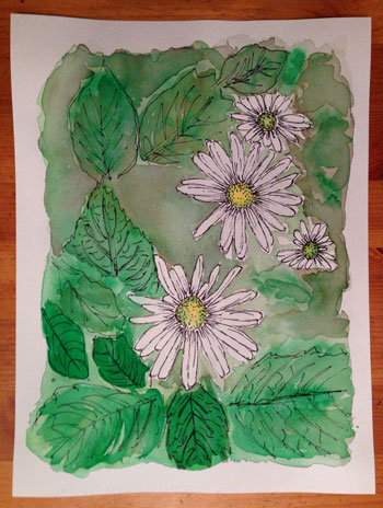
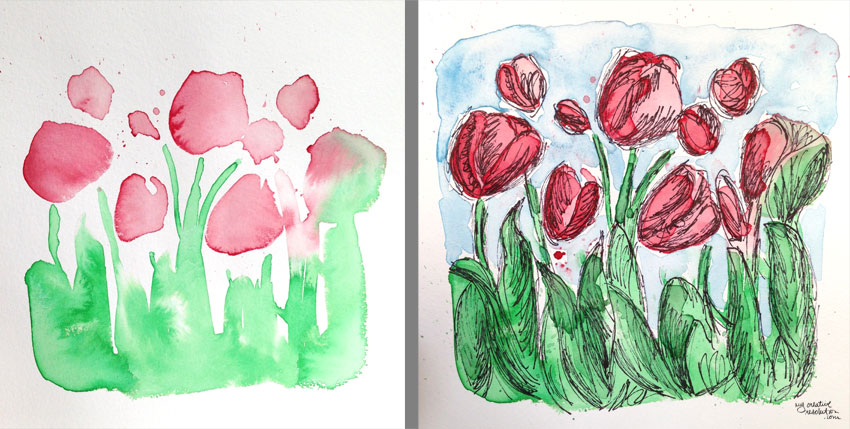
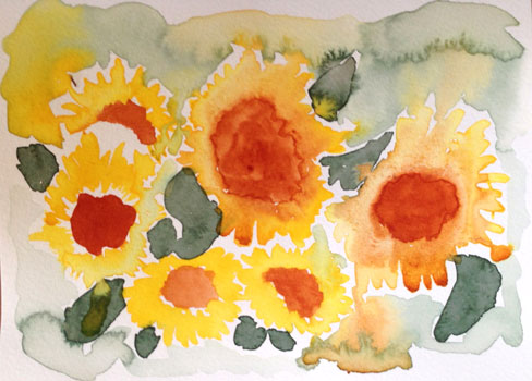
It felt good to get into my project. My goal was to stay loose and not paint each flower – which is why I started the flowers and buds by splashing the pink on my paper. I wanted the background to be dark. To achieve this, I had to apply a couple of layers to the background. I think buying gouache paint is in my future!

For me this painting is not so much about the final product, but about getting started, and getting ideas flowing again.

I can’t wait for Spring and for the Cherry Blossoms!

“Valentine’s Day Love” Pattern

valentine'sdaypattern
I’m in the heart/love frame of mind this week, as I am posting a new Valentine’s Day inspired photo to Instagram, every day from February 1st – the 14th! (@mycreativeresolution) So, it’s no surprise that my digital pattern of the month is also Valentine’s Day inspired.

I’m getting into creating art in Photoshop, especially with doodles that originate in my sketchbook. The process is a lot quicker than I thought it would be. And the amount of different textured brushes is awesome. Where have I been?!

I’m excited to continue trying new brushes – last month I used a watercolor brush for my January pattern. This month I used the Soft Oil Pastel brush. I wanted the background to have texture – but that can be an issue when you repeat the pattern because irregularities won’t line up. I used a fade so that it wouldn’t be an issue, but I’d like to learn more about the technicalities of creating repeating patterns.

It’s ironic that two of the things I’ve been working on so far this year, are so different! Linocut seems like an old craft, and digital illustration is on the other end of the spectrum! Time will tell how things shake out and in what form I continue to work.

It’s been so fun, I may have to do another pattern before February is over!

Here is the pattern without the repeat:
valpatternnorepeat

Watercolor Montauk Daisies – Lifting Color

montaukdaisiesf
I took the reference photo for this painting in our yard. I really worked this painting! I kept going back in and adding color. Good thing I’m using watercolor paper these days!

Finally I remembered to tape my paper to a board (a palette did the trick) to keep the paper smooth and prevent the paint from pooling. I made sure to add paint to the “white” petals, because they aren’t truly white. Then, I added the base color of the background.
md1st md2ndl

When that was mostly dry I painted in some details. BTW in the end, I preferred this painting upside down from the way I painted it. So the painting is flipped from here out.
md3

I added some outlines and details in ink. But felt the empty area needed to be darker. I had to add color several times to get it dark enough. Then, I thought it looked weird. Like the Montauk daisies were floating. Even my nine year old son said, “Maybe you need to add some leaves in there.” I drew some leaves in ink and then lifted the dark color where the leaves were. I added a little bit of green to those new leaves. I like the result and how those leaves are subtle. [See final painting in the first photo.]

If you have never “lifted” watercolor paint before, it is easy. Using a wet brush, you touch the area you want to lift the paint from. Wipe the brush on a paper towel (you’ll see the color come off onto it) and rewet the brush and repeat until you’ve achieved your desired effect. 🙂
md2
 md1

Working with outtakes

sunflowerouttakes
The other day, when I was painting sunflowers, I started several versions before selecting one to work on in more detail. Today I decided to see what I could do with two of these “outtakes.” I used an ink pen and started scribbling away.

The first outtake immediately reminded me of a feather (when the sunflower’s center flowed all over the paper). So I added ink and made it a feather.

Outtake #1:
feather1

The second outtake, looked like a bunch of sunflowers, so I added ink to make it look more finished. Lately I’ve been having fun playing with ink. In the past I shied away – thinking the outline had to be precise and perfect. Now I’m just scratching away, the way I would with a pencil. Is my style coming out?!

Outtake #2:
sunflowers2