Let the Watercolor Parties begin…

withjen
One of my 2015 goals is to host a watercolor party. Inspired by the Sip & Paint “movement” I thought it would be fun to invite a few friends over to paint. A way to share what I love to do.

I don’t think I’d want it to be a business, but I thought it would be fun to try a party. My friend since 1st or 2nd grade – Jen, who follows me on Instagram, asked, “Can I paint with you?”

So, when I was visiting her beautiful new home on Saturday, I brought my painting supplies. I figured I could try things out and see if I ‘d even want to try it on a group of people. A few days before, I tried teaching my young niece and my immediate thought was, “I don’t want to do this.” But armed with what I learned from my experience with my niece (who had been very happy painting what she felt like) I had the framework of a plan. My niece wanted to paint what she wanted to paint. That is part of the challenge – how do you teach people and “control” what they are working on, so you can guide them, but also allow them to be free to follow their own inspiration?

Here how I approached my lesson with Jen:

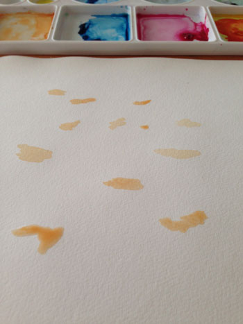
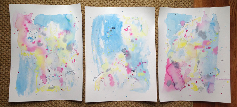
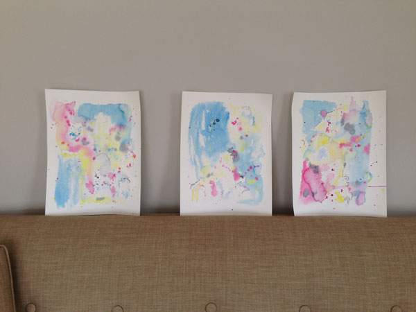
  • scrap paper – first I explained the fundamentals of watercolor and we practiced – wet on wet, wet on dry, dry on dry, etc.

It is really funny how people, who don’t normally create, feel pressure with that blank piece of paper. Jen asked, “What should I paint?” I think she felt like she was being tested. I explained it was “scrap” paper and we were just learning.

  • first assignment – draw lightly in pencil any shape and create an interesting background

The object of this assignment is to start playing with watercolor without stressing about what it’s suppose to be. Jen drew a heart in the middle. I drew a starfish. We kept our shapes dry and wet the area all around it. We concentrated on creating interesting backgrounds. I worked along with her on my own painting showing her different things I do, so she could use any techniques she wanted to. We let the backgrounds dry before we painted the shape.

  • final project – what do you want to paint?

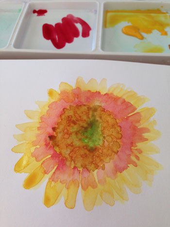
I knew Jen was interested in painting a beach chair, so we found a photo for inspiration. (This will be more challenging for a group. I’ll have to have projects/photos ready for them to pick from.) The chair itself was really hard to draw. She started drawing it, I finished it up, but I was struggling. I guided her on what area to paint first, and talked her through the painting as needed. I was happily amazed at how quickly she picked up how to use watercolor – how wet the brush should be, when to add water, when to add paint. There was only once or twice that I interrupted to offer advice. One thing she said afterwards stuck with me. She said, “You made me feel like it was okay to mess up.”

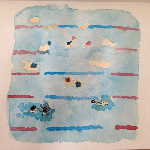
This picture of her painting doesn’t do it justice! It came out great. I was proud of her and I think she was proud too!
jensbeachchair

It is really, really, satisfying to see someone experience that moment. That proud, “I made this,” moment. The same moment I had, a few years back, when I drew my bear. It’s the reason that there is a bear in my logo. For me it represents that moment. I may be hooked on spreading this joy! 🙂

P.S. Today she is online shopping for watercolor paints – wow.

Easy Acrylic Beach Painting

beachaerial
I needed something to hang on the bare wall over the couch. I had the idea to create an aerial view of the beach on two canvases. I wanted it to be very simple – 2 areas of solid color. The area where they meet would have a little more detail to hint that it is a beach shot from above.

Here’s my sketch and the acrylic paint colors I selected – Buff White and Cobalt Teal. Similar paints Windsor & Newton Buff Titanium and Liquitex Cobalt TealYou’ll also need a small amount of white.
beachacrylicaa
I put two 20 x 24″ canvases together to sketch where the shoreline would be and to ensure the canvases line up.
beachacrylic1
I painted each of the solid areas. 
beachacrylic2

Then, I added a thin layer of the blue over about 2″ of the sand nearest the shoreline. This is the shallow area of the ocean. At the edge of this area (and the sand) I added a thin uneven line of white for the ocean’s foam.

I was really happy with the results! Let me know if you give it a try.
overcouch

This contains affiliate links to products/brands I use and recommend. I earn a small commission whenever you buy using these links, at no additional cost to you. Thank you for supporting my blog!

Have you read:
Six Ways to bring the Beach into your Home https://mycreativeresolution.com/2017/05/19/six-ways-to-brin…h-into-your-home/ Process for Painting the Beach in Watercolor 14 tips on painting waves in watercolor
Easy steps to paint a sunset sky and a tree in acrylic paints

Easy Acrylic Beach Painting anyone can make!

Love this Sketchbook!

sketchbooknew
Since I bought this sketchbook I’ve been busy filling it! I love the heavy paper. It works so well with watercolor. If you follow me on Instagram (@mycreativeresolution), you’ve probably seen some of these illustrations. Lately I’ve been posting everyday which helps keep me motivated. I setup my sketchbook and paints in the morning. Throughout the day I sit down to tweak or add to my painting. I’m going to need a new book soon!

Watercolor Swimming Pool

swimminglanesfinal
It feels really good to finish something that I have wanted to do for a long time – paint a pool. I have loved pools since I was a little kid, especially outdoor pools. I grew up in a beach town (I know poor me) and our local pool was an indoor pool. I was a swimmer and occasionally during the Summer we would go to a swim meet at an outdoor pool. I thought I’d died and gone to heaven.

My kids are lucky enough, during the Summer, to have practice and all their swim meets at outdoor pools. Our pool even has a high dive. Spoiled kids! During the Summer, while I watch my kids practice I always think about painting the pool and the swimmers. I’ve taken pictures, started, sketched, but I always struggle early on and never finish.

Last Saturday we were at a Championship swim meet at an indoor pool and I was sitting high up in the bleachers. I took this photo. I thought it was so cool how the pool was crowded with swimmers warming up. I posted it on Instagram and wrote “I’d love to paint this!”
poolphoto

Yesterday I gave it a try. I realized that if I did the bodies first and painted the blue over parts of the body, that part would look like it was underneath the water.
swimbodies  bodies2

In this first version I didn’t like that you couldn’t see one of the lane lines (the kids are sitting on it in the photo). The lanes were also uneven. And once I added the ink, I didn’t like it at all.
version1

I decided to try again. I see my willingness to “try again” as growth as an artist. I used to sit down and expect to get it right the first time. Can you imagine if a photographer only took one photo! I now know that I need to warm up, try things out, not get discourage, and keep working and trying.

I purposely kept things simple without a lot of detail. Both my sons liked my first attempt better! But I like the second one. I’m hoping to do more of these, now that I finally got started!
lanelinespool-2

Abstract Watercolor

abstractwatercolor
I need a large piece of artwork to fit over my new couch in our living room. It seems a shame to buy something when I’ve been doing all this work, right?! Problem is, I don’t normally work large. I had an idea to paint two canvases with acrylics but my first stab didn’t go well, and I haven’t been inspired to try it again. Acrylics are still out of my comfort zone.

The Bare Wall
abstractwatercolorc2

Lately on Instagram, I’ve gotten compliments for my watercolor backgrounds (ahem Margie). The other day when I was looking through a magazine I saw a watercolor “blob” for sale. Personally I didn’t really get it, but it gave me an idea. “Maybe I can create a larger piece that is similar to the backgrounds I normally create. An abstract watercolor.”

Yesterday morning it struck me – to work on three panels together, almost as if they were one sheet. I’ll trim each one, frame them separately, and hang them next to each other!

Will these work? The hunt for frames begins…
abstractwatercolorc

P.S. There aren’t any work in progress photos because I took a video! But it needs serious editing before I show it to you. ha ha. I turned the camera on, then walked away for 5 minutes to get my paints! Hopefully my editor (my daughter) can work on it soon, so I can show you. 🙂

Watercolor: Building up the Layers

finalsunflowersketchbook
When I first started working in watercolor I was intimidated by paintings with highlights and shadows. I thought I couldn’t possibly paint several layers. I hoped I could paint one layer and make it good enough. As I got comfortable with watercolor, I realized it’s all about building up the layers of paint. You start out in the ugly stages and as you add, and add, you [hopefully] turn the ugly duckling into a beautiful swan. I liked that you built it up, because mistakes could be covered or fixed. Each brushstroke wasn’t make or break. It’s a process.

This is what I was thinking about when I painted this sunflower this morning. How the ugly stage was awfully ugly! And how each layer of watercolor I added made the painting better. Originally I planned to add ink to the flower when I was done painting. As I got closer to finishing, I liked it the way it was. My daughter agreed.
sunphasebsunphase1
sunphase2sunphase5

Exciting News…

countrylivingpost
Yesterday, Country Living Magazine reposted my Instagram pic! In their April issue they asked readers to post “how and where” we enjoy Country Living. I shared the above picture of my sketchbook, where I created illustrations from the April issue.

Here is the back story, so you can fully understand why this is so awesome to me. 🙂

  1. Sometime after 2001 – Girl (new mom, me) from the suburbs of NYC falls in love with Country Living Magazine. She finds it creatively inspiring.
  2. 2014 – Girl starts mycreativeresolution.com and includes Country Living as one of her inspirations.
  3. Girl sees illustrations in Country Living and dreams about one day creating illustrations for the magazine.
  4. 2015 – Girl thinks about approaching Country Living with a sampling of “country” illustrations. She works towards this but doesn’t follow through.
  5. Girl reads April issue of Country Living and sees the call out to share on Instagram. She pulls out her watercolors.
  6. Girl posts picture of sketchbook with #mycountryliving.
  7. Country Living “likes” girl’s post. Girl goes crazy with excitement. Shares news with family.
  8. Country Living starts following Girl (@mycreativeresolution). Girl gets more excited. Shares news with family.
  9. Several uneventful days pass.
  10. Girl checks Instagram and sees numbers – next to the likes and follows – that don’t make sense. 44 likes? 23 new followers? Instagram must be broken.
  11. Girl realizes that Country Living Magazine reposted the sketchbook picture – thereby sending people to Girl’s Instagram. Girl passes out from excitement.
  12. Girl recovers and at the end of the day, realizes she has 43 new followers. 888 people liked her picture on Country Living Magazine’s Instagram!


Is this story over? I hope not. 🙂

Finding my groove.

I’ve been all over the place this week, creatively speaking. With extra time on my hands, I participated in an online hand-lettering workshop, I painted with acrylics (for the first time in months), I created St. Patrick’s Day art, and I painted in my sketchbook. Even with all of these different projects, I’m realizing what I love and what my focus should be.

Not that long ago, I worried that my creative journey didn’t have a clear path. That I was headed in too many different directions. Back in January I wrote a post, “But where am I going?” As I mentioned in that post, I found the book, “Making Art A Practice: How To Be The Artist You Are,” very helpful. The Author, Cat Bennett, suggests that you analyze your work and look for connections in theme and style.

I’ve been looking through my work and I’ve noticed what current projects make me happiest. It’s funny because I started scratching away with the ink pen (on watercolor) on a whim, but each time I do it I love it. I feel like I’ve found my style. I won’t stop exploring other things – lino, lettering, patterns, etc., but I now have a focus.

Here’s a collection of new and old illustrations that feels like “me.”

Painting Digitally

citybike

I’m still playing around with painting digitally! The original idea for this illustration was a quick sketch in a lined notebook. I intended on redrawing it more carefully, but I liked the messy one better!

Original sketch:
citybikescrap

I scanned it and opened it in Photoshop. I’ve been using Photoshop for years as a Graphic Designer, but I’m learning and practicing great stuff with brushes that I never used before. This previous post links to an awesome video tutorial. It opened my eyes to another side of Photoshop. Before watching it, I didn’t know it could be so quick and easy to add texture.

In Photoshop, I first went to Image > Adjustments> Levels and made adjustments so the paper didn’t show and some of the blue lines disappeared. Then, following what I learned in the tutorial, I made my sketch one layer and put the “multiply” effect on it. (When you select multiply all the white stuff disappears, only the black remains and the layer underneath shows through.) Then I did all the coloring in a layer underneath it.

My color layer:
citybikejustcolors

The sketch is visible on top of the color layer because “multiply” is selected:
citybikecolor

To give it character, I applied a mask to the color layer, and filled it with black. (The entire layer disappears.) I selected the Soft Oil Pastel paintbrush and painted white onto the black mask. (The white parts of a mask is what shows through.) This gives the effect you see at the top of the post.

It’s fun! Give it a try and let me know your results. 🙂