Kick up your Creativity with Color!

Kick up your Creativity with Color! Steps to Creativity for everyone
Want to be creative but don’t know how/where to start? If you haven’t already, click here and start with these 3 steps! If you have started with the beginning 3 steps, then you’ve accomplished a lot!

  • Your eyes are open to inspiration. You take photos and make lists of things to sketch.
  • You’ve been sketching regularly in pencil. Hopefully noticing the difference between the softer B and the harder H pencils. You have a regular creative practice!
  • You don’t just draw something once – you practice drawing it several times. Take a moment to look through your sketches and see overall how much you’ve progressed!

Well done. When you are ready, move on to these steps – that are all about Color!

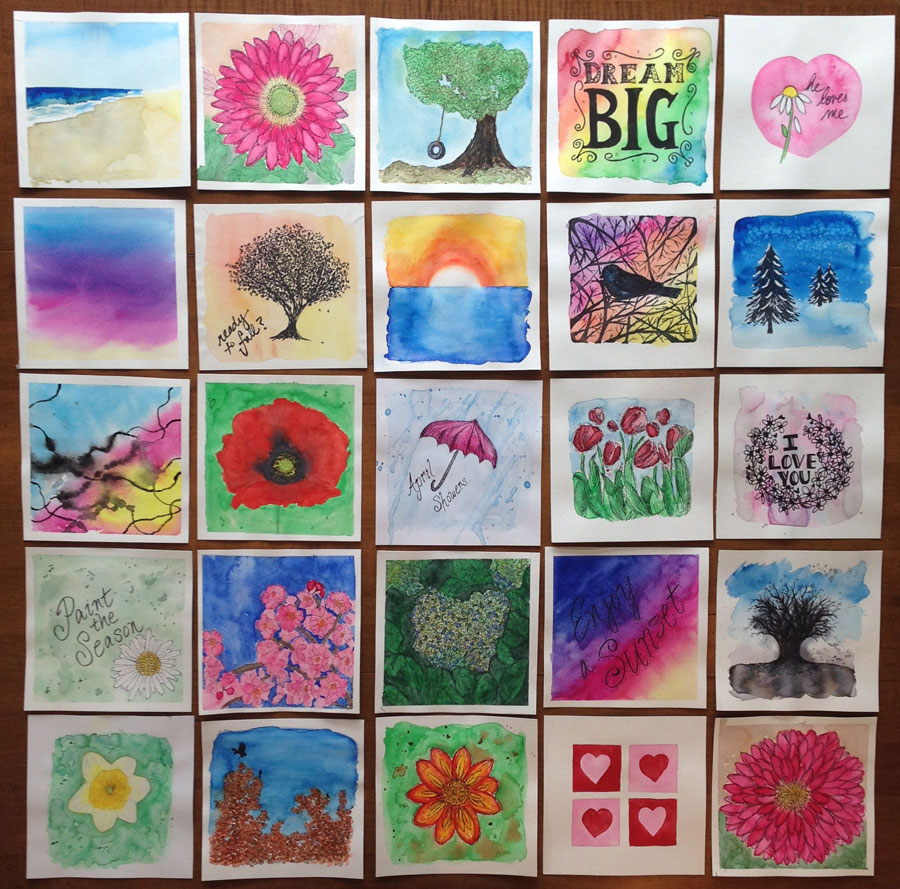
1. Colored Pencil or Watercolor? – The next logical step may seem to be colored pencils, but if you are itching to paint, and want something more fluid, I recommend watercolor. Here is where YOU decide what path your creative journey takes. This is about finding what YOU like. If you need recommendations on either see below.

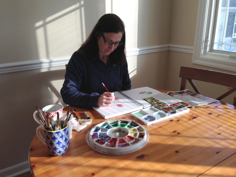
2. Start simply with your sketchbook. Continue with your creative habit of sketching regularly – but now use color! You can use regular pencil first and then add color – or start directly with color. I recommend working in your sketchbook because it’s a no pressure, play zone, where you can practice and learn. Note: if you decide to use watercolor – please look at my sketchbook recommendation below, so your pages don’t buckle.

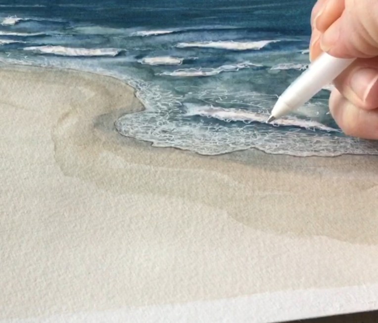
3. Beyond the sketch. After practicing in your sketchbook, it’s time for a drawing or painting that you spend more time on. After all your loose, quick sketches, you are ready. It can be a page in your sketchbook, or perhaps use a nicer paper – see recommendations below based on your choice of medium. Before you start, plan it out. Pick a reference photo, study it, and lightly plan it out in pencil.

When you are working on a drawing or painting for a longer period of time, stepping away and coming back to it with fresh eyes, helps a lot. I sometimes work with my reference photo and paper upside down – to check that things look right. Don’t expect immediate results. Don’t give up because it isn’t looking like you envision. I used to be a “quitter,” but I learned that it takes time, and the results often surprise me if I stick with it, and work through “mistakes.” In the end, any “weak” areas – are just things to work on for the next time. It’s a learning process. Good Luck!

My recommendations:

Colored PencilsPrismacolor Colored Pencils
Strathmore Bristol Vellum Pad – Smooth thicker, bright white paper – great for a colored pencil project.

Watercolor Tube Sets – I love Windsor & Newton paints and started with their affordable Cotman “student grade”
Canson Multimedia Sketchbook – I love this versatile, bright white, thicker sketchbook paper
Fluid Watercolor Paper – great for a watercolor painting. Tape down the sides to a larger piece of cardboard with painter’s tape to prevent buckling!

Colored Pastels are another option. I never really got the hang of them, but my daughter loves them. She uses the Prismacolor sticks.

Want a dose of creative inspiration? Sign up for my newsletter “My Creative Collection” by clicking here. Learn more here.

Click here to view my collection of watercolor and acrylic seascapes.

This post contains affiliate links to products/brands I use and recommend. I earn a small commission whenever you buy using these links, at no additional cost to you. Thank you for supporting my blog!

Add a notebook to your painting setup

Eileen McKenna watercolor artist
I find it useful to have a small notebook opened next to my palette. This way if I have a thought for a blog post, want to remember which blue I’m using, or whatever, I can just scribble a note to myself. I also write down the date and time of the photo I’m painting from. This way it’s easier to find on my iPad when I sit down again to paint. This saves me a lot of time.

Curious what my favorite art supplies are? Read
 

Want a dose of creative inspiration? Sign up for my newsletter “My Creative Collection” by clicking here. Learn more here.

Have you visited my online shop? Prints of my seascapes are available on watercolor paper or canvas, in many sizes including the new “mini” canvas 11″ x 14″ at shop.eileenmckenna.com. Take a peek!

Having the time to experiment

Adding details with a white gel pen
Almost a month focusing on one theme has given me time to try new techniques and tools, including:

  • Using a white gel pen to add the foam of the ocean
  • Mixing different color combinations for the ocean and sand
  • Adding white gouache to my skin tone mixture for a creamier look
  • Using painter’s tape to achieve a straight horizon line

Straight horizon with painter's tape

Some of these ideas I get from others like the painter’s tape tip and the white gel pen. It has become part of my style to add details with a black gel pen. But when I paint an ocean landscape the black ink seems to dark. It just doesn’t work. A few months ago I saw a post – I wish I could track down this source! – of an artist using a white gel pen when painting the ocean. Wow, that might be the answer to my dilemma! I didn’t hesitate and ordered the pen. It sat relatively unused until today.

I find the foam a bit of challenge and the gel pen is a unique way of handling it. I was hesitant to use it, preferring to leave areas white for the foam. But this particular painting wasn’t going so well and I thought, “What do I have to lose?”

I really like how I could scribble away and create the look of the foam. One book I read recommends using masking fluid to keep the foam areas white. Personally I’m not that much of a planner or that meticulous. I like to wing it a bit. That’s probably why I love painting in watercolor so much. It’s not so permanent. You can add in one area, and take away in another, and continue to work at a painting – that may not be going well – and possibly turn it into something beautiful.

This post contains affiliate links. When you purchase something using these links you help support my blog. Thank you!

11 art supplies I can’t paint without!

11artsupplies

Painting Essentials:

  1. Canson Multimedia sketchbook. Love the thicker paper in this sketchbook. I can add watercolor without the pages buckling.
  2. Fluid Cold Press watercolor paper. I especially love the square shape of this high quality thick watercolor paper!
  3. Uniball signo 207 bold gel pen. I love how smooth these pens are when I want to add ink details to my paintings.
  4. Palette with cover.
  5. Painters tape – to tape down my paper
  6. Grumbacher watercolor brush. Favorite sizes: 8, 6, 4, and 2
  7. Van Gogh watercolor paints
  8. Holbein Gouache mixing set of 5. I love adding the opaque look of gouache to my paintings!
  9. Derwent drawing pencils. Especially with figures, I like to sketch in pencil before starting a painting.
  10. Kneaded eraser. For erasing and leaving only faint lines when I begin to paint.
  11. Paper towel – I have to have a piece of paper towel to suck water off the brush when I need a drier brush. Or to blot the brush after dipping in the water. It’s a good way to check the brush is clean.

Other Essentials:

  • iPad – I do everything on my iPad – google reference photos, take photos, write posts, create digital art, look through and post on Instagram, read WordPress blogs, and more. I made the investment when my Kindle cracked and it was the best thing I did. I couldn’t live without it!
  • ZXU Stylus pen – for drawing on the ipad. I use the apps Adobe Draw and Adobe Sketch because they link up with Photoshop and Illustrator on my desktop.

Other stuff in my supply tray:

  1. Reeves watercolor pencils for adding details
  2. Tombow markers for handletter

Recycled stuff:

  1. Tray from a holiday gift “basket” to hold everything
  2. Plastic egg container for mixing colors to keep the paints in my palette “pure”
  3. Back of the watercolor paper pads – to tape down my paper so it doesn’t buckle when it gets wet
  4. Recycled container (Ricotta or sour cream) for water
  5. Cracked mug for my brushes. It was too pretty to throw away!

Easy Forest Watercolor Painting for BeginnersWatercolor Seascape Tutorial Download

This post contains affiliate links to products I use and recommend. I earn a small commission whenever you buy using these links, at no additional cost to you. Thank you for supporting my blog!

My 12 Surface Designs – one a month this year!

I’m really proud, and happy, that I followed through on my goal to start creating surface designs. I designed the first one in January, and decided to commit to “1 Surface Design a Month.” That goal, and the end of the month deadline, really pushed me to put in the work.

12 Surface Designs
January – Art Supplies

artpatternrepeat

February – Valentine’s Day
valentine'sdaypattern
March – Gardening
gardeningrepeatfinal2
April – Dahlias
dahliapatternv2
May – Sandcastles
sandcastleEM
June – Echinacea
echinaceapattern

July – Shells
shellspattern

August – Ice Cream Cones
watercoloricecreamcones

September- Feathers
featherspattern1

October – Leaves
leavespatterncolor

November – Nutcrackers
nutcrackersrepeating
December – Toy Soldiers
toysoldiers2_5inchhigh

I’m always asking you, “What’s your favorite?” And I would love to hear, but I’ll also tell you my favorites.

I really liked when I started using the technique of creating the ink lines and watercolor backgrounds separately and then merging them in Photoshop. I started this with the shell pattern. I think the watercolor really adds a depth that you can’t get with Photoshop brushes. I started this technique with the shells, and continued it with the leaves – which is my favorite design in this style.

My other technique is drawing the elements in my sketchbook and adding color in Photoshop. My favorite design, using this technique, is the Toy Soldiers. They are just so cute!

Will I be continuing with surface design in 2016? Absolutely! As you know, I’ve made the Nutcracker and Toy Soldier patterns available on Spoonflower, where you can have them printed as fabric or gift wrap. It is really interesting to see the designs printed and to think about how it will be used. It makes you think about the design, and what works and doesn’t. It’s a different perspective than just seeing it flat on the computer screen.

In the new year, I’ll be adding a few of the other “12 designs” onto Spoonflower. And I plan to continue designing one new one a month!

My Art Supply Closet

 One of the ways I’ve been able to incorporate creating into my daily life, is by having my supplies close by. I use a closet close to the kitchen table for storing my paints, brushes, paper, sketchbooks, inspiration magazines, and more. It makes it so easy to pull stuff out and work. Clean up is quick too. Since I recently organized my art supplies, I decided to give you a peek! Happy Sunday!

My 8 inch square paintings

8inchpaintings
What size, shape do you like to work in?
When I finally started using watercolor paper (I know what was I waiting for?) I came across Fluid Watercolor Paper 8″ square pad or “Easy Block” as they call it. I love working with this size and shape!

As you can tell by the image above, I do it often. I don’t know what it is, but I love the square shape and the size is small enough that I don’t feel…intimidated. I tape down the edges and end up with a .5″-1″ border which I love.

After falling in love with my first Fluid pad, I went back to Blick to get more and they didn’t have any!! I figured no big deal, I’ll just cut the paper, but it wasn’t the same. On my next trip to Blick they had it in stock, so I bought a couple. I’m out again so I’m anxious to get back to Blick and get more.

I’m starting to envision having a show, where all my pieces are 8″ x 8″. I can dream right? 🙂


Artist’s Setup

artistsetup
Very quickly into my creative resolution, without really thinking about it, I started setting up my paints and supplies a certain way. A few brushes on a paper towel to the right (I’m right handed), water and cup of brushes above that. Paper or sketchbook in front of me. Above the paper is my watercolor palette. To the left of the palette is the mixing tray. If the table is smaller (like in the illustration) the mixing tray is to the left of the paper. Above the brushes and water is my bin of paint tubes, markers, watercolored pencils, scrap paper, etc. Pretty much anything else I may need. A coffee cup is usually placed near the water, which often leads to mix ups. Fortunately the mix up is I clean the brush in the coffee, not that I drink the dirty water.

Do you have a certain way you set up your painting supplies?


settingup mepainting