When I first started painting watercolor seascapes I left the white areas of the ocean blank. The white of the paper was my white. But I felt this technique left my seascapes looking unfinished. There is so much movement and energy in the white of ocean water – I wanted to paint it, not leave blank areas.
My early seascapes.
white gouache
I felt like something was missing. On a whim I decided to try White Gouache. Gouache is thicker and less translucent than watercolor, so you can add it on top of watercolor and it will cover it.
I first painted the color underneath the white of the ocean – like the brown sand being churned up in front of a wave. Then I painted the white foam on top of the brown. This layering help add depth to my seascapes and I was able to better capture the movement and energy of the water.
Every time I get to the stage where it’s time to add the white I think. “Now for the fun part.”
When I’m painting with white I used different motions to paint different areas. Sometime I use different brushes.
White techniques:
In front of the waves (the foam part) – Paint overlapping zig zags with a flat brush
Paint a thicker edge to the foam
In a crashing wave – First paint circular strokes, add shadows with grey. Then add dots with a fine brush (stippling) on top of the wave (and the shadows).
Use dry brush to create spray
Learn the watercolor seascape process
I’ve created easy to follow – beginner friendly lesson to share my seascape painting process.
Whoops! There was an error and we couldn't process your subscription. Please reload the page and try again.
This post contains affiliate links to products/brands I use and recommend. I earn a small commission whenever you buy using these links, at no additional cost to you. Thank you for supporting my blog!
Watercolor is a fun, convenient medium. It’s easy to set up and clean up. If you are just getting started with watercolor you may be wondering…
What supplies do i need to paint in watercolor?
There are several things you need to paint in watercolor – some of which you have around your home! Here is what you’ll need:
Watercolor paint (see below for specifics)
Watercolor brushes (see below for specifics)
Watercolor paper (see below for specifics)
Cardboard larger than your paper
Painter’s tape to tape down your paper to the cardboard
Container of water
Paper towel
Scrap paper
Palette to mix paint with water or mix colors – try the top of a plastic egg carton
You are probably wonder – Ok, but what kind of paint, brushes and paper? I’ve created a FREE downloadable pdf – “Watercolor Basics” – that covers what kind of paint, brushes, and paper you should use.
sign up here to receive the “Watercolor Basics” free pdf:
Processing…
Success! You're on the list.
Whoops! There was an error and we couldn't process your subscription. Please reload the page and try again.
How should I set up my supplies?
Now that you’ve collected all of your watercolor supplies, you may be wondering how to setup your workspace.
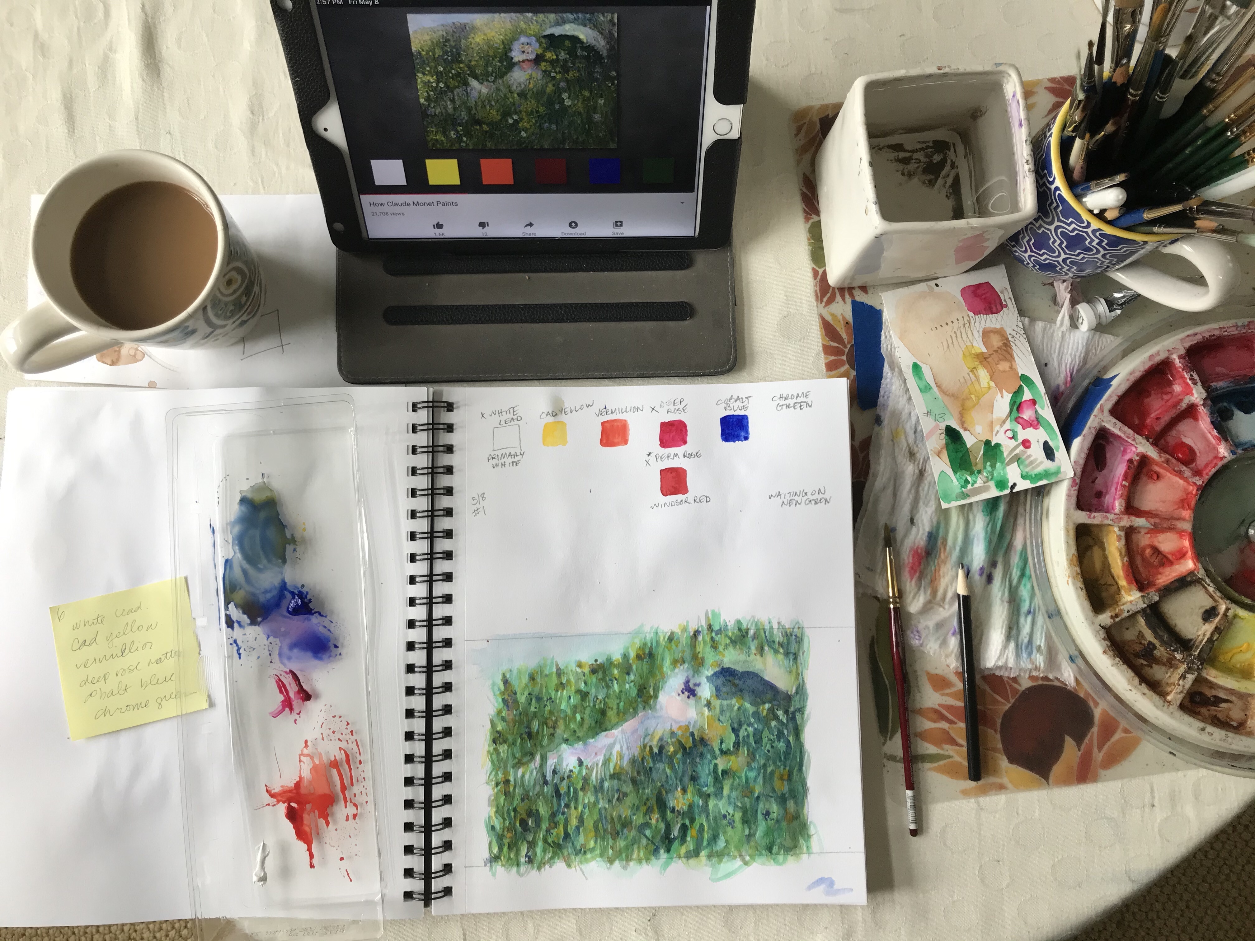
As a right handed person, I set up most of my supplies to the right of my paper or sketchbook. This is so I’m not reaching across my paper to get water or paint – I don’t want to accidentally drip on my paper! I usually place a reference photo (on my ipad) directly in front of my workspace. My mixing palette (top of an egg carton) can be moved around as needed. It’s always best if my coffee isn’t near my water. I’ve dipped my paintbrush in my coffee too many times!
how do you paint with watercolor?
A key element to painting in watercolor is water.
If you use a dry brush, the paint will go on rough and paper will show through in spots.
If your brush is wet the paint will glide onto the page.
If the paper is wet the paint will bleed into the water on the page when you touch it with your brush.
To lighten watercolor add water, NOT white.
These different ways of painting work in different circumstances. To paint one subject you will likely use all of the above ways of painting in different areas.
what should i paint?
When you are starting out it’s sometimes hard to come up with ideas. You’d like to practice but don’t know what to paint. Choosing a challenging subject can be discouraging.
printable painting tutorials
To help with this and to introduce you to the fundamentals of watercolor, I’ve created printable painting tutorials. Each tutorial walks you through fundamentals as you paint the steps for a specific final painting, like the “WATERCOLOR CONEFLOWER PAINTING LESSON” below.
When paper gets wet it wrinkles and buckles. To avoid this tape your paper to a piece of cardboard using painter’s tape. The tape also creates a nice border to your painting.
For weekly tips, sign up for my newsetter:
Processing…
Success! You're on the list.
Whoops! There was an error and we couldn't process your subscription. Please reload the page and try again.
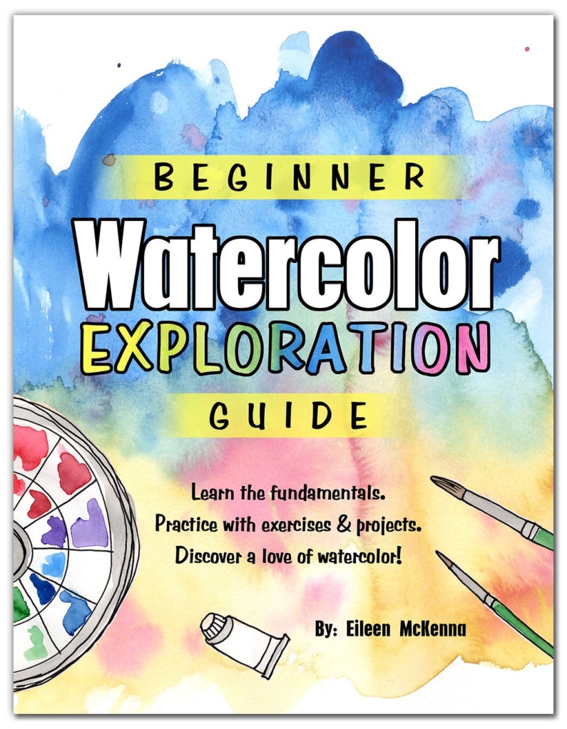
looking for a comprehensive introduction to watercolor? This guide is for you!
This Beginner Watercolor Exploration Guide is the perfect introduction to watercolor. Each fundamental is explained and then you practice it with exercises and painting projects.
The 5 tutorials build upon one another as you progress through the guide. You go from beginner brushstrokes to a watercolor seascape!
This posts contains affiliate links to products/brands I use and recommend. I earn a small commission whenever you buy using these links, at no additional cost to you. Thank you for supporting my blog!
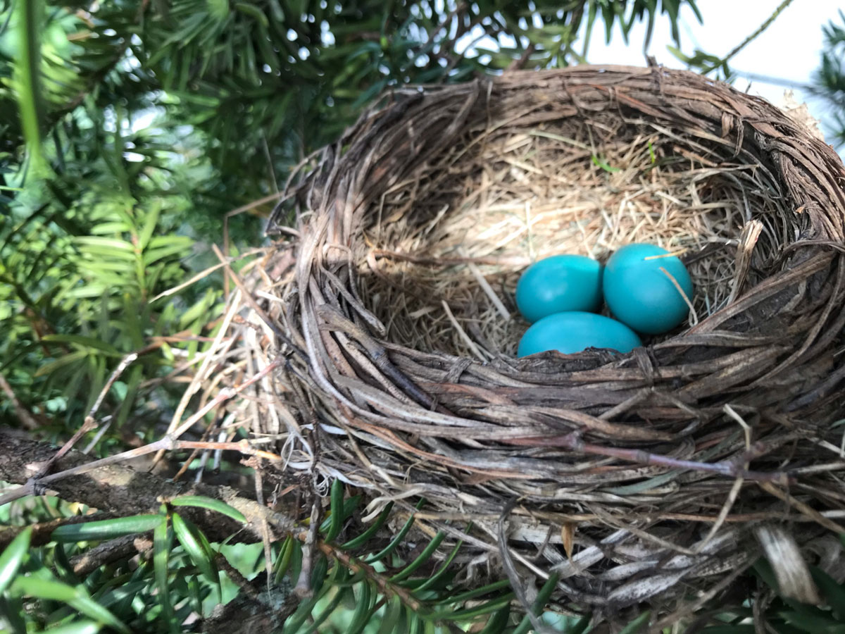
I was really feeling the spring vibes the day I climbed up and peeked in the Robin’s nest and saw these three eggs. Of course I painted the nest in my “Finding Joy” journal later that day!
I realized the bird’s nest was the perfect subject to share my watercolor painting process. So, I painted it again and recorded it for you.
Here’s what you’ll need to paint your own nest:
Watercolor or multimedia paper
Watercolor paints. I used brown, black, turquoise, orange, hooker’s green, raw sienna (tan)
Paintbrushes – round in medium to small (thin) sizes
This post contains affiliate links to products/brands I use and recommend. I earn a small commission whenever you buy using these links, at no additional cost to you. Thank you for supporting my blog!
I started a personal project that I’m calling “Finding Joy.” I wanted to look for and appreciate the little things in life and I wanted to get back to daily painting.
Since starting, I realized we have moments of joy during the day – “Wow that is pretty,” or “This is fun,” or “This tastes good.” But these moments can be fleeting. In painting them I’m extending the joy!
Finding Joy ~ Extending Joy
I started this project because I’m having skin cancer surgery on my cheek and I wanted to be in a place of positivity. It’s working!
Want to start your own Finding Joy project? It’s easy:
How to start your own “finding joy” Sketchbook project
This post contains affiliate links to products/brands I use and recommend. I earn a small commission whenever you buy using these links, at no additional cost to you. Thank you for supporting my blog!
For weekly watercolor tips & Tricks sign up for my newsletter:
Processing…
Success! You're on the list.
Whoops! There was an error and we couldn't process your subscription. Please reload the page and try again.
Recently I wrote about how you should take some time to observe a reference photo before painting. I have to constantly remind myself of my own advice because I want to jump in and start painting. I want to get to the fun part!
1. observe your subject
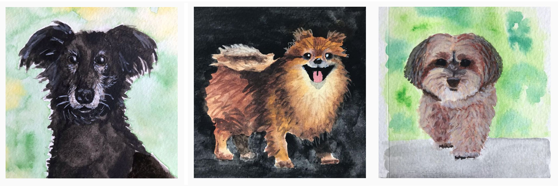
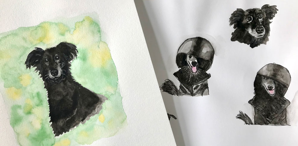
After painting a few dog portraits, the part 2 to this advice occurred to me:
2. Do a “study”
What is a “study”? Essentially a study is a practice painting, drawing, or sketch. You have most likely seen studies done by the Masters before they painted their final masterpieces.
For weekly watercolor tips & Tricks sign up for my newsletter:
Processing…
Success! You're on the list.
Whoops! There was an error and we couldn't process your subscription. Please reload the page and try again.
The masters did studies
Georges Seurat, “A Sunday Afternoon on the Island of La Grande Jatte,” 1884-1886 (Photo: The Art Institute of Chicago Public Domain)
Sketching or painting helps you see the subject more closely. As I painted the dog portraits I noticed more about the dogs as I painted. When I paint or draw my eyes travel back and forth from my painting to the reference photo and back again.
This is something I try to instill in the kids at the art center where I teach:
Everything you need to know about the subject is in the photo. If you want to realistically draw or paint it, keep looking at the photo and your artwork.
Eileen McKenna
Another way of seeing
I find it useful to occasionally flip both the reference photo and my paper to see things differently. Looking at things this way is supposed to trigger the other side of your brain. This theory was written about in the popular book Drawing on the Right Side of the Brain.
I notice that when I look at things upside down it is easier to see the individual elements of something. For example a face upside down allows me to focus on the elements more than the whole face.
painting Stella
Stella by Eileen McKenna
When I painted Stella, I looked through many photos and selected a few photos to practice with. I wanted to “see” what characteristics were unique to her. As I painted I felt I was getting to know her. These practice paintings helped me get a more realistic final painting.
For weekly watercolor tips & Tricks sign up for my newsletter:
Processing…
Success! You're on the list.
Whoops! There was an error and we couldn't process your subscription. Please reload the page and try again.
This post contains affiliate links to products/brands I use and recommend. I earn a small commission whenever you buy using these links, at no additional cost to you. Thank you for supporting my blog!
Looking for unique fabrics for your next sewing project? Looking for fabric that represents a unique hobby or passion? Spoonflower has tons of niche fabrics created by independent designers – like me! Visit my Spoonflower shop here.
It isn’t hard on Spoonflower to find a unique fabric. In the Spoonflower Magazine they have a section called:
“There’s A Design for That”
“With the largest collection of surface patterns in the world, Spoonflower has always been the destination for one-of-a-kind designs. But did you know that thousands of new designs are added every month? Dive into our Marketplace and spend a few minutes discovering the perfect match for any personality-we know you’ll find one as unique as you are.”
– Spoonflower Magazine
I know first hand that people are looking for niche fabrics. By far my biggest sellers are very niche fabrics, specifically my Swimming Laps and Rainbow Goggles fabrics and more recently my Lacrosse fabrics.
Somewhere, someone is looking to make a quilt or other sewing projects that encompasses their unique interests or a loved one’s interests. That’s how I connected with Sue Finley. Sue made a quilt for her daughter’s swim team. I was honored that my fabrics were part of it. Both my Swimming Laps and Rainbow Goggles fabrics are part of this quilt.
create your own fabric designs
Can’t find the right fabric? Create your own!
I began turning my watercolor illustrations into fabric patterns on Spoonflower back in 2015. You can do it too! Fabrics are made up of a simple piece of artwork that “repeats” over and over. When you are uploading a design to Spoonflower, you upload the single “repeat.” Think of it as a slice of the design. Spoonflower will duplicate the repeat to fill whatever length of fabric you or someone else orders.
Not only can you upload your designs and order fabrics for your own sewing projects, but you can offer your designs for sale and make a commission when some else orders your fabric! Who doesn’t love passive income?
Let me know if you decide to give fabric design (called surface design) a try – I’d love to hear!
Several years ago I dedicated myself to painting seascapes. I painted one after another. I studied my photos as I painted and as time went on I noticed more things about the ocean and waves. These little details are what made my paintings better.
For weekly watercolor tips & Tricks sign up for my newsletter:
Processing…
Success! You're on the list.
Whoops! There was an error and we couldn't process your subscription. Please reload the page and try again.
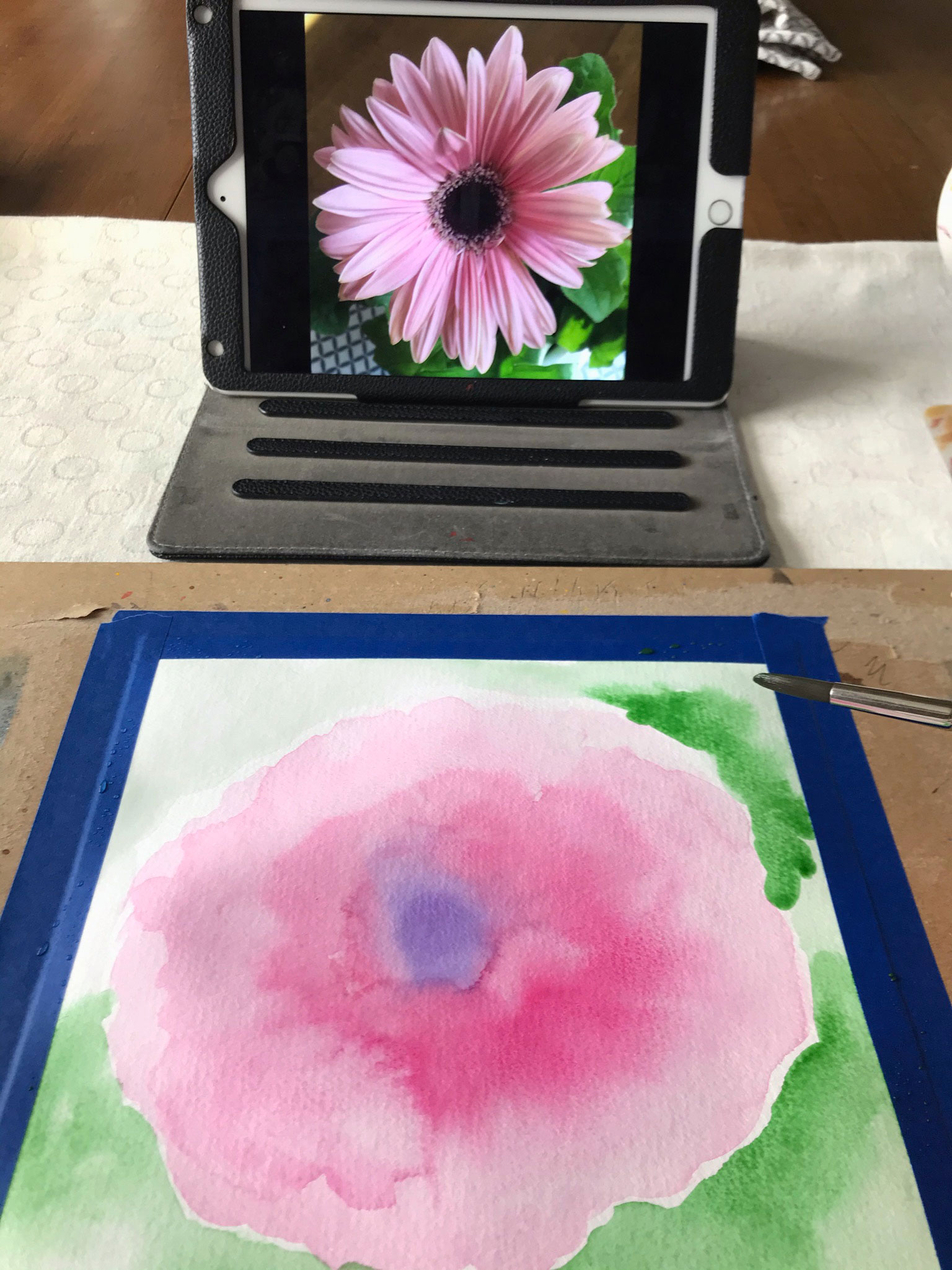
By nature I am an impatient person. I’ve heard it said that the Aries motto is “Ready, Fire, Aim.” It is certainly true about me. When I’m painting, I rarely draw anything beforehand. I immediately want to get to the fun part of splashing paint onto the page. But I am often reminded that if I took some time to look at and study my reference photo I would get better results.
I took a close up of a Gerbera Daisy, so I could see the details. A great start! But I dove in too quickly and ended up struggling. My painting had twice as many petals as it should have and looked off. I’m sharing the lesson I learned with you:
Take time to look at and study your reference before painting.
For weekly watercolor tips & Tricks sign up for my newsletter:
Processing…
Success! You're on the list.
Whoops! There was an error and we couldn't process your subscription. Please reload the page and try again.
This post contains affiliate links to products/brands I use and recommend. I earn a small commission whenever you buy using these links, at no additional cost to you. Thank you for supporting my blog!
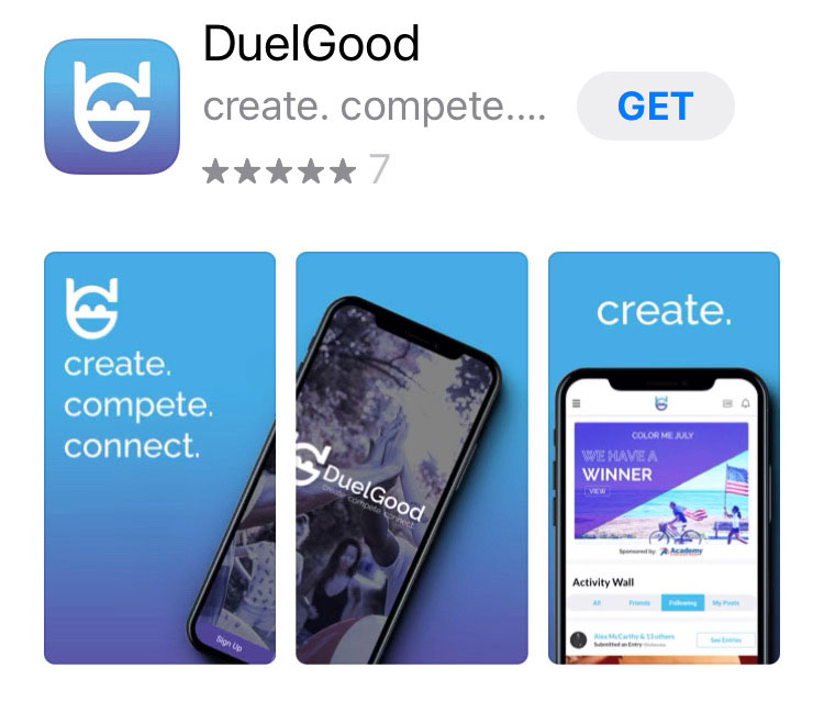
I’ve partnered with DuelGood to create a Watercolor St. Patrick’s Day Challenge! Enter for a chance to win a $25 Blick gift card.
DuelGood is a global social platform to inspire creativity, build connections and do good in the world by engaging people in fun, easy-to-execute challenges.
This post contains affiliate links to products/brands I use and recommend. I earn a small commission whenever you buy using these links, at no additional cost to you. Thank you for supporting my blog!
This post contains affiliate links to products/brands I use and recommend. I earn a small commission whenever you buy using these links, at no additional cost to you. Thank you for supporting my blog!